A closer look at select projects — from initial brief to outcome. Each study outlines the strategic thinking, creative development, and craft behind the work.
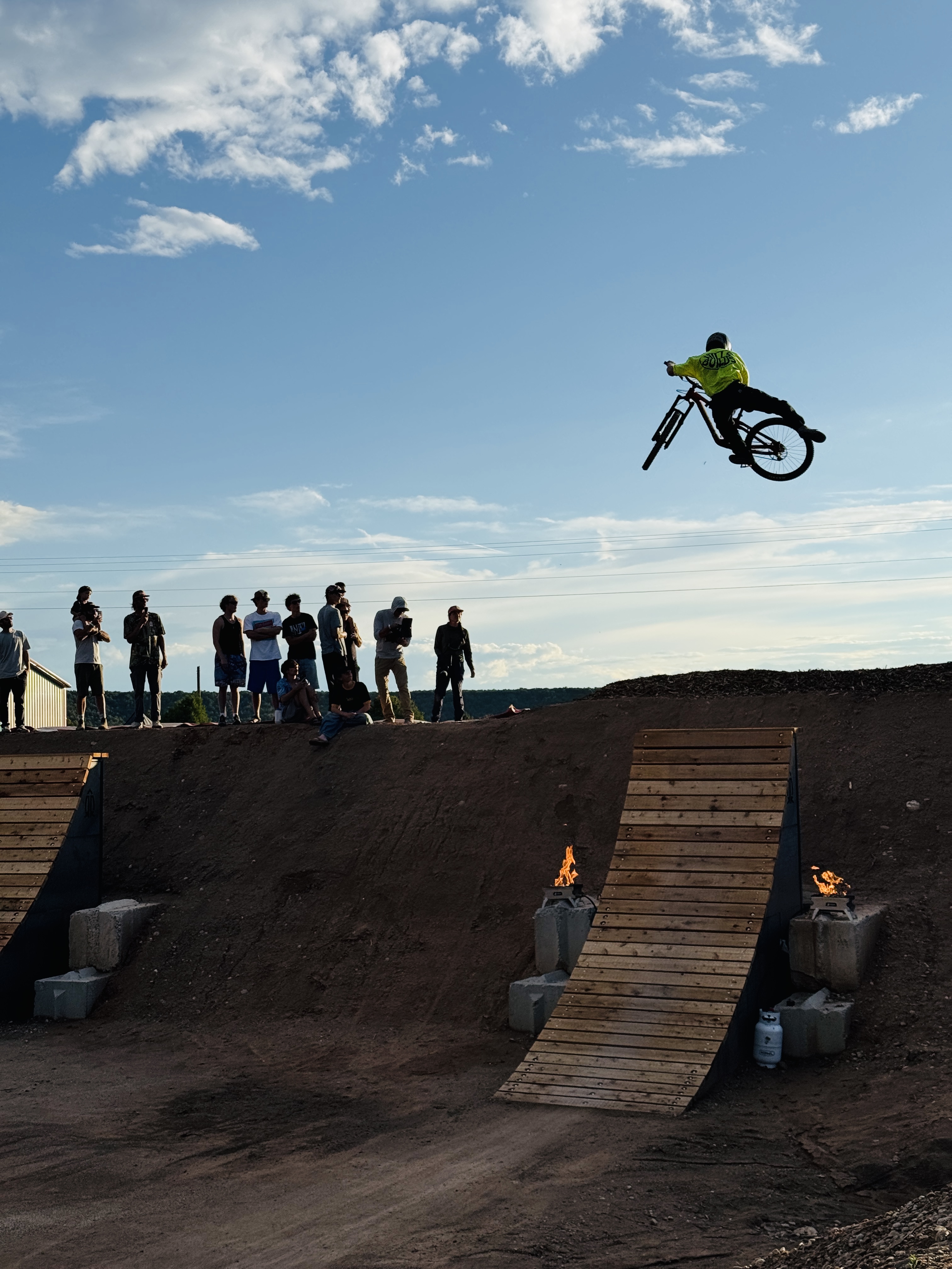
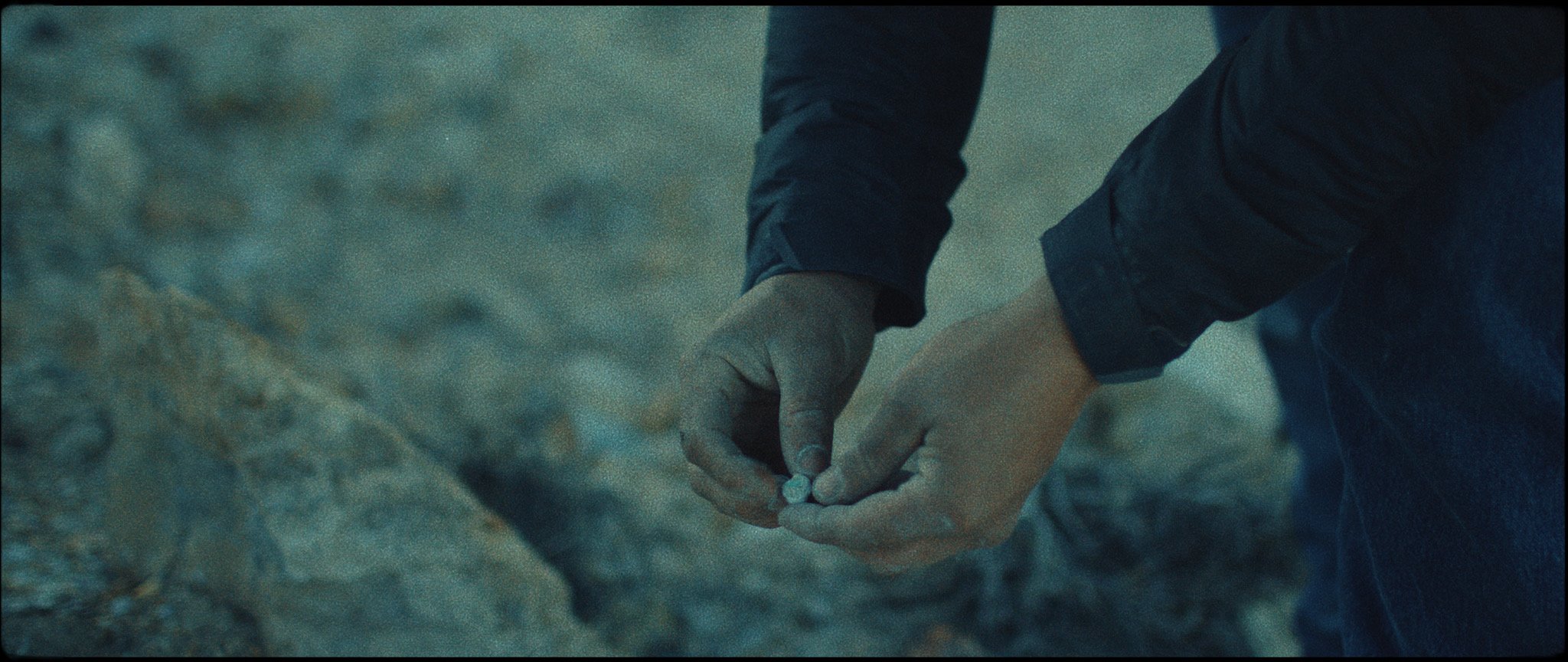
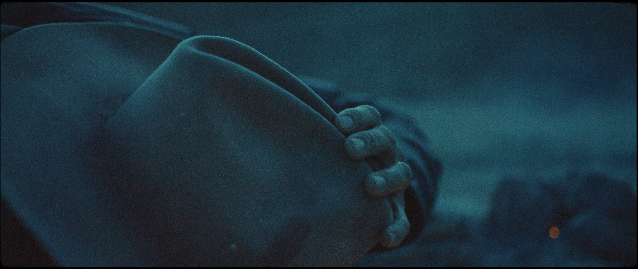
Experimental sound for Logan Bonwell's edit of the Trash Pit — Rocket Ramps' newest bike park.
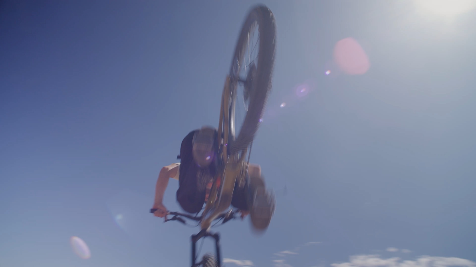
A 60-second experimental sound project nestled within Logan Bonwell's video edit for the newest Rocket Ramps bike park, the Trash Pit.
Sound built to score the motion rather than sit beneath it.
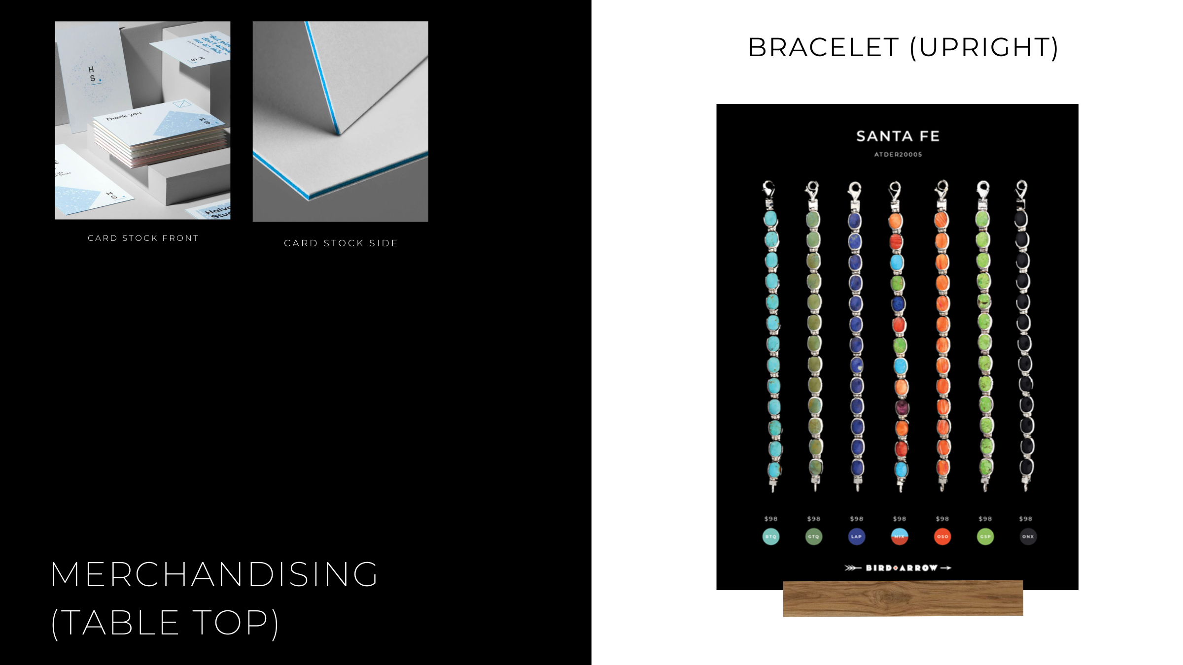
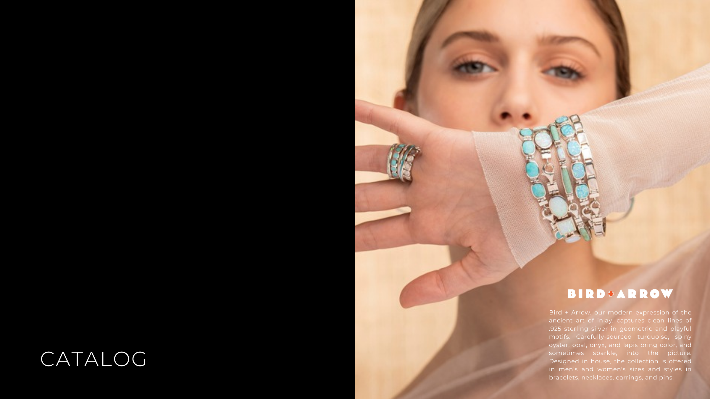
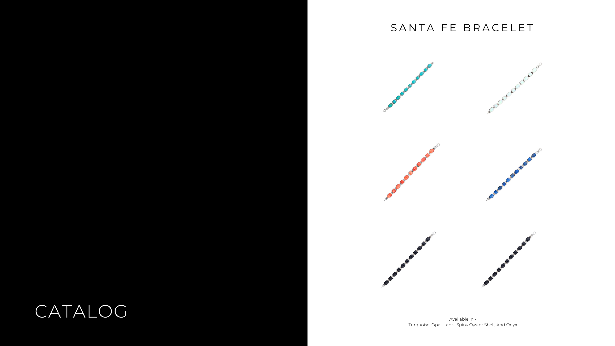
Creative direction and photo styling for Peyote Bird's Spring/Summer 2026 collection, produced exclusively for Mr Porter.
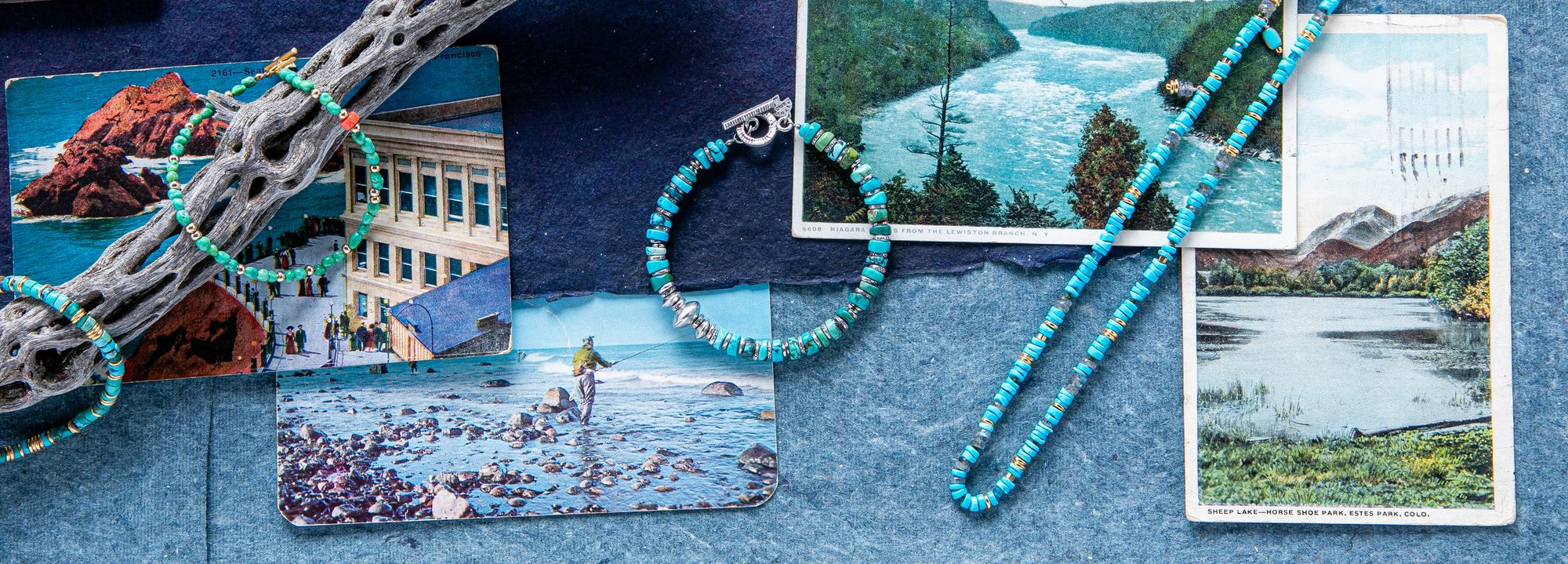
Peyote Bird tapped the studio to direct the product photography for their Spring/Summer 2026 campaign with Mr Porter. The goal was to move beyond standard e-commerce flat lays and build a visual world around the jewelry itself — one that felt tactile, layered, and true to the Southwest without leaning on cliché. Each composition needed to let the turquoise, coral, and silver speak while giving the campaign a cohesive editorial identity.
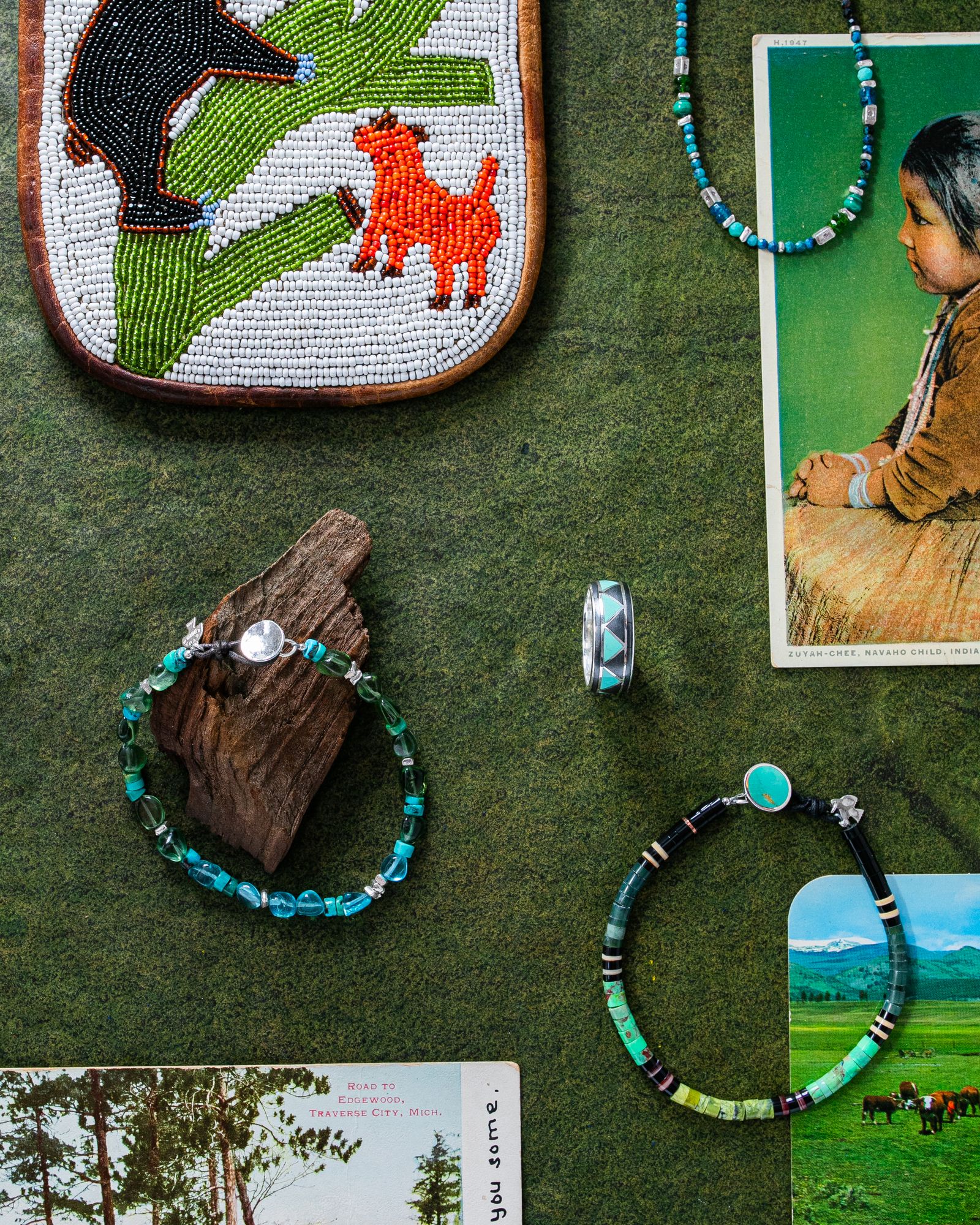
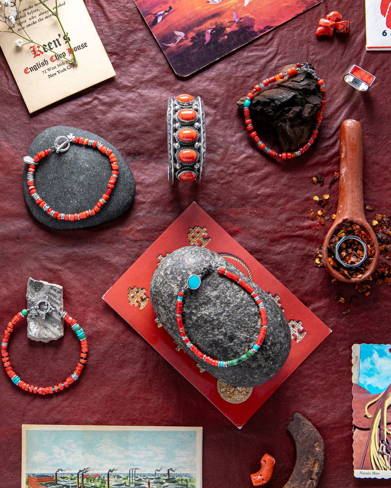
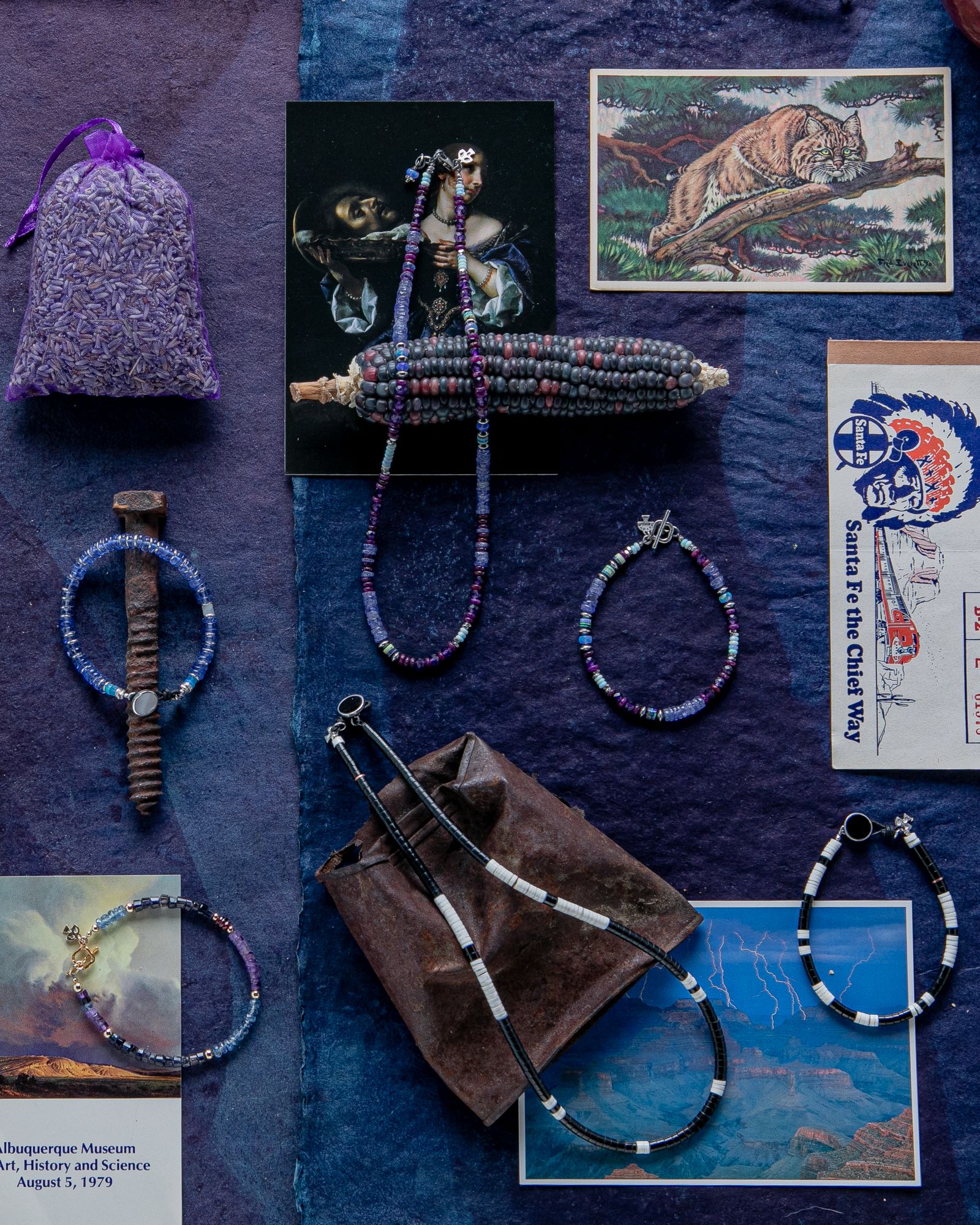
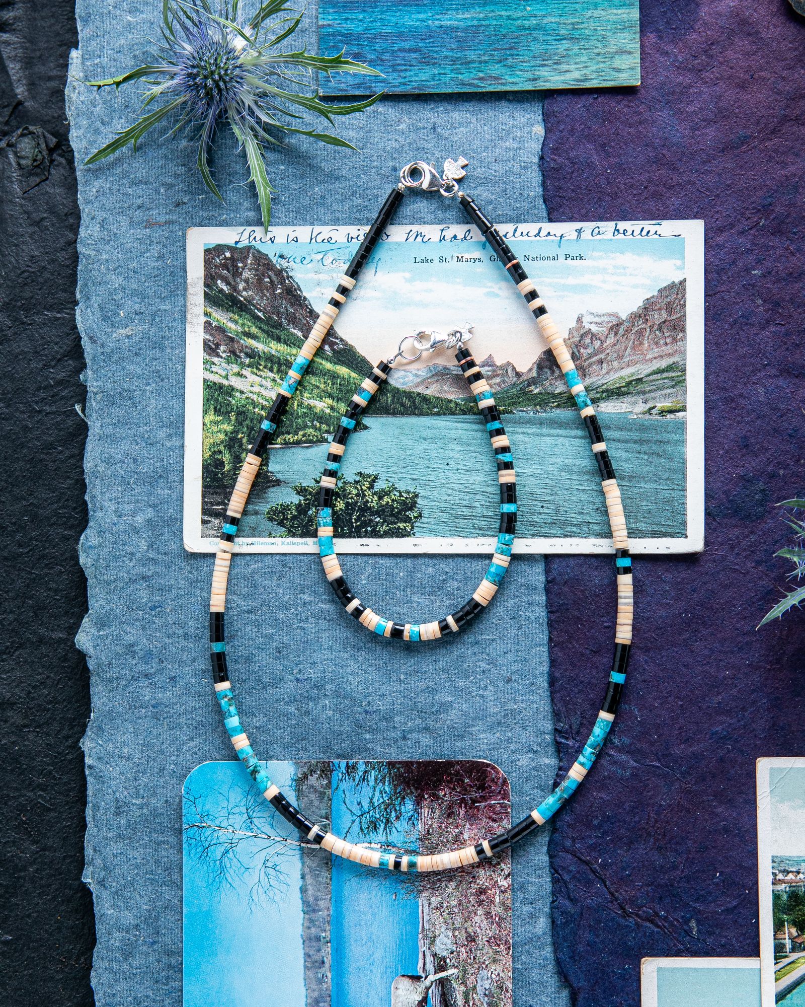
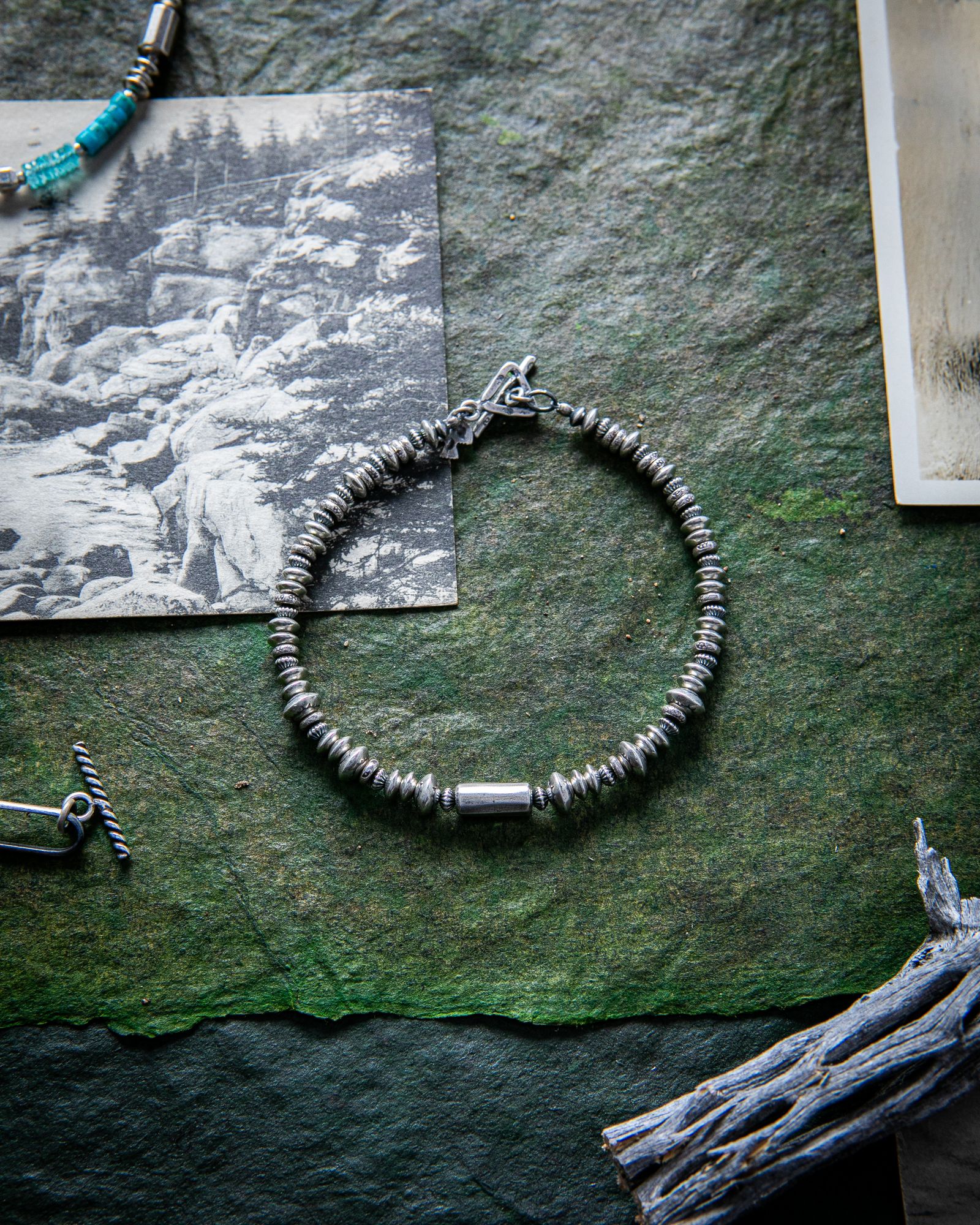
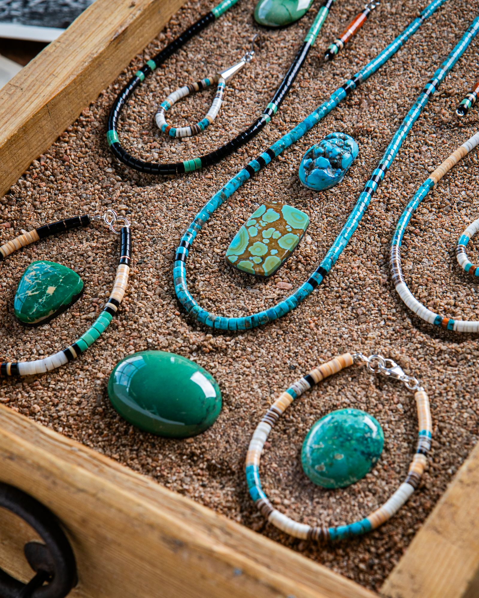
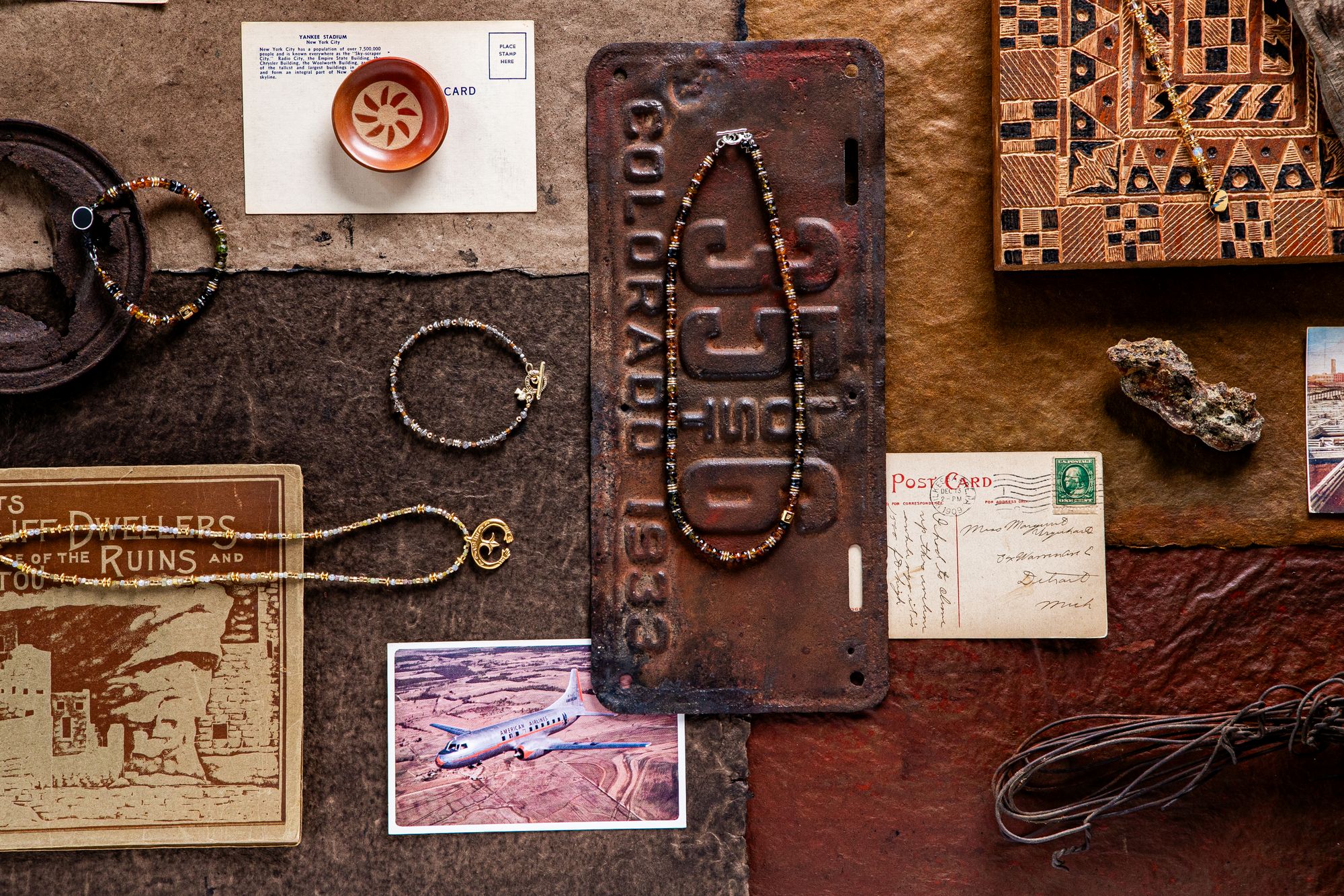
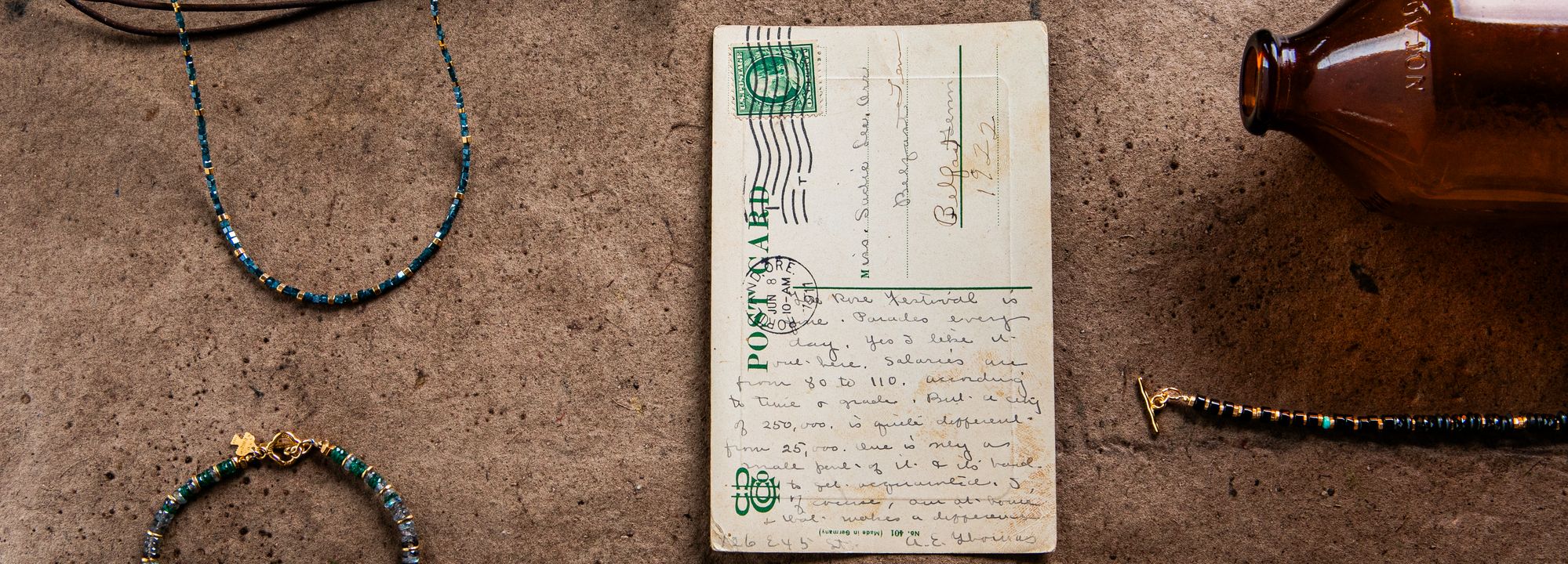
The resulting campaign gave Peyote Bird a rich, unmistakable visual language across the entire Mr Porter collection — every frame grounded in real materials, real color, and a point of view that felt as considered as the jewelry itself.
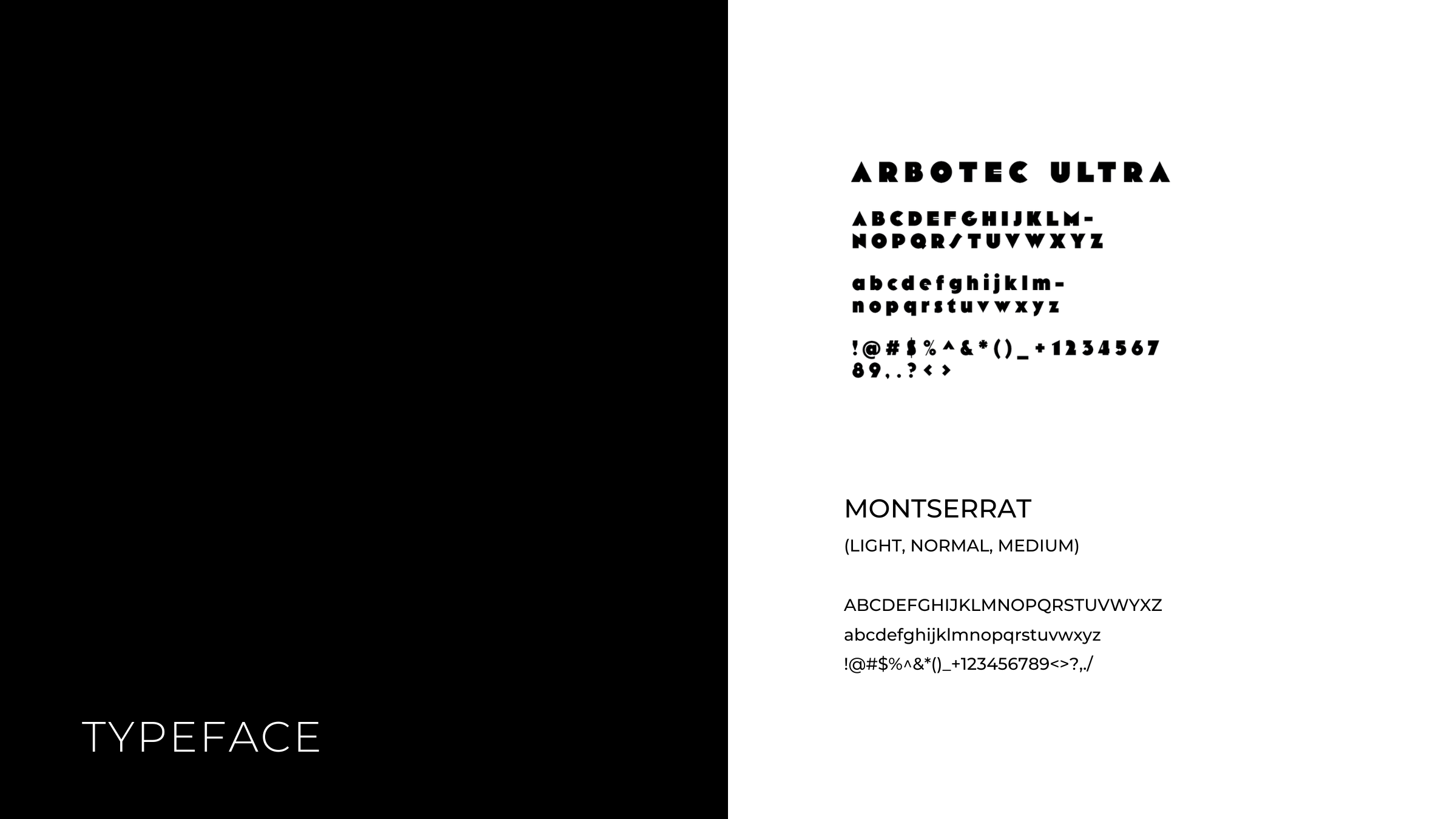
Brand collateral, typography, and visual system design for a contemporary architectural studio.
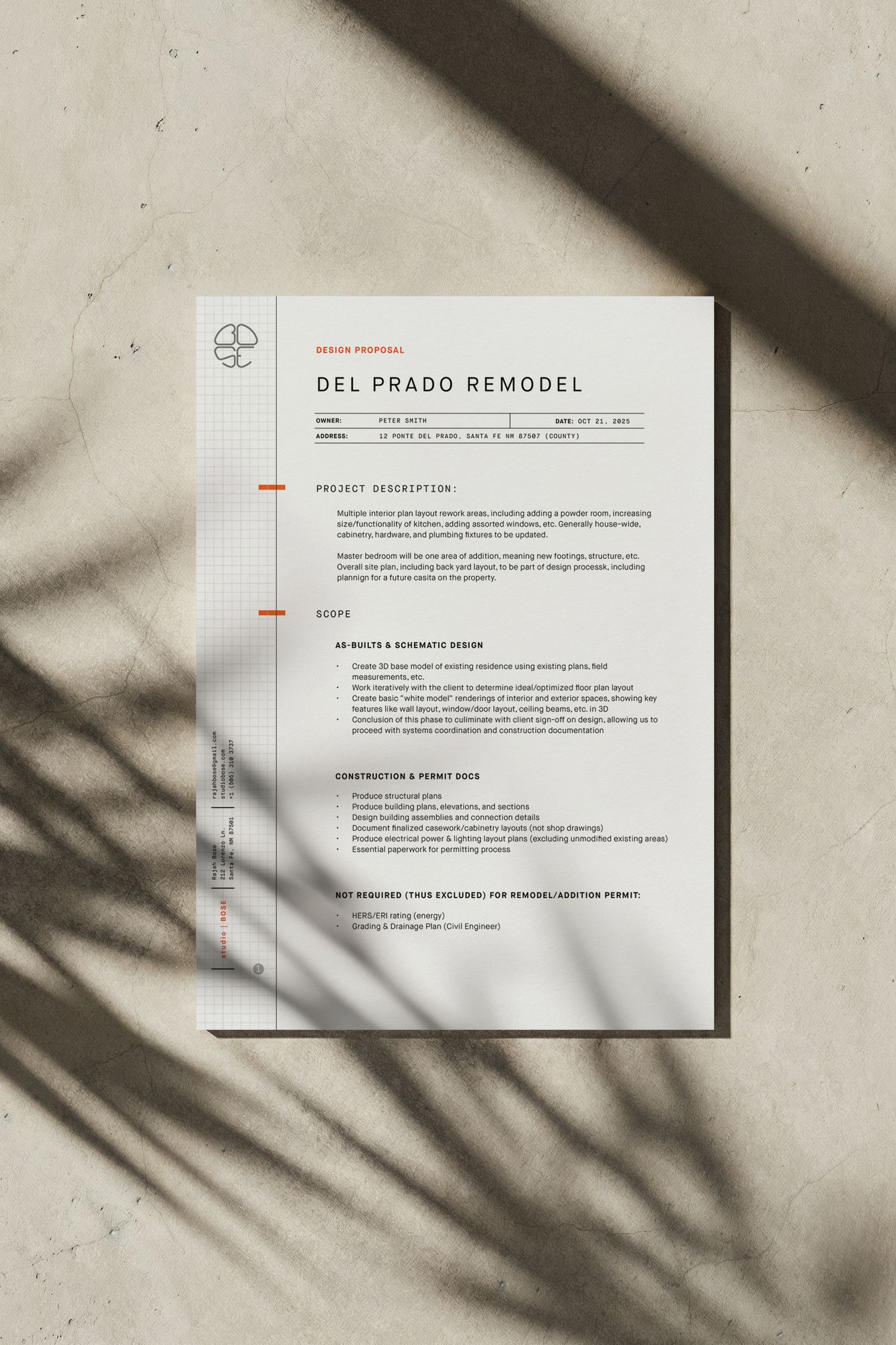
With the primary logo established, studio | BOSE required a comprehensive collateral system built around it, including proposals, invoices, typography, color palette, and layout templates. The objective was to create a cohesive visual language that extended the existing mark into every client-facing touchpoint, grounded in forms that reflected the studio's creative ethos.
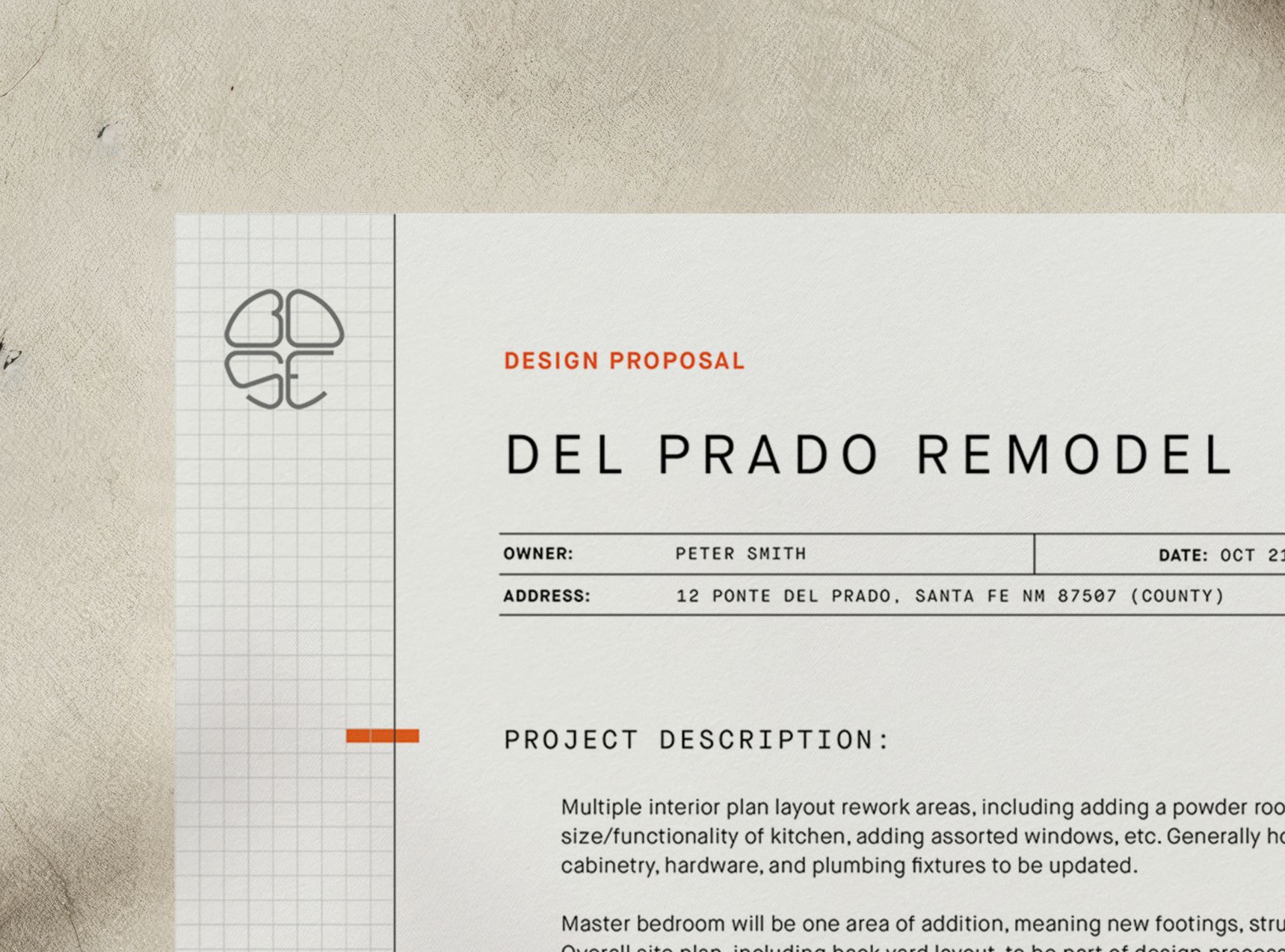
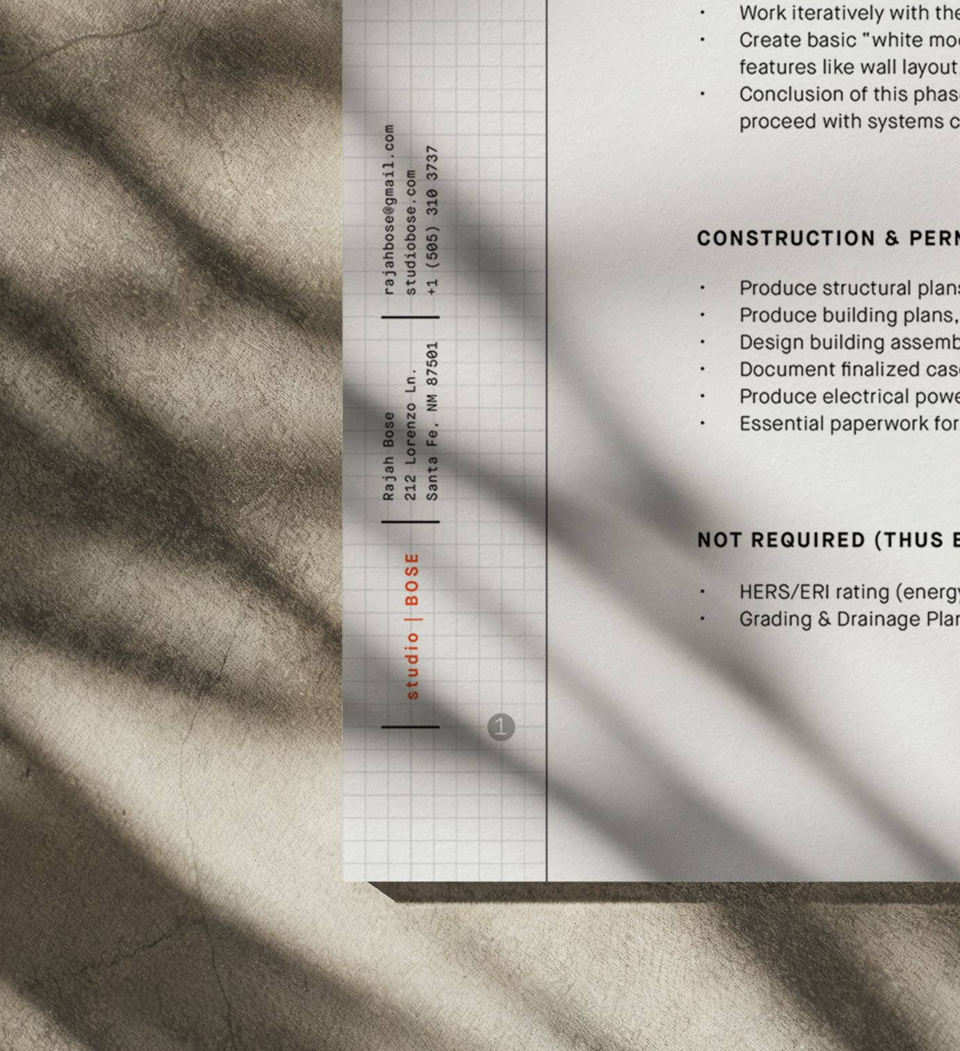
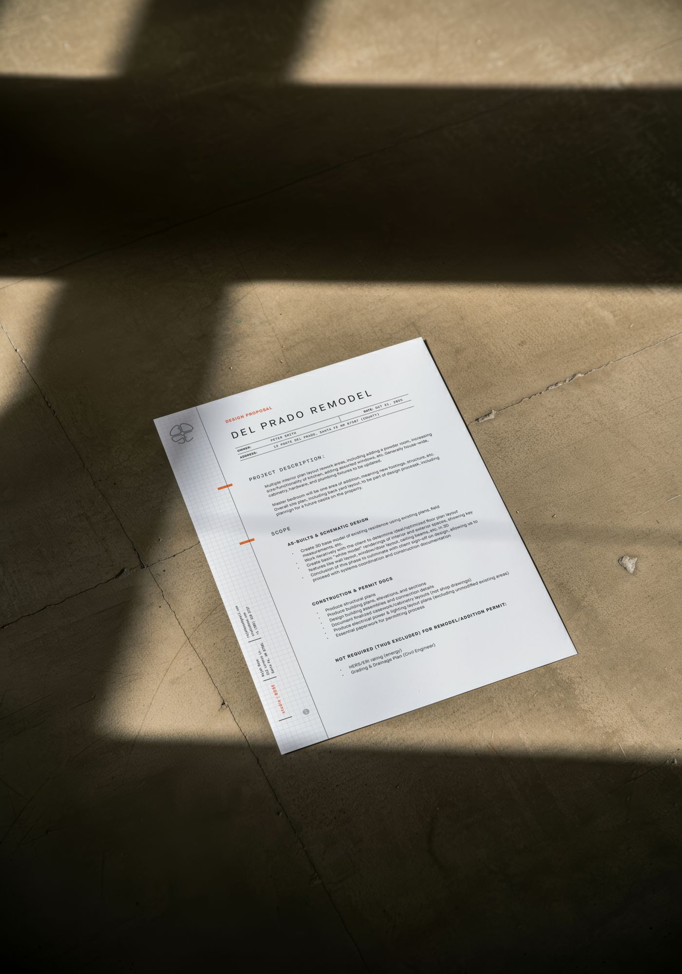
The collateral system translated a single logo into a cohesive brand presence. Every proposal, invoice, and document now reflects the same intentional visual language, strengthening studio | BOSE's professional identity across all interactions.
Custom illustration, brand collateral, and event merch for the grand opening of the Picuris Pueblo All-Wheel Park — northern New Mexico's newest bike park.
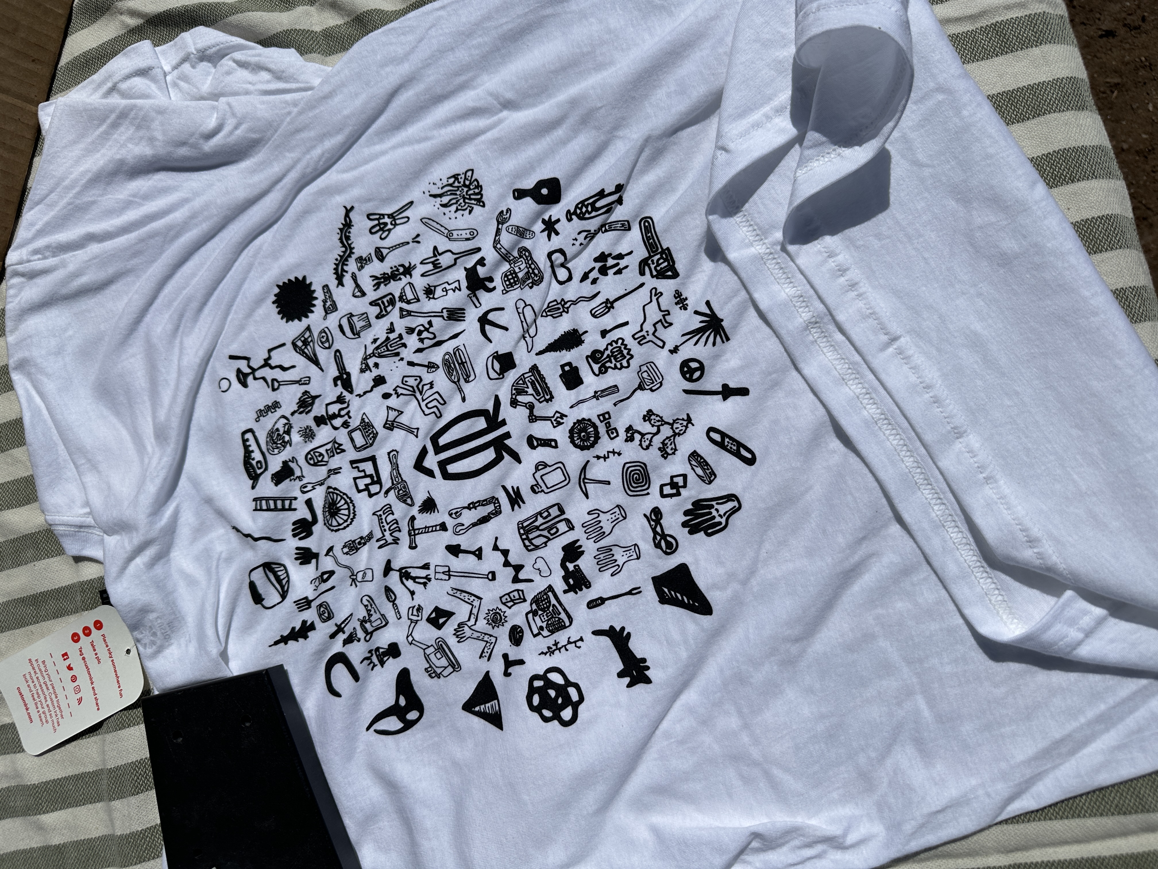
Rocket Ramps, a Santa Fe-based trail building company, commissioned designs for the launch of the Picuris Pueblo All-Wheel Park, a $500K bike park funded by the New Mexico Outdoor Recreation Division. Working within the existing brand mark, the studio's project goal was to design event apparel and branded materials featuring hand-drawn icons that captured both the energy of the competition and the community behind it.
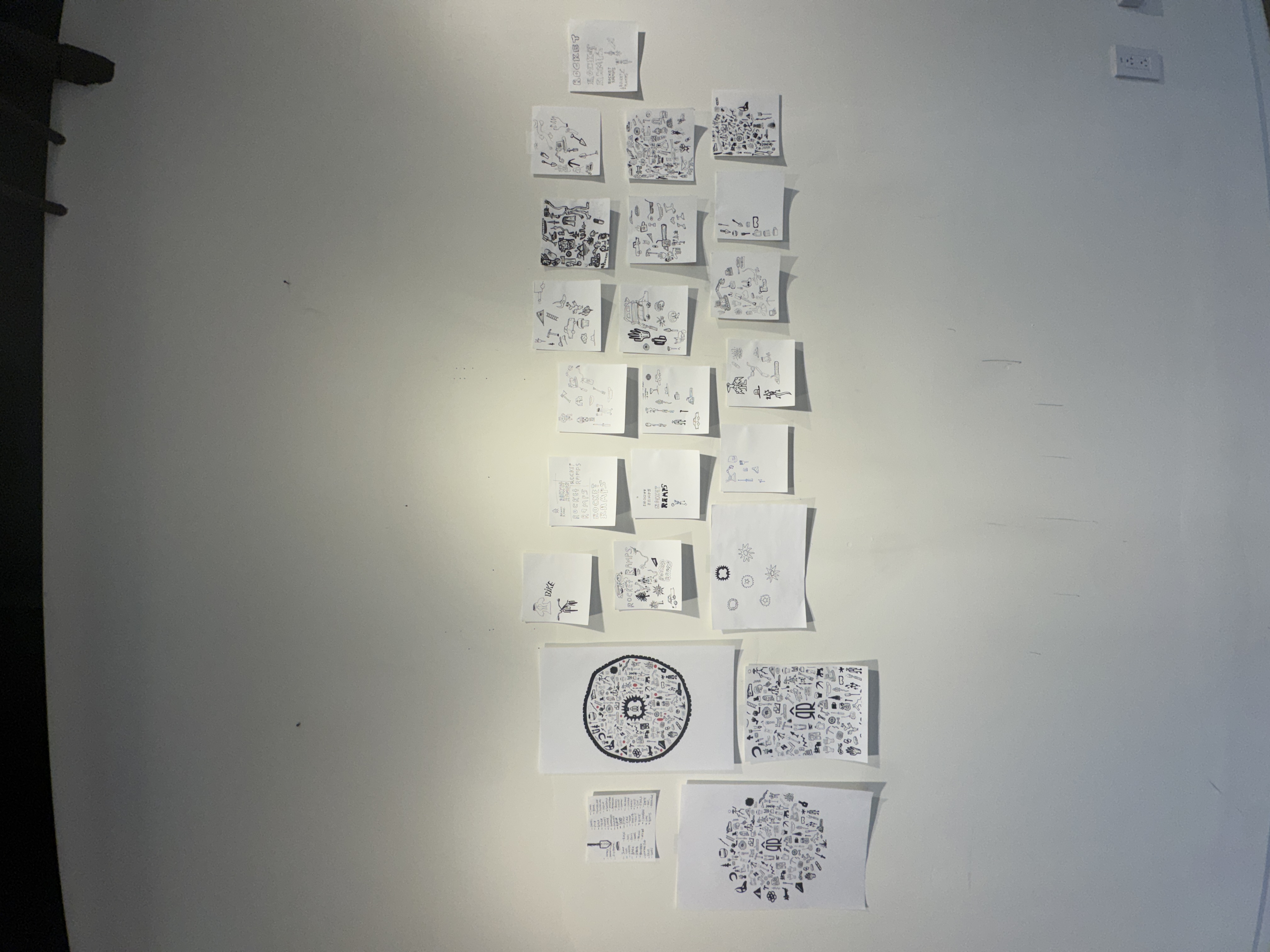
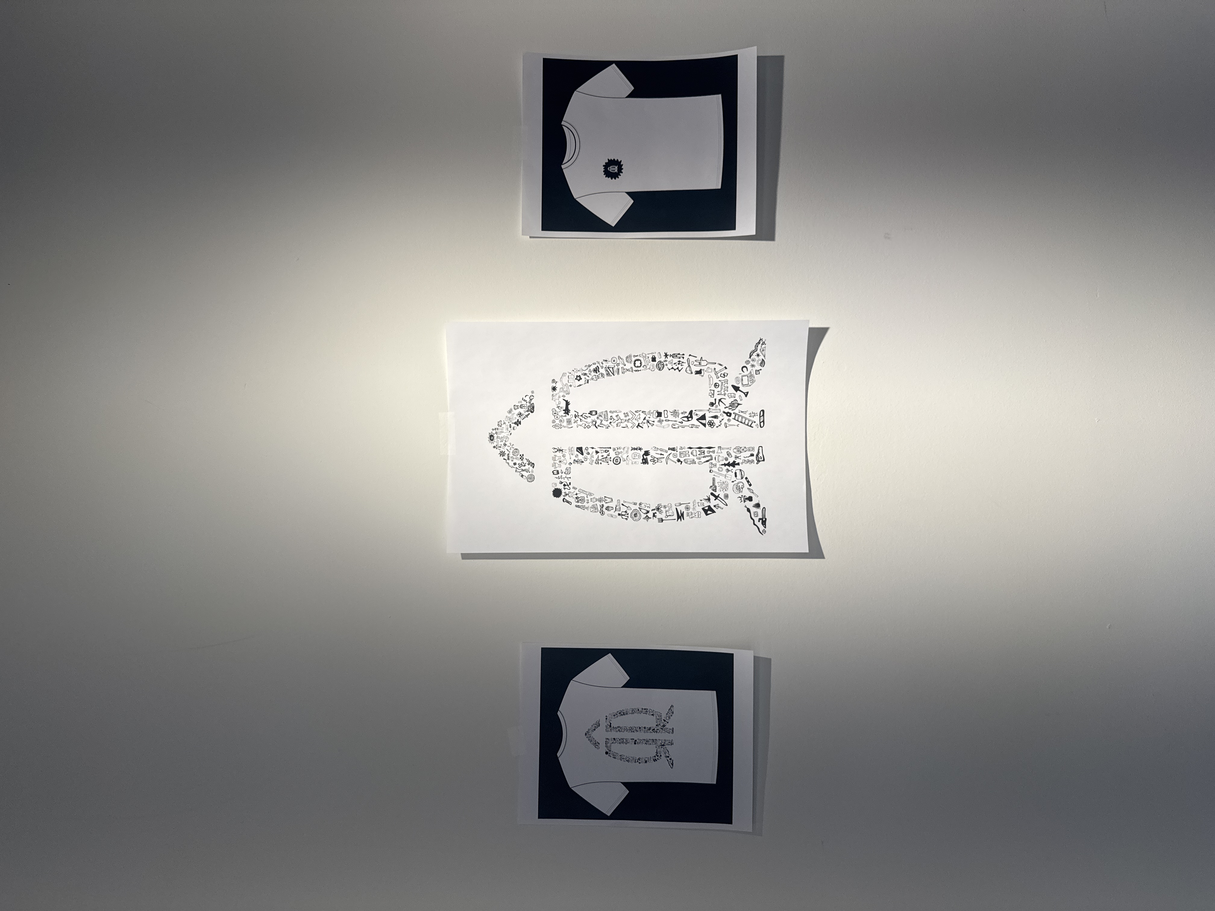
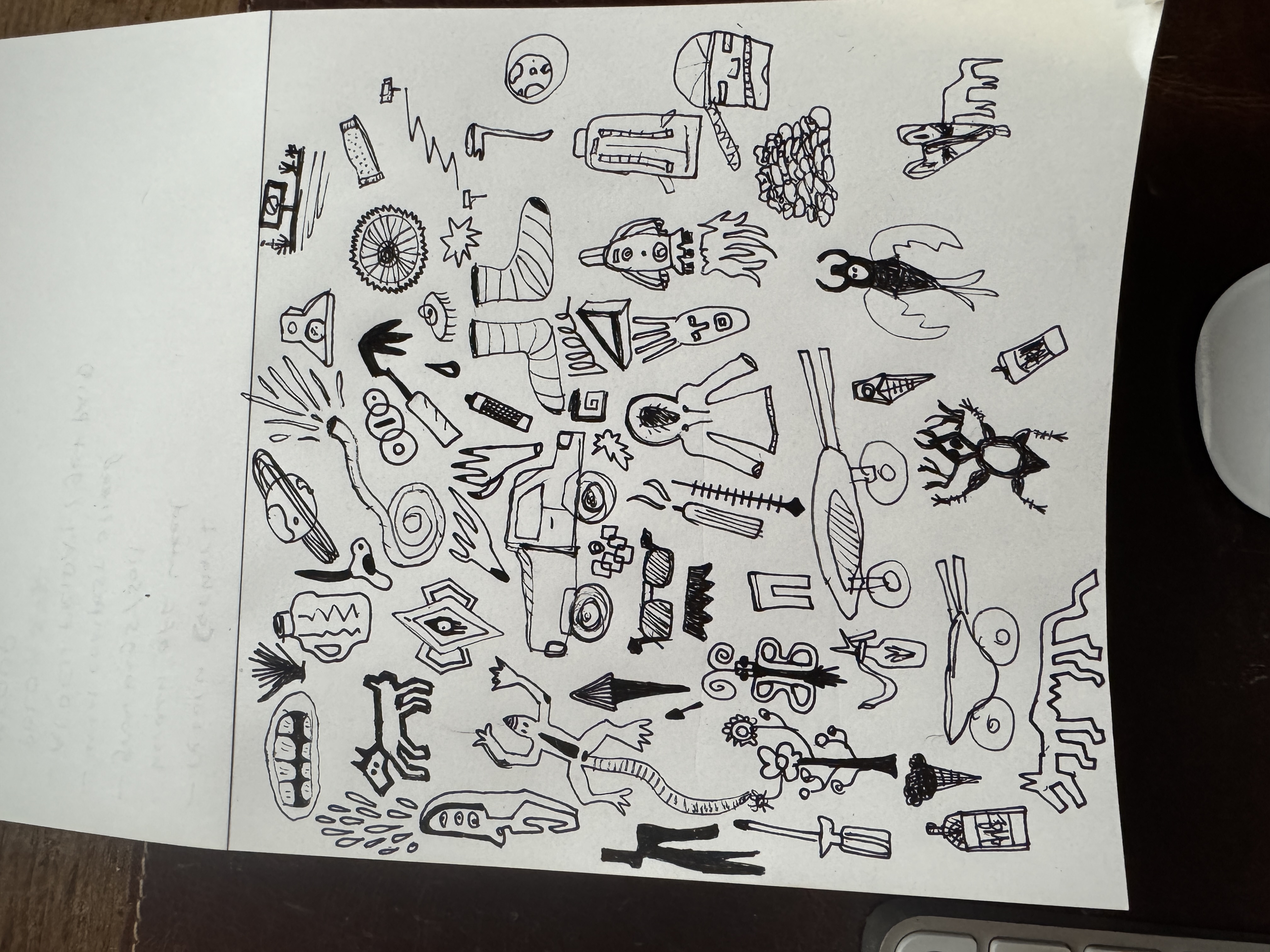
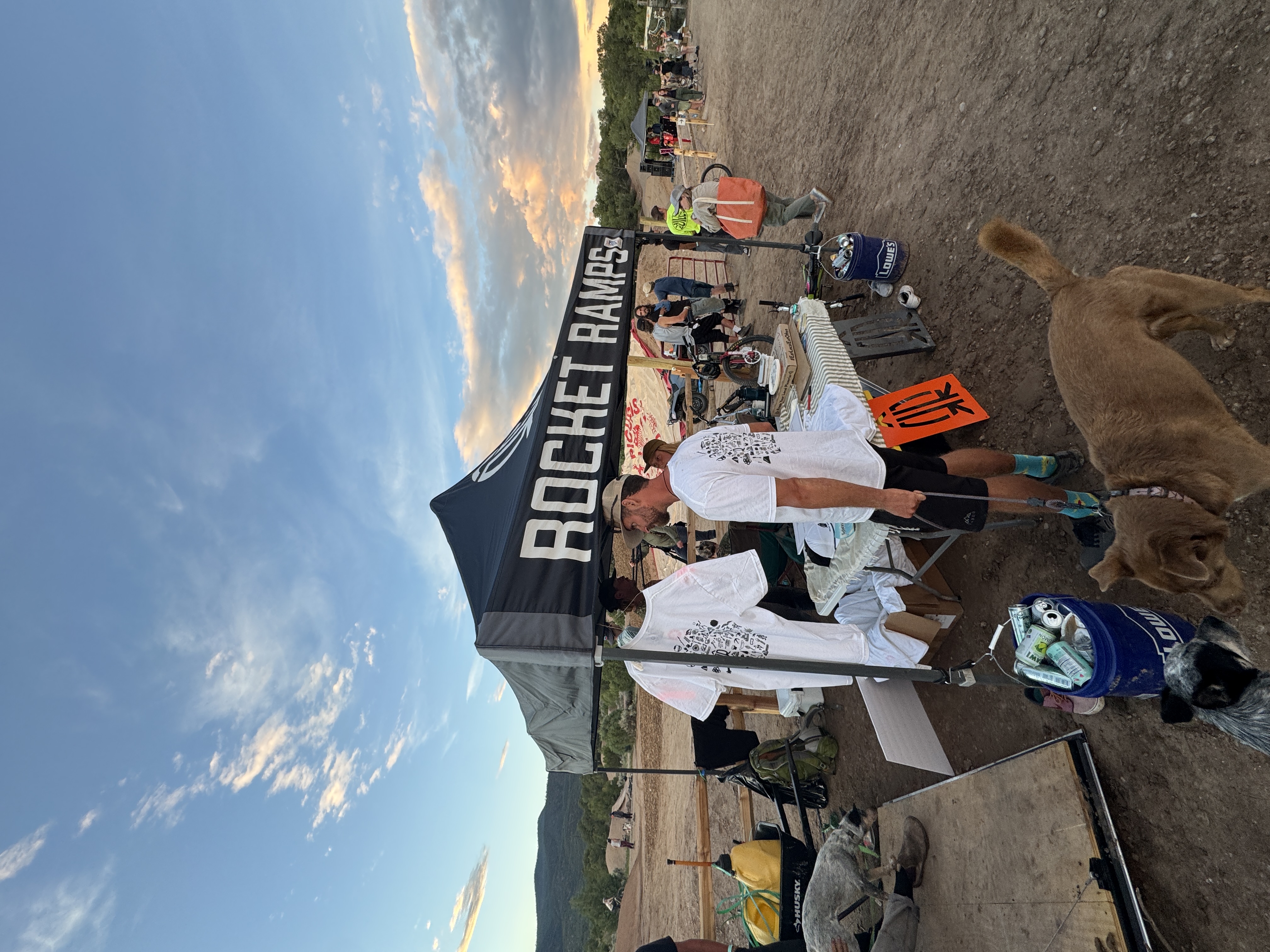
The Picuris Pueblo All-Wheel Park opened July 19, 2025 to a packed crowd. What started as a collateral project became a full visual language — over a hundred hand-drawn icons that told the story of the land, the tools, and the people building on it.
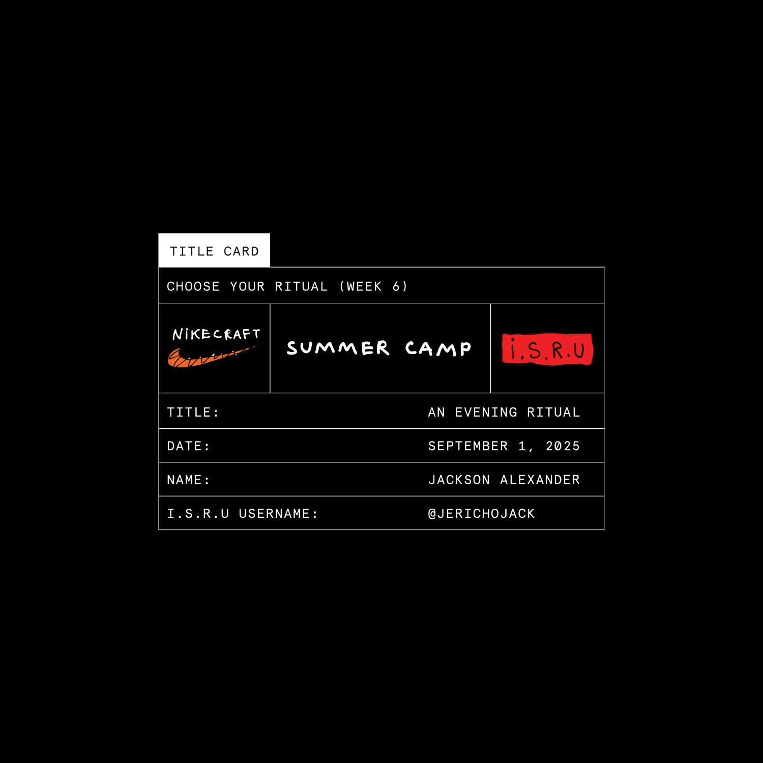
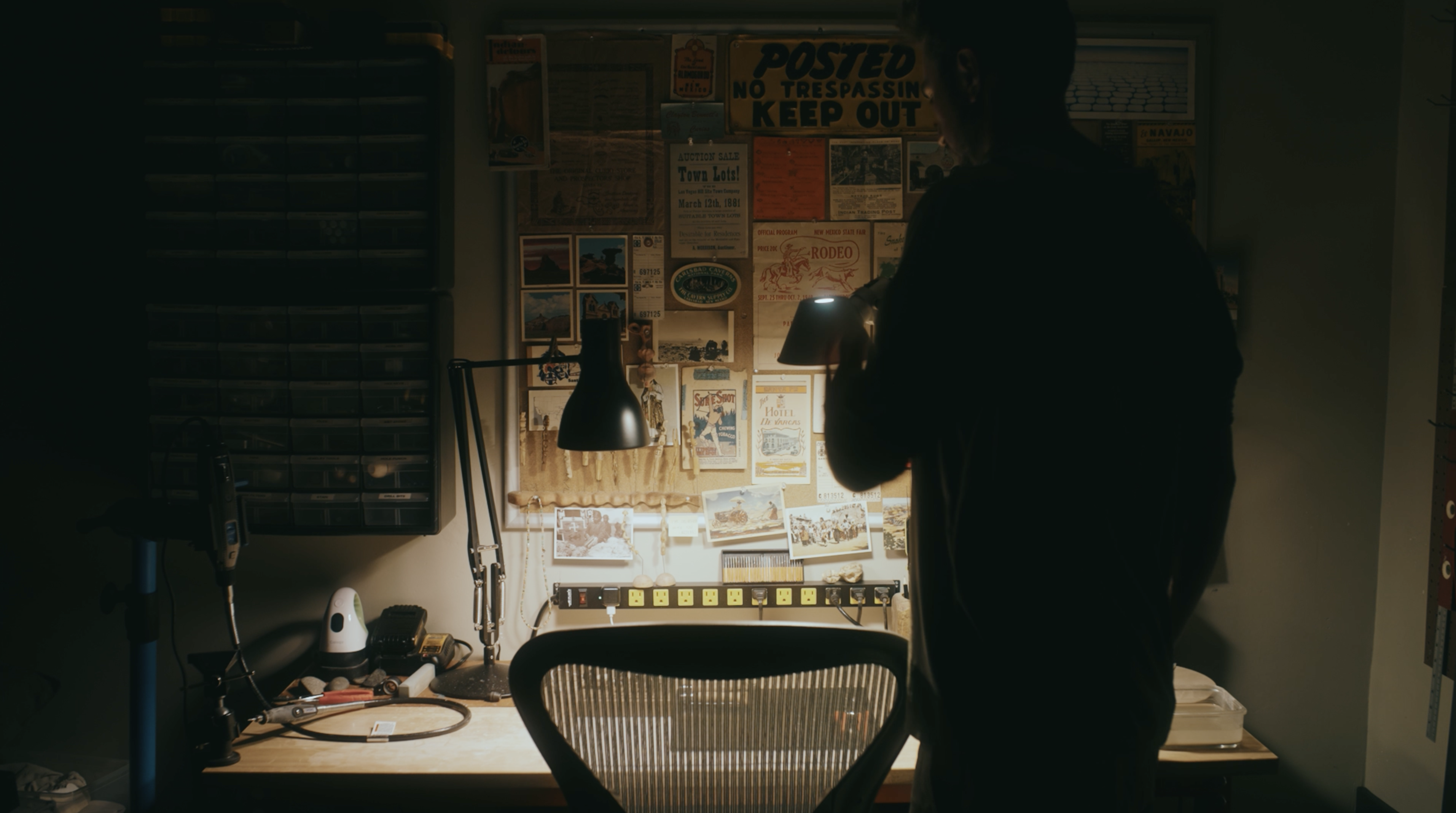
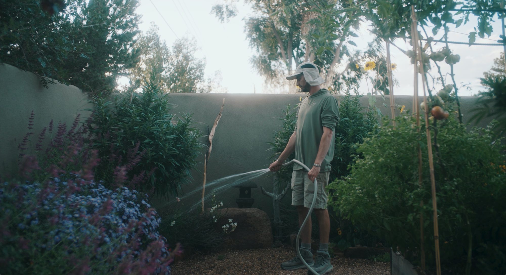
A short film documenting daily garden practice as ritual — produced as the final challenge for the Tom Sachs ISRU summer camp.
The Tom Sachs ISRU summer camp was a three-month daily practice — structured around discipline, craft, and showing up every day. The final challenge was a short form video submission around your daily ritual, whatever that may be. I called up my good friend and videographer, McCall Sides, and we built a piece focusing on the rituals surrounding maintaining a garden in late summer in Santa Fe.
Full brand identity, visual system, and brand book for Peyote Bird's contemporary jewelry line.
Peyote Bird needed a distinct identity for Bird & Arrow — a sub-brand targeting a contemporary, design-forward audience. The goal was to create a complete visual system that could stand on its own while maintaining a connection to the parent brand. The deliverables spanned logo design, typography, color palette, and a comprehensive brand book.
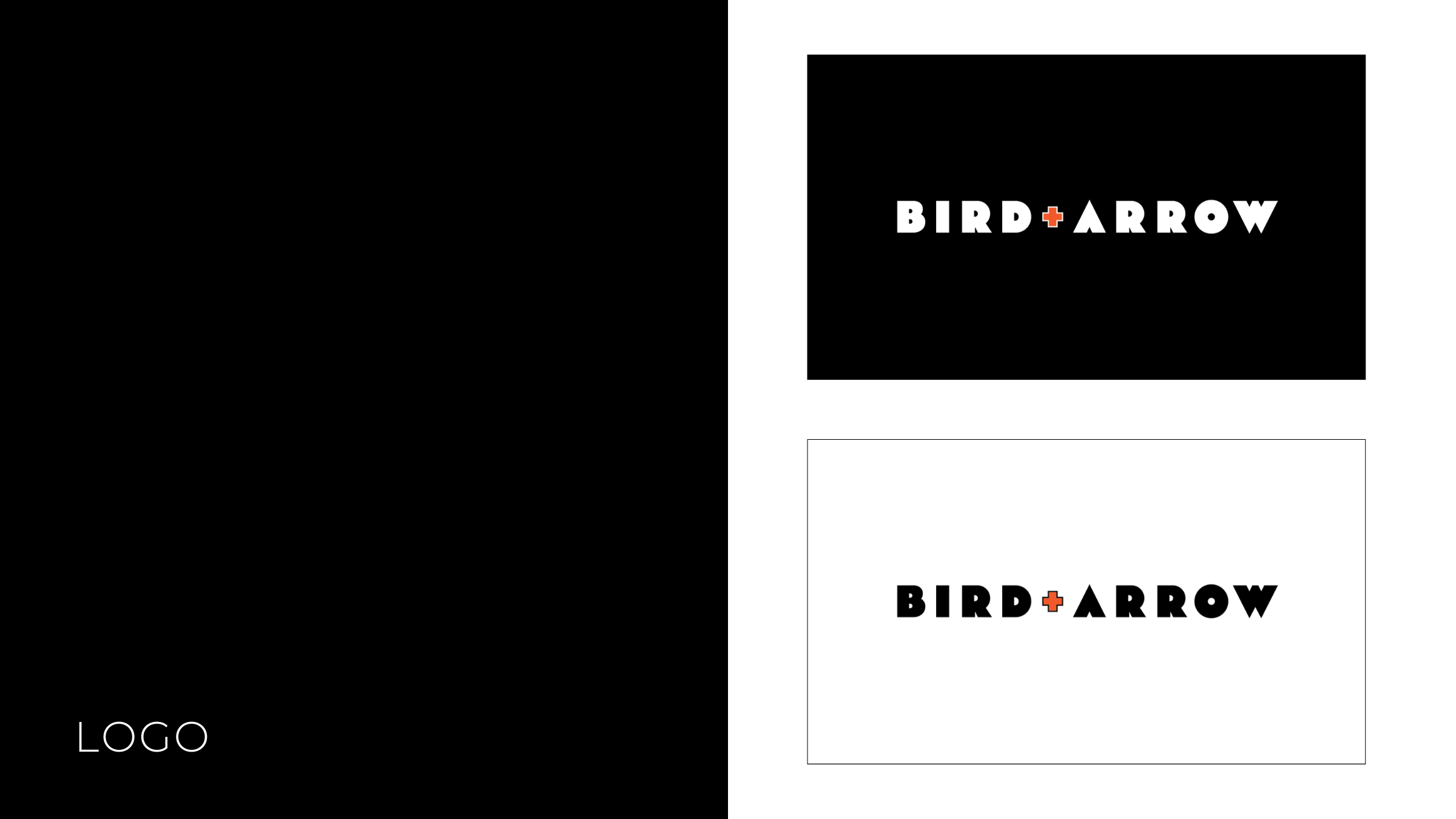
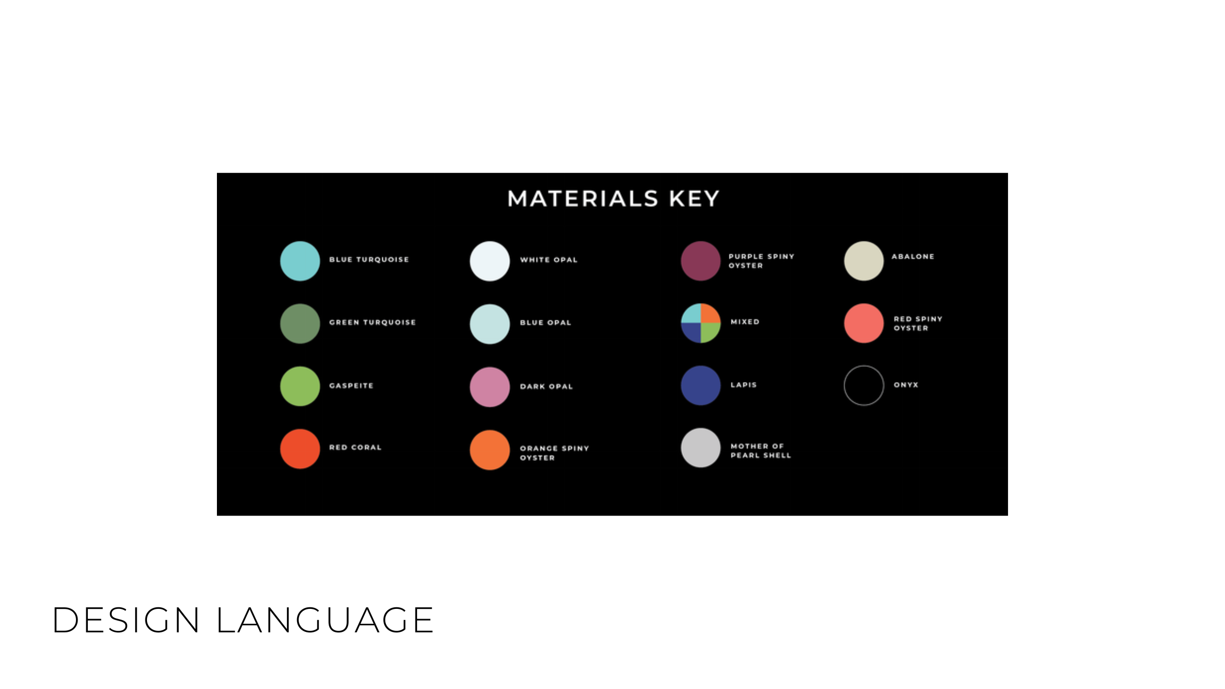
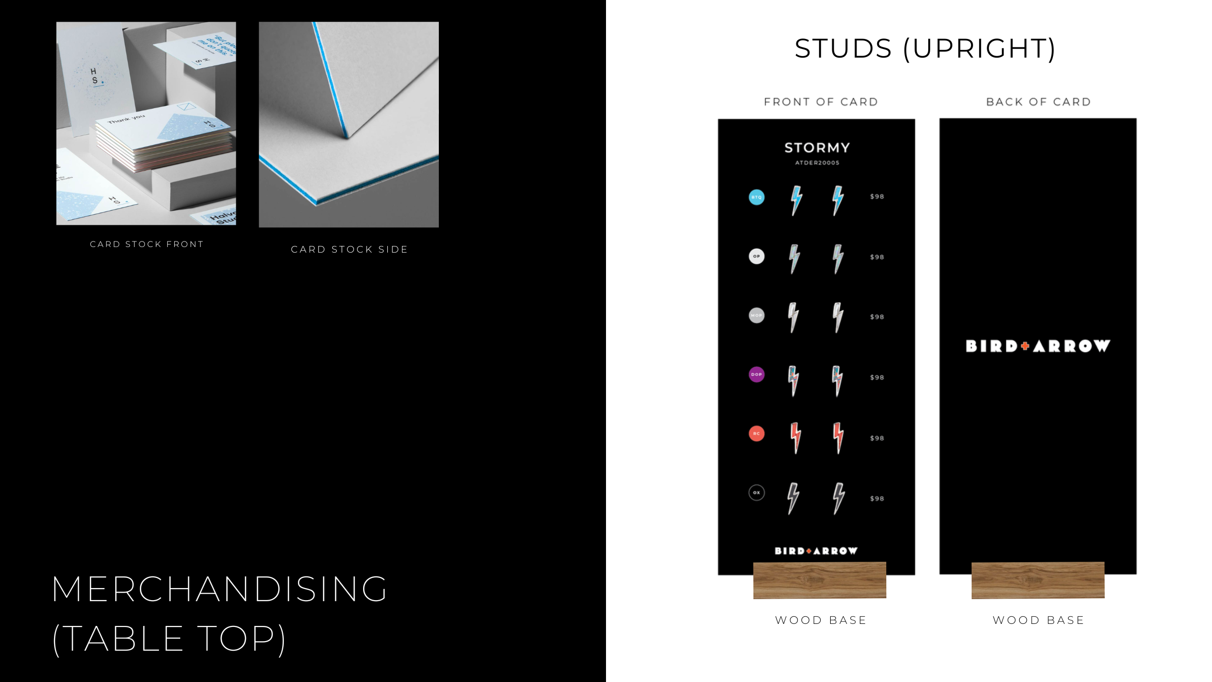
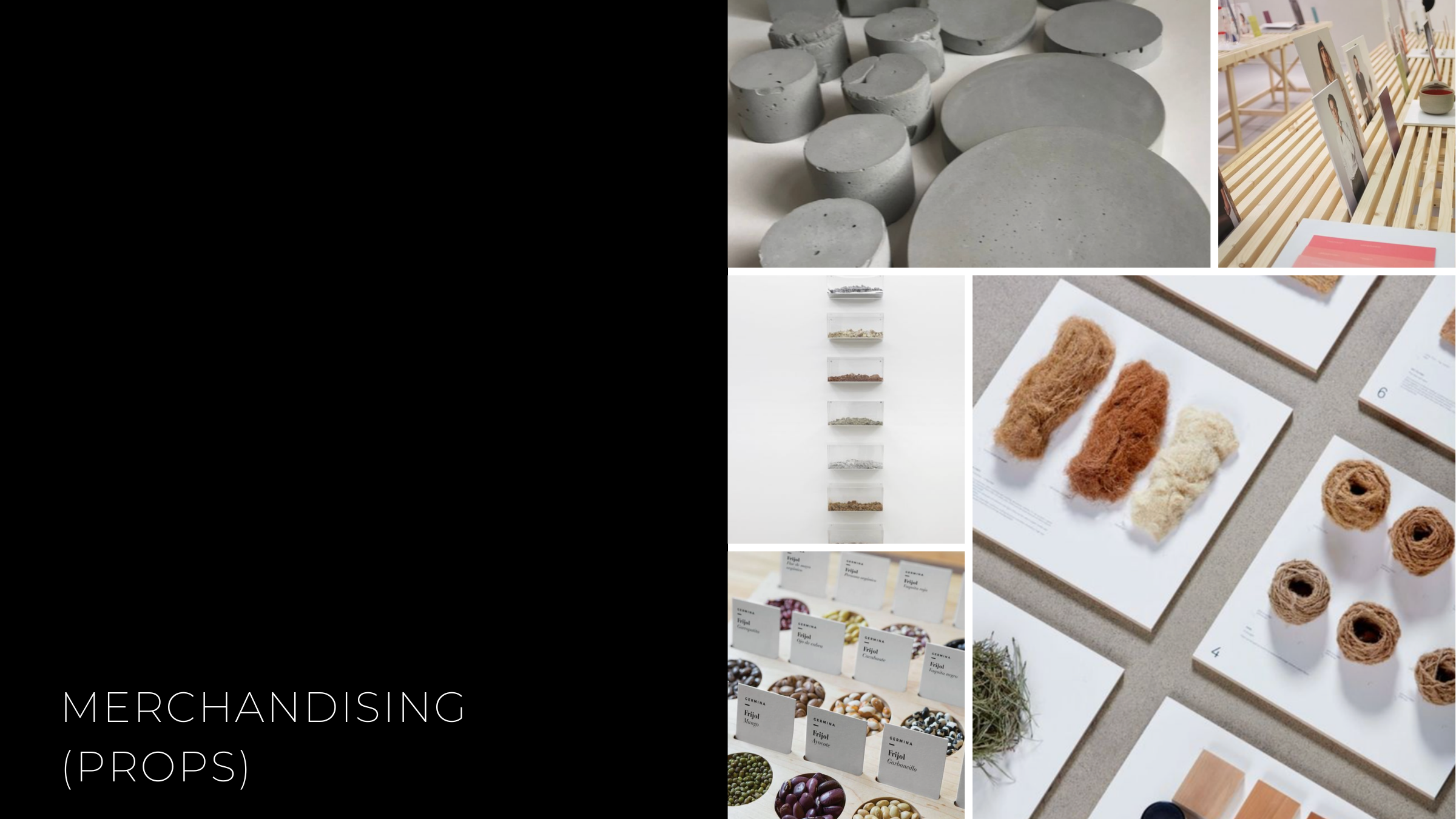
Bird & Arrow became a fully realized brand — from mark to motion to a 34-page brand book. The identity gave Peyote Bird a contemporary counterpart that speaks to a new audience while honoring the craftsmanship the studio is built on.
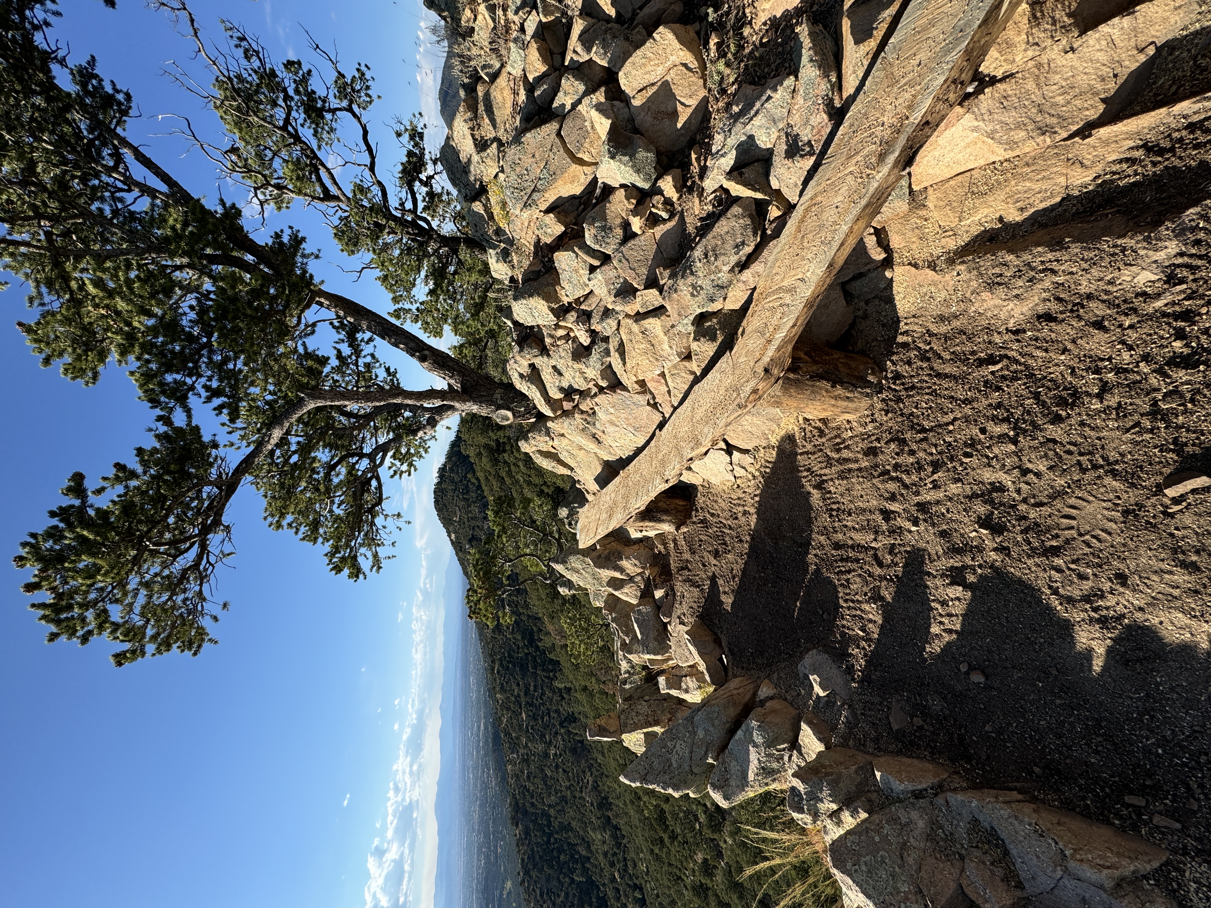
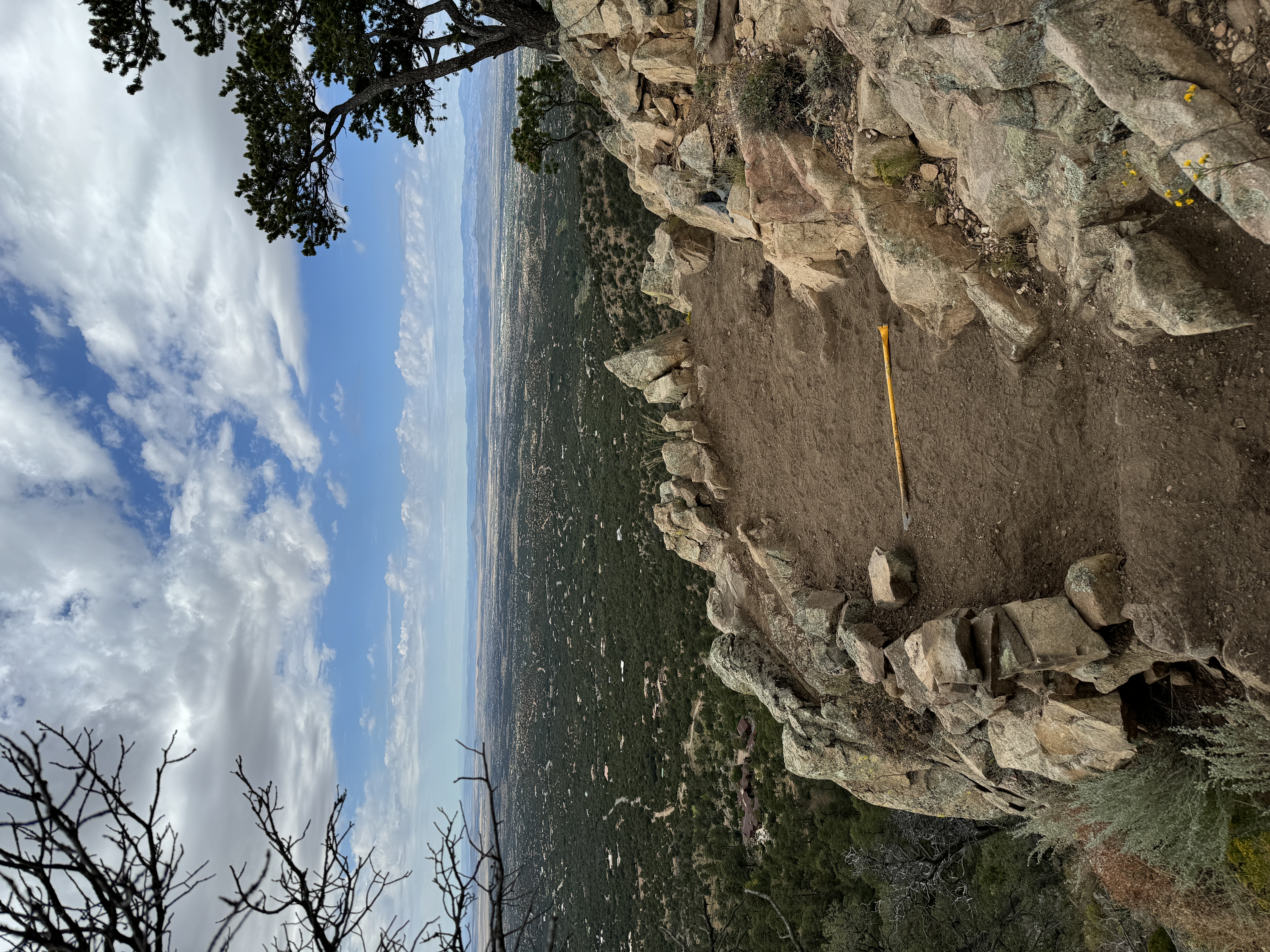
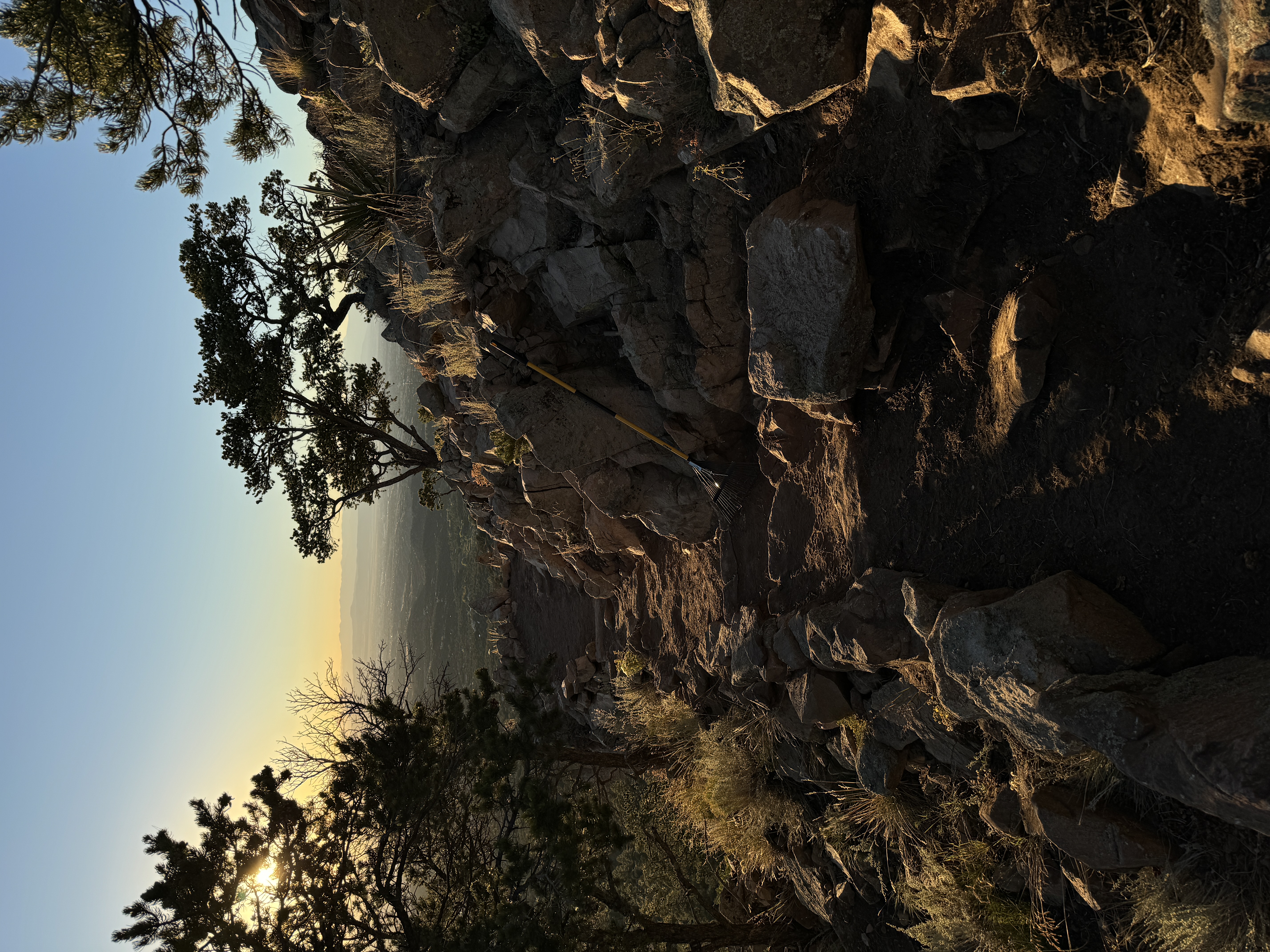
A hand-built dry-stacked stone structure on a mountain ridge outside Santa Fe — raw materials, simple tools, and a long view.
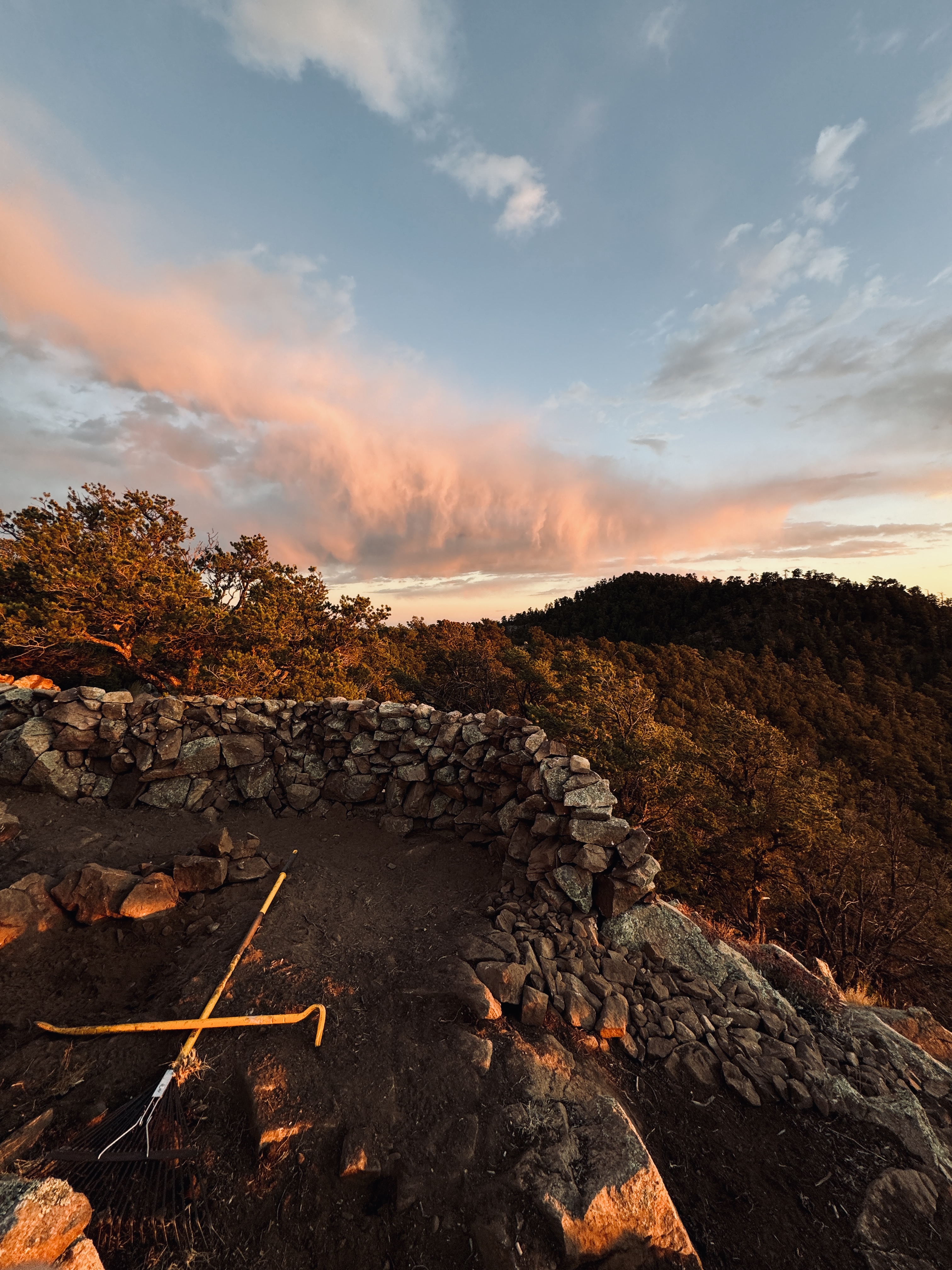
A ridgeline at 8,000 feet with a 360-degree view of the Sangre de Cristos and the Rio Grande valley. The project was simple in concept — build a dry-stacked stone wind shelter using only the material already provided by the land itself. No mortar, no concrete, no power tools. Just a pickaxe, gloves, and the rocks underfoot. Inspired heavily by the land art of Andy Goldsworthy, this project was the first in what would become a series of rock walls across the property.
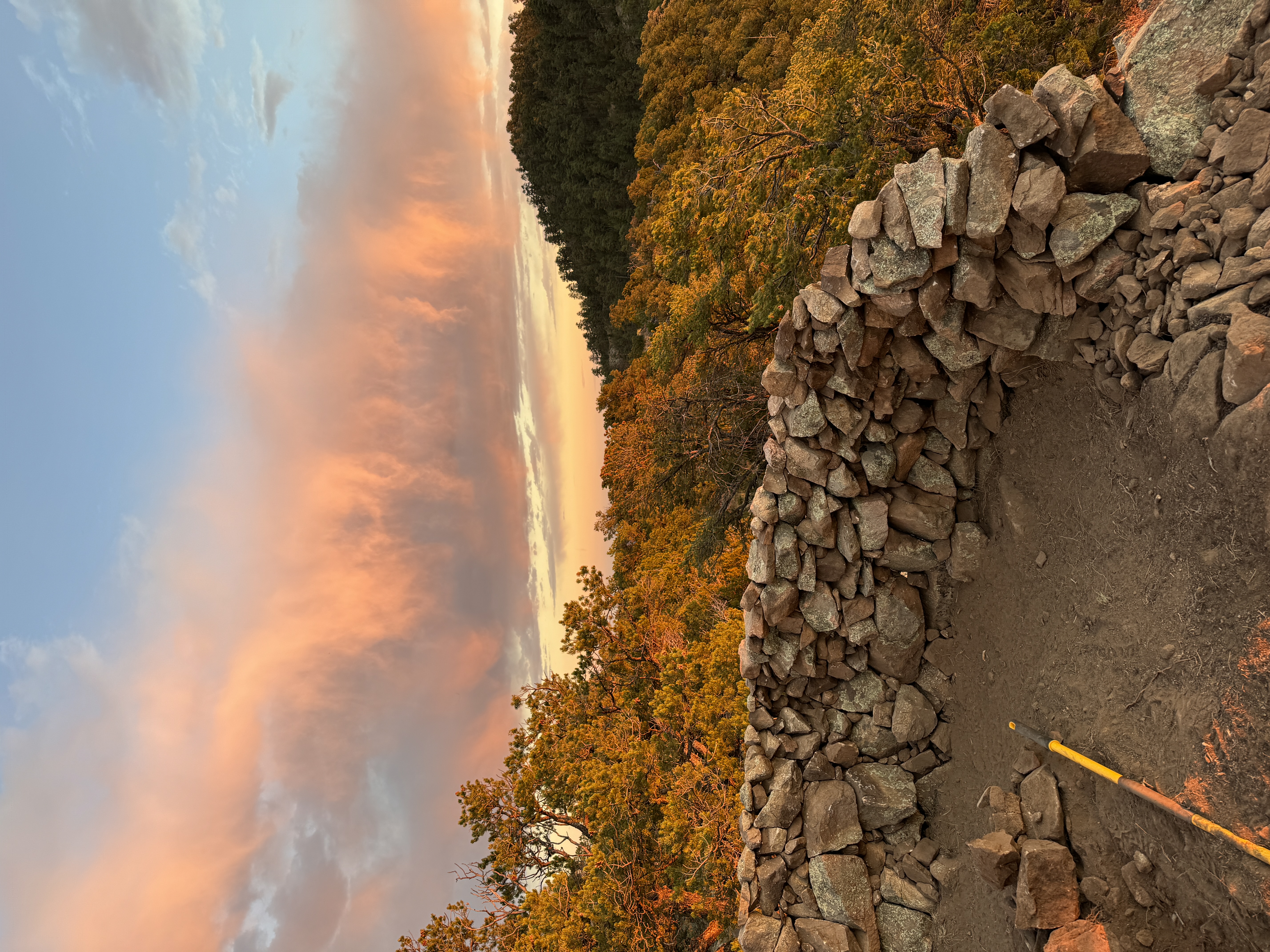
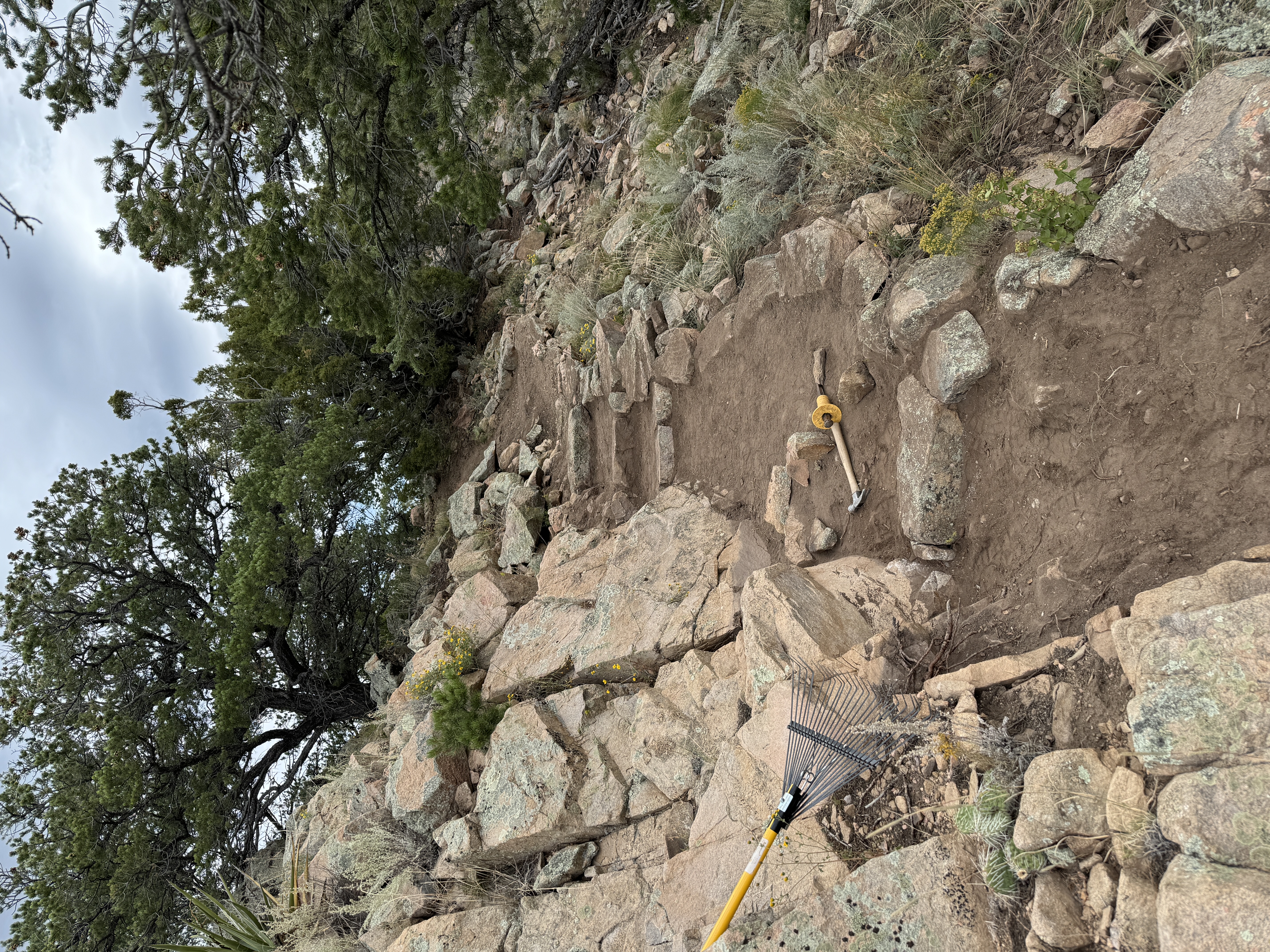
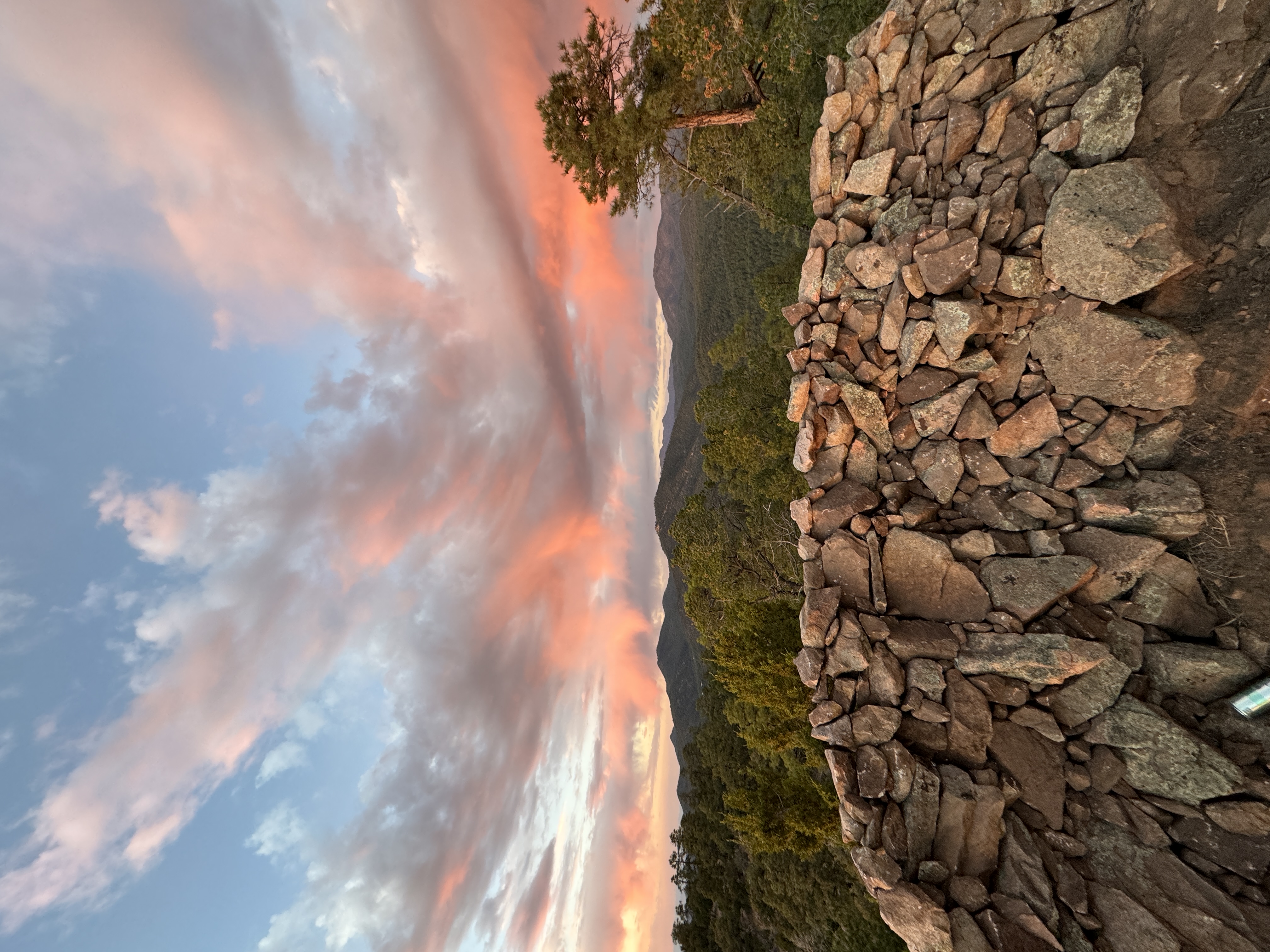
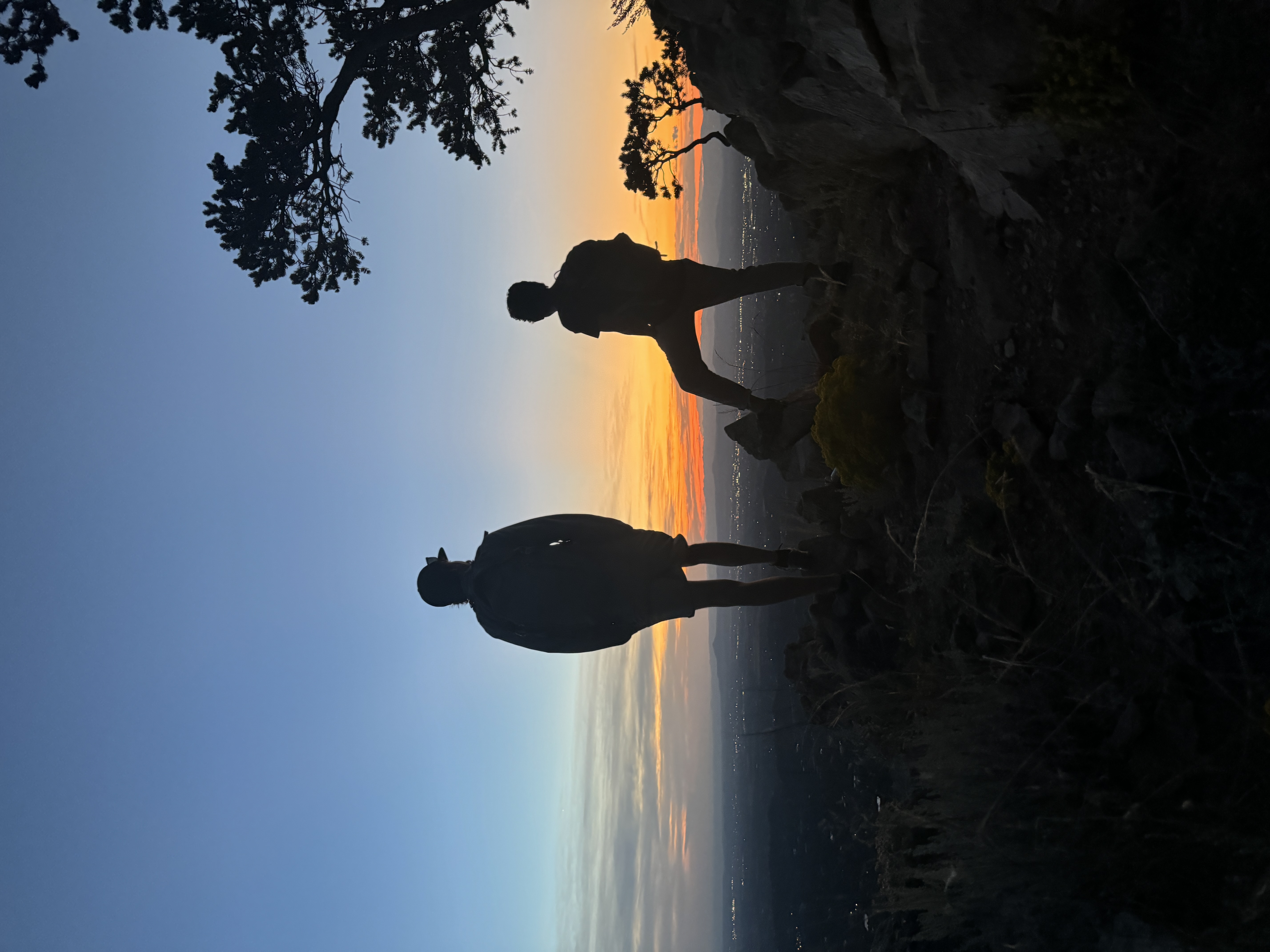
Jericho Ridge was my first attempt to break away from the type of work I had been confined to for a decade or more. Sitting at a desk inside and moving things across a screen day in day out. With this project, I was now just hauling rocks up and down a hill and stacking them up one at a time. It ended up being one of my favorite projects to this day: quiet work in nature, building something physical with my hands, and entering the flow state that is so hard to truly sink into these days.
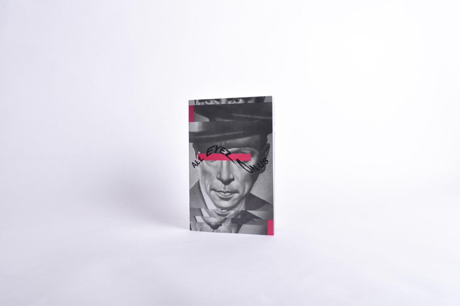
Poster design for Zozobra: 100 Years of Fire and Redemption — a documentary celebrating a century of Santa Fe's most iconic tradition.
Every September, Santa Fe burns a 50-foot marionette called Zozobra — a tradition started by artist Will Shuster in 1924. For the centennial, Hutton Films produced a short documentary and needed a poster that captured the weight and weirdness of a hundred years of burning gloom. The ask was a single image that could work on screen, in print, and on the marquee at Violet Crown Cinema for the premiere.
The final black-and-white composition balanced archival tone with contemporary clarity. Displayed across Santa Fe for the premiere, the poster functioned as both promotional material and commemorative artifact.
Full restoration — engine, suspension, bodywork, seats, stereo, wheels, wiring, interior.
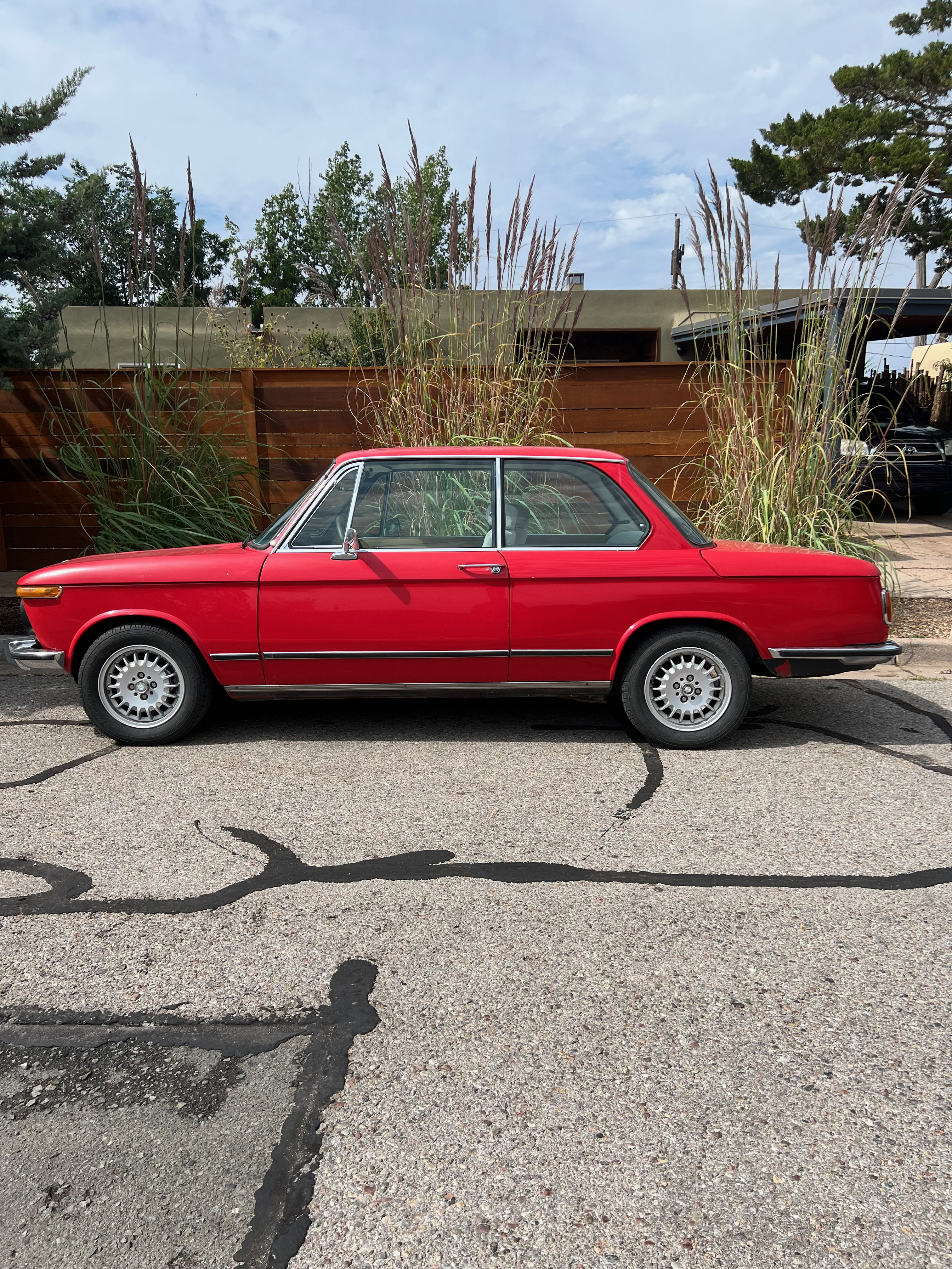
A 1974 BMW 2002tii — mechanically tired, electrically unreliable, and sunfaded after fifty years of wear and tear. The end goal was to bring the car back to life as a daily driver: rebuild the engine, upgrade the suspension, and restore the finer details back to their former glory.
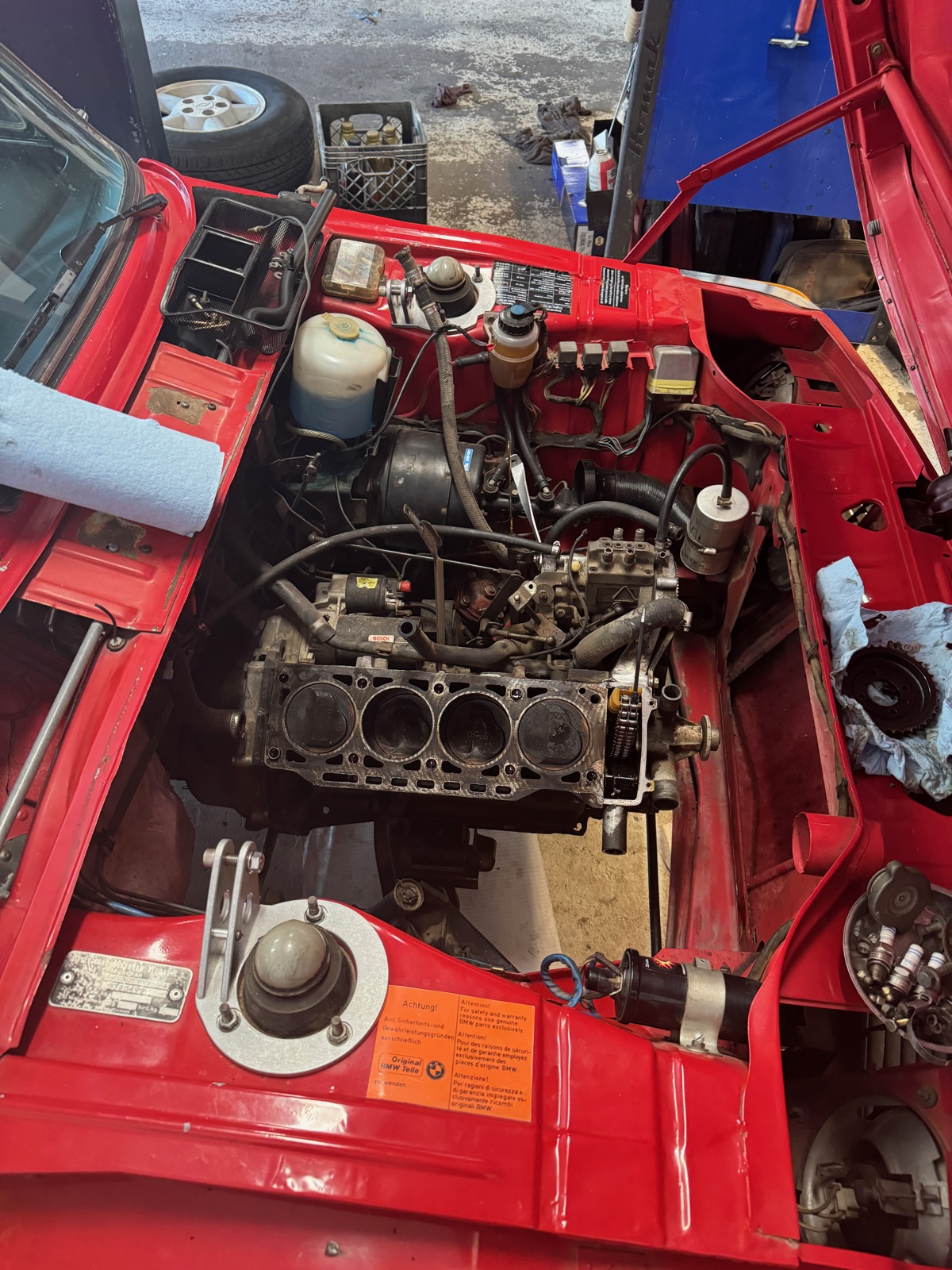
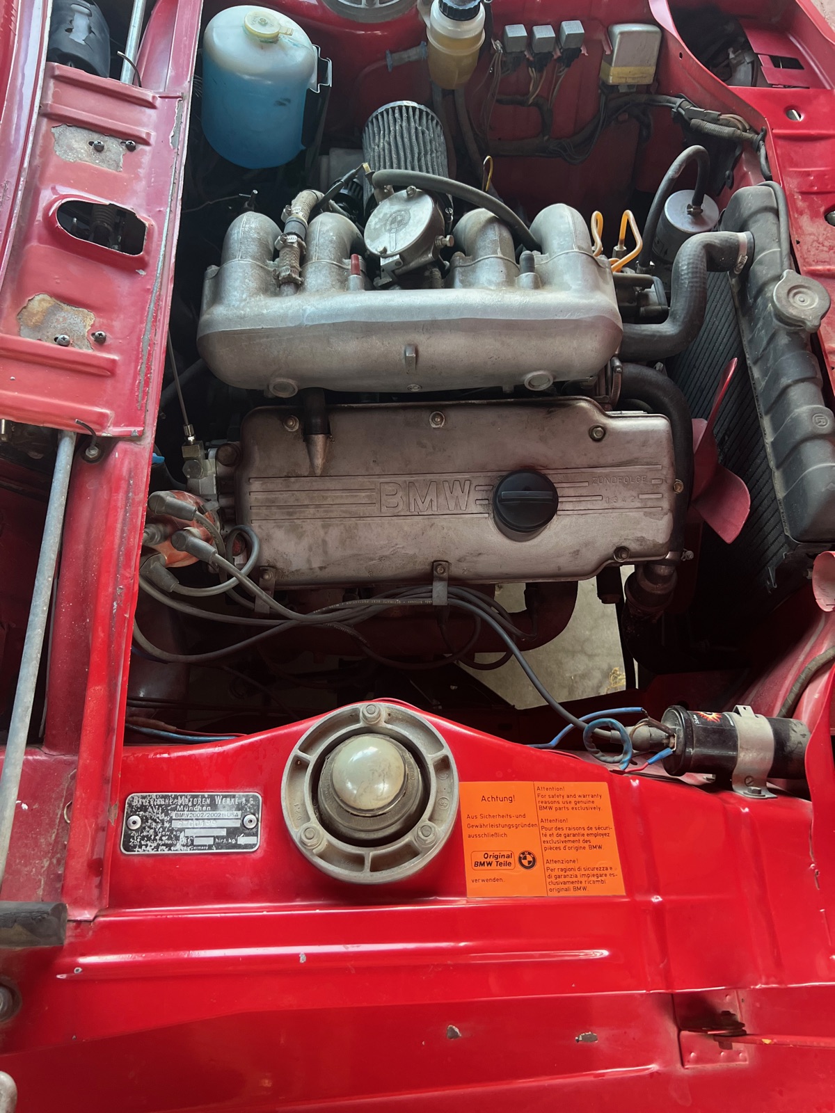
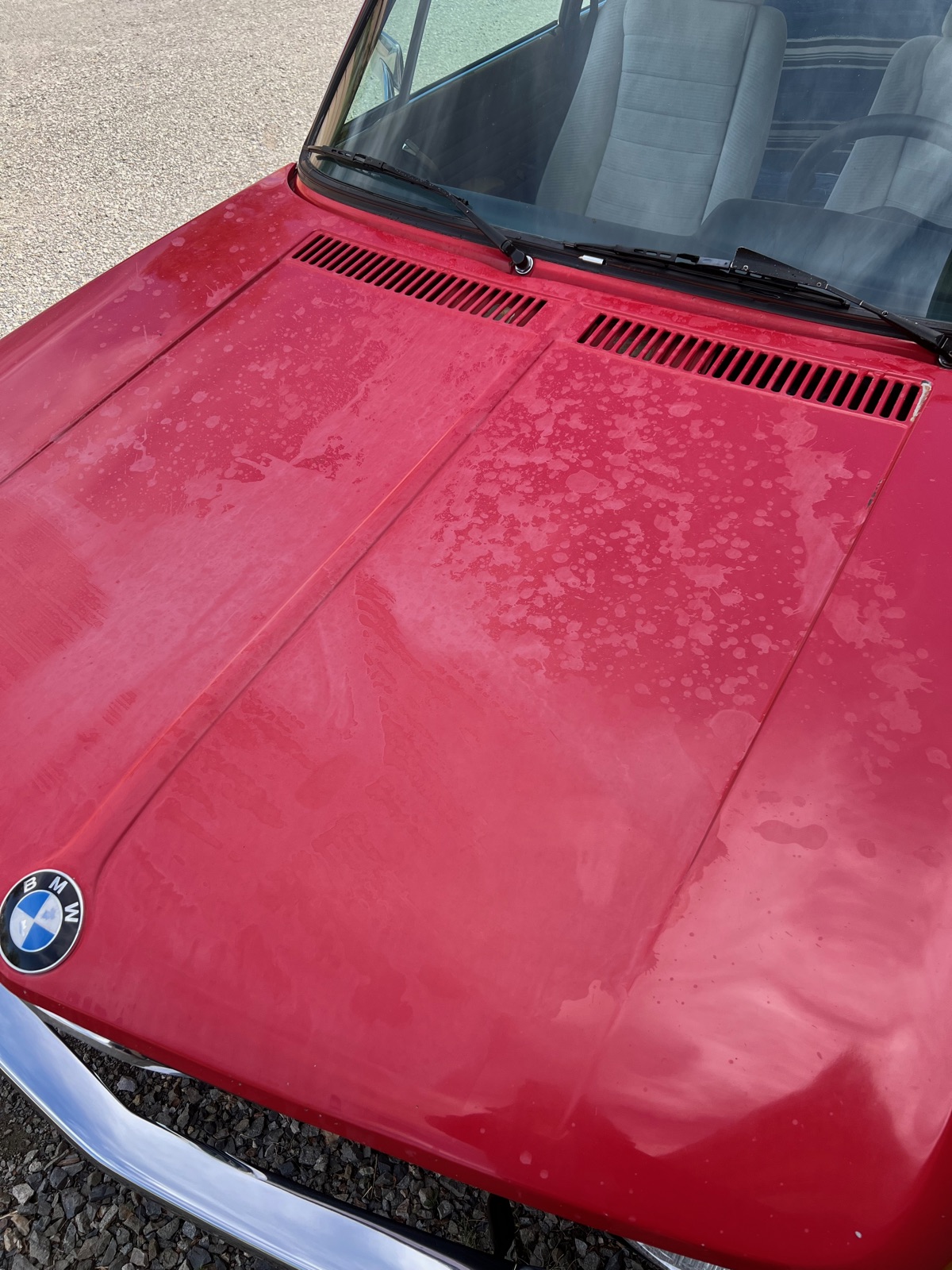
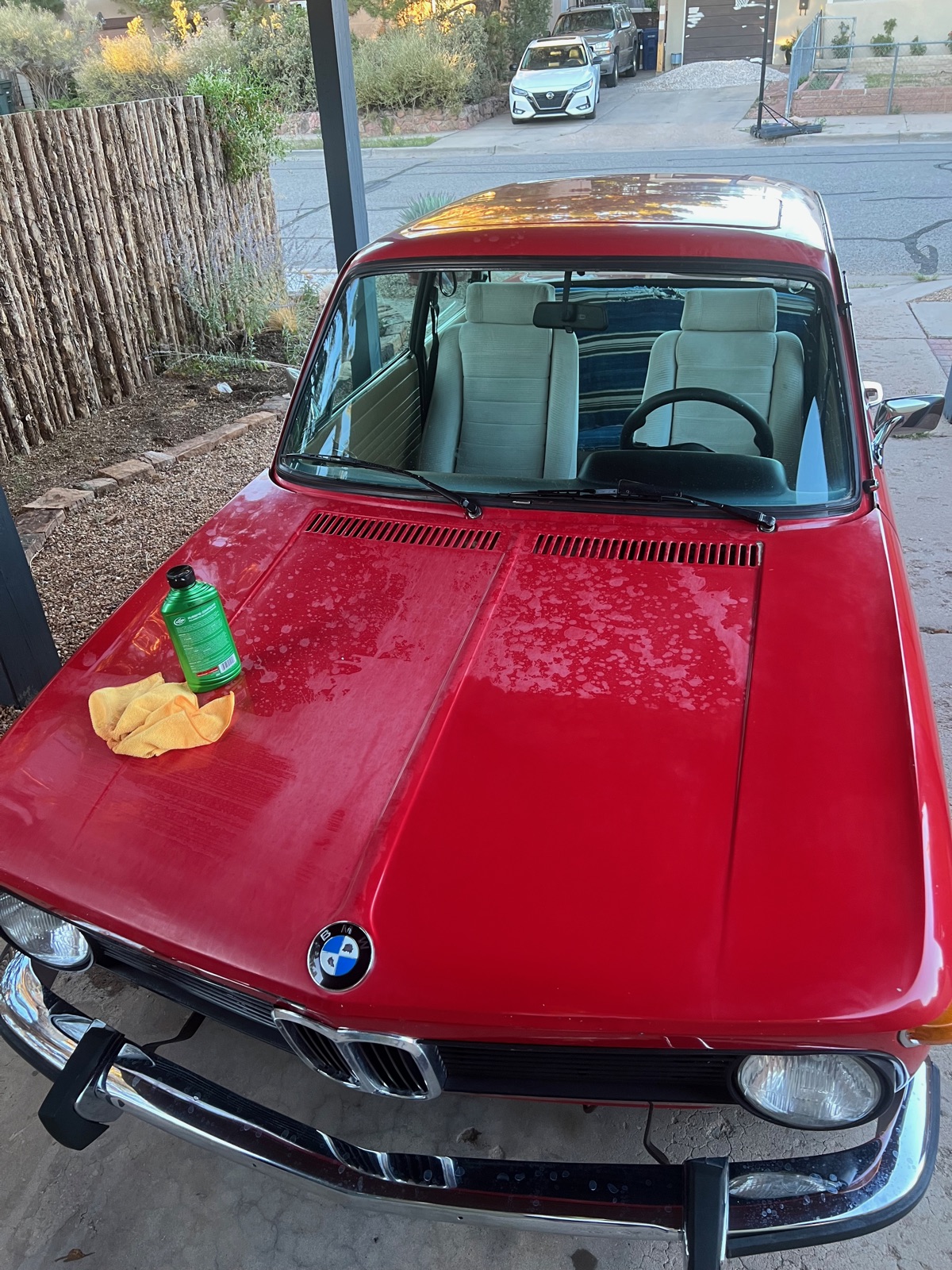
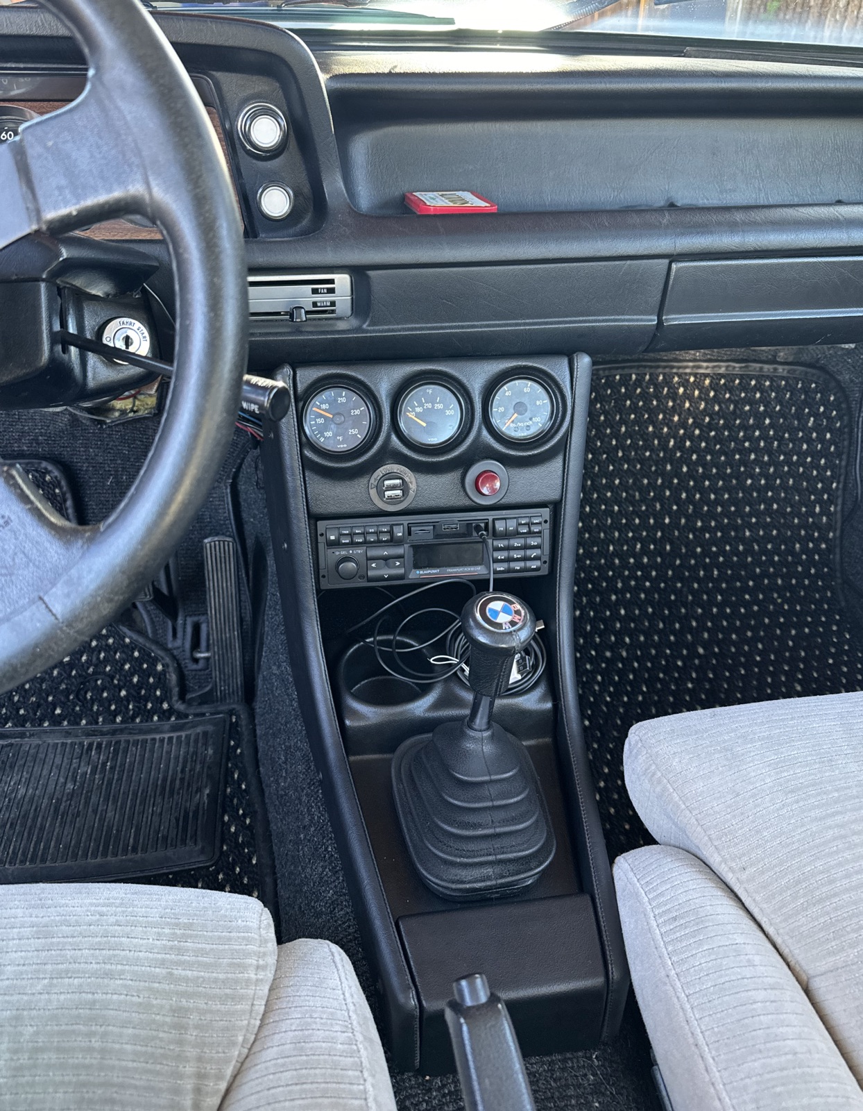
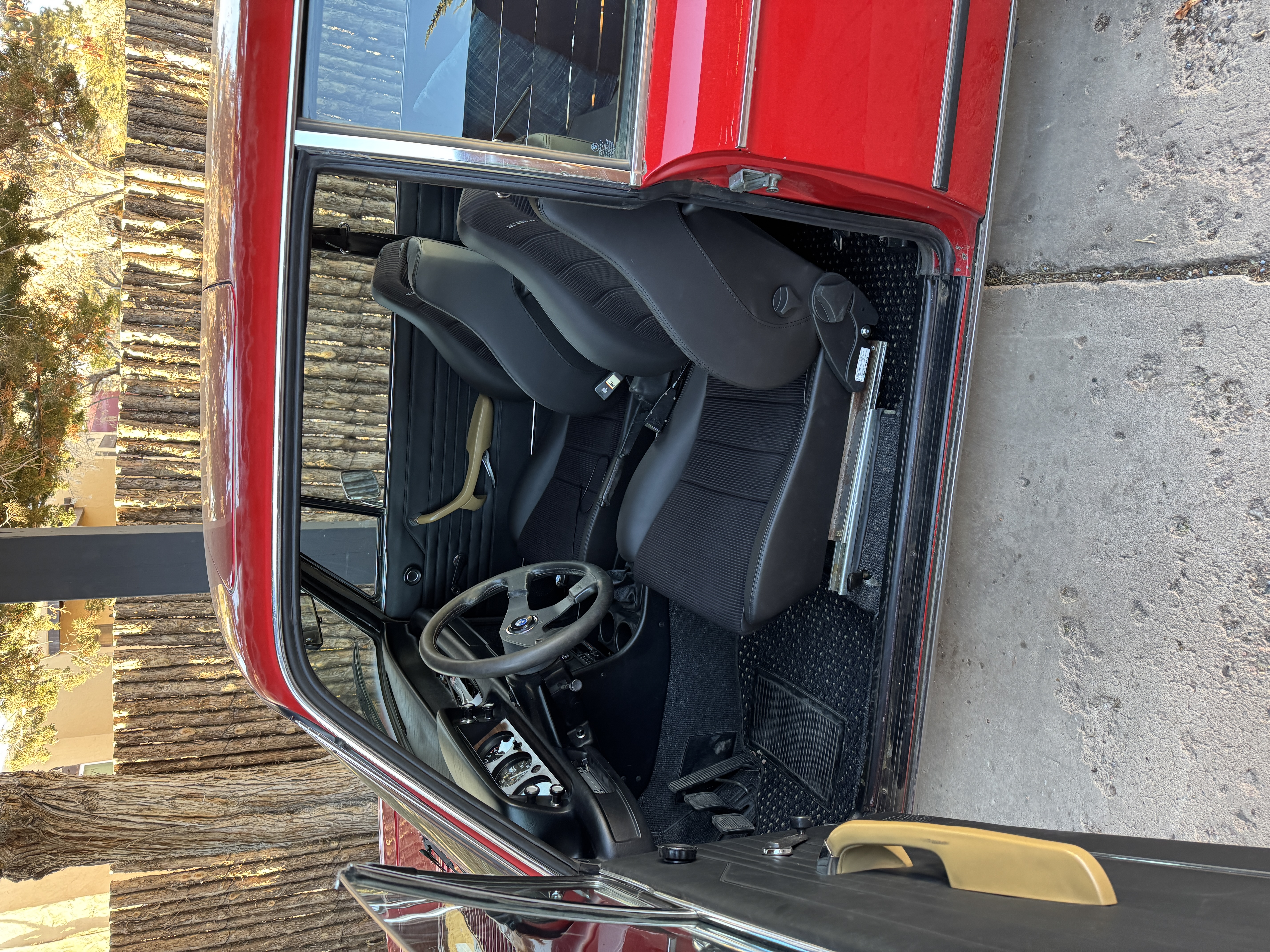
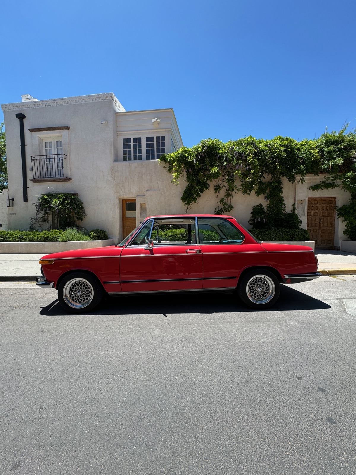
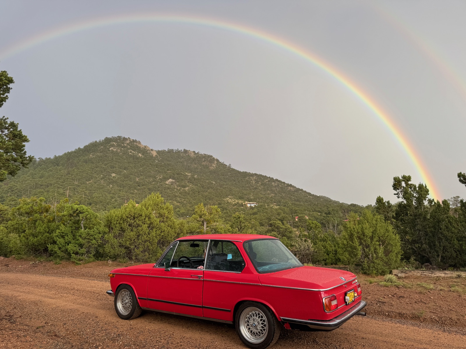
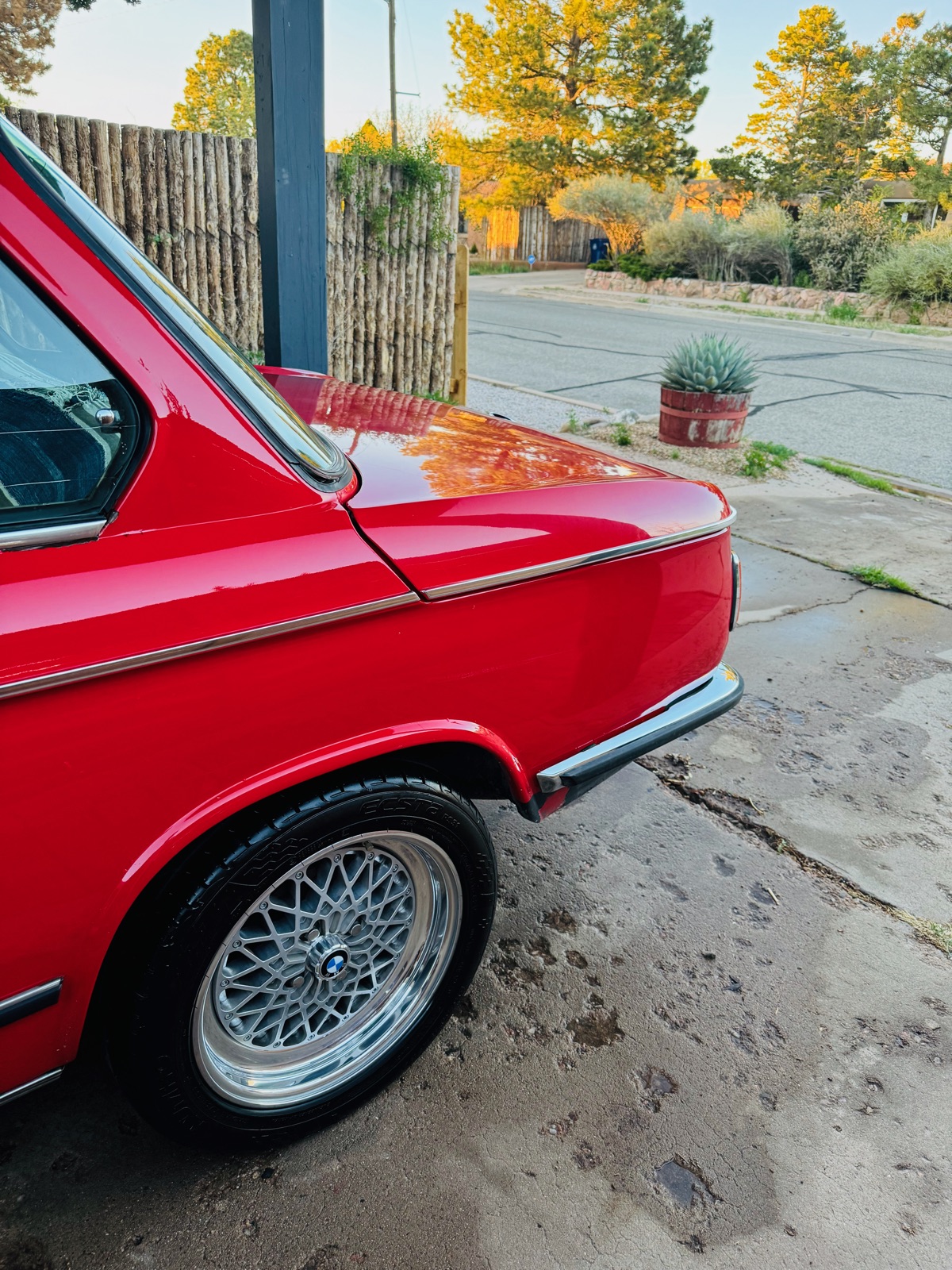
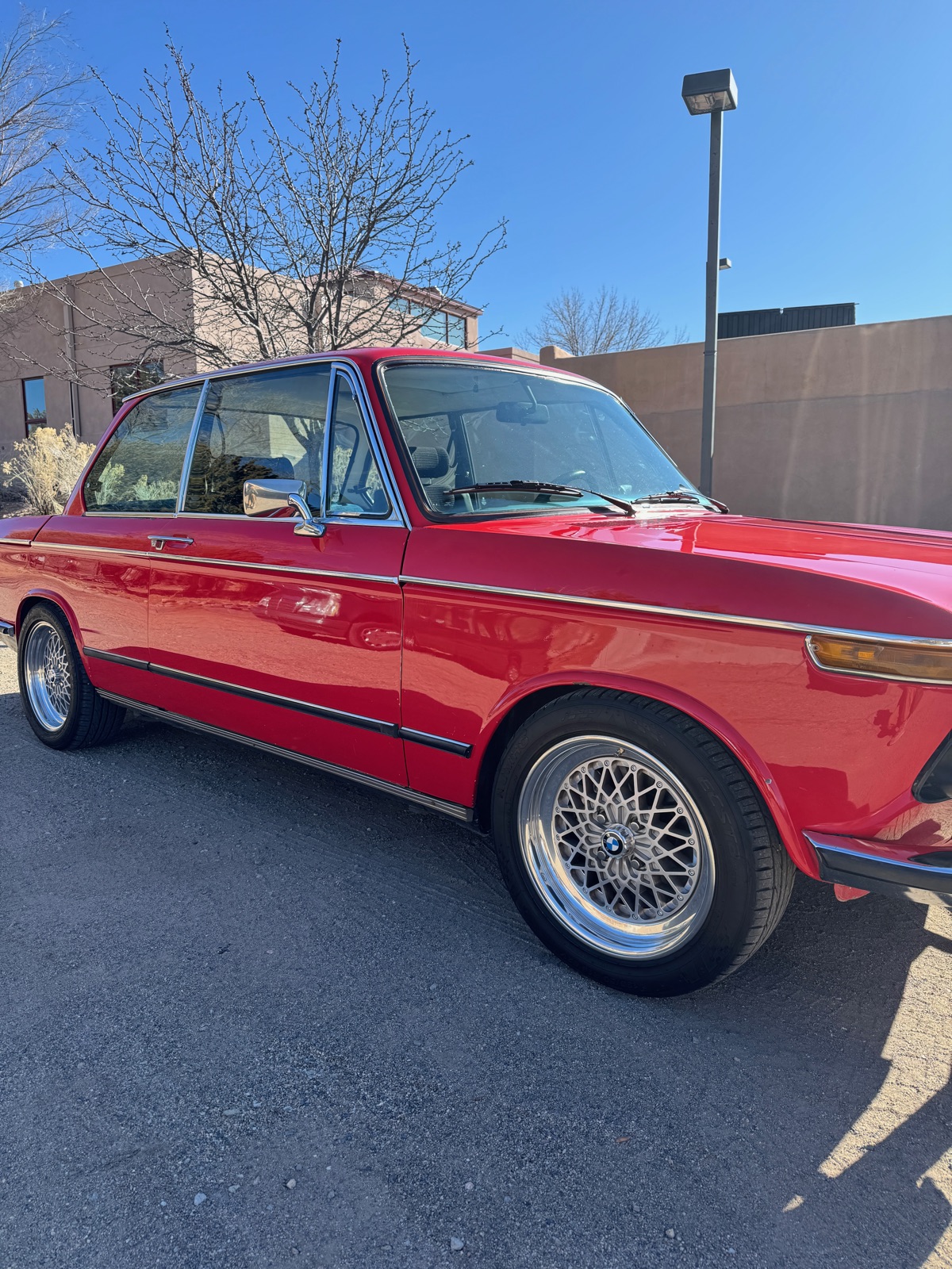
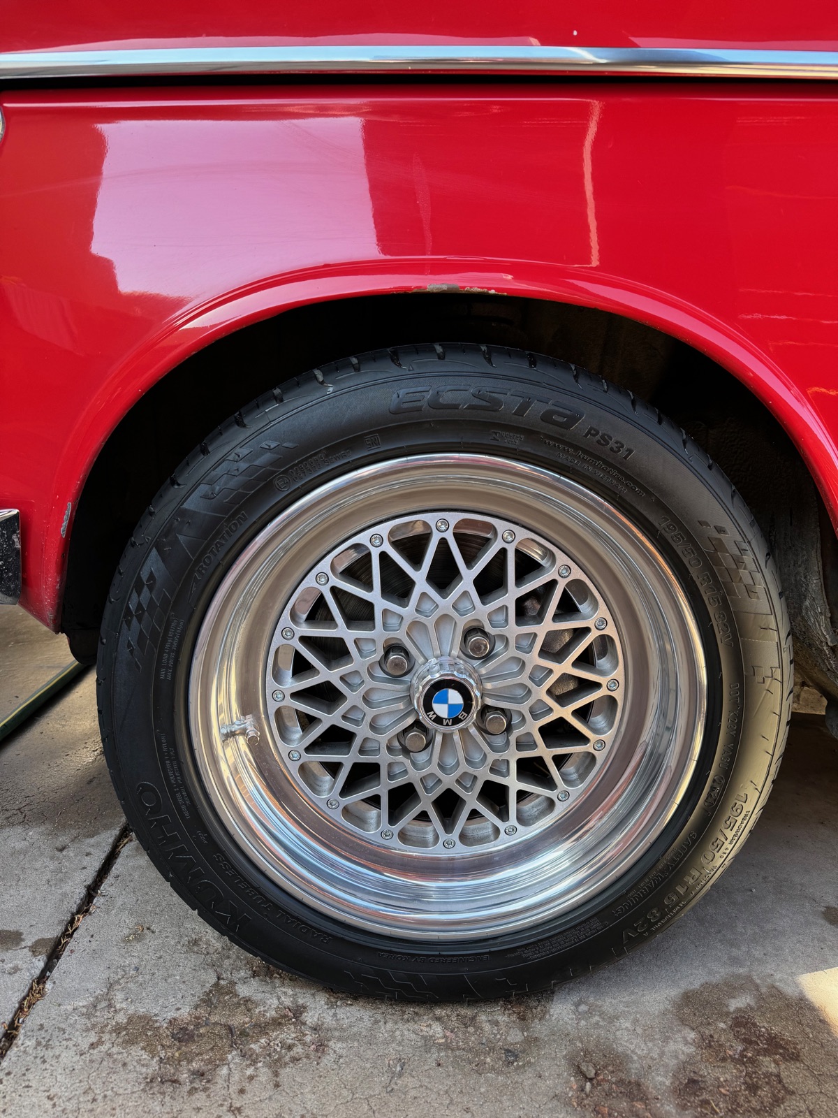
This project was a collaboration between my father and me. Though painfully slow-moving, expensive, and frustrating at times, we both came out of the experience with a deeper appreciation for the car, inside and out. It is safe to say the car will be in the family for years to come.
A short documentary following turquoise miner Jess Robbins into the Nevada desert — produced for Peyote Bird and the Sundance Catalog.
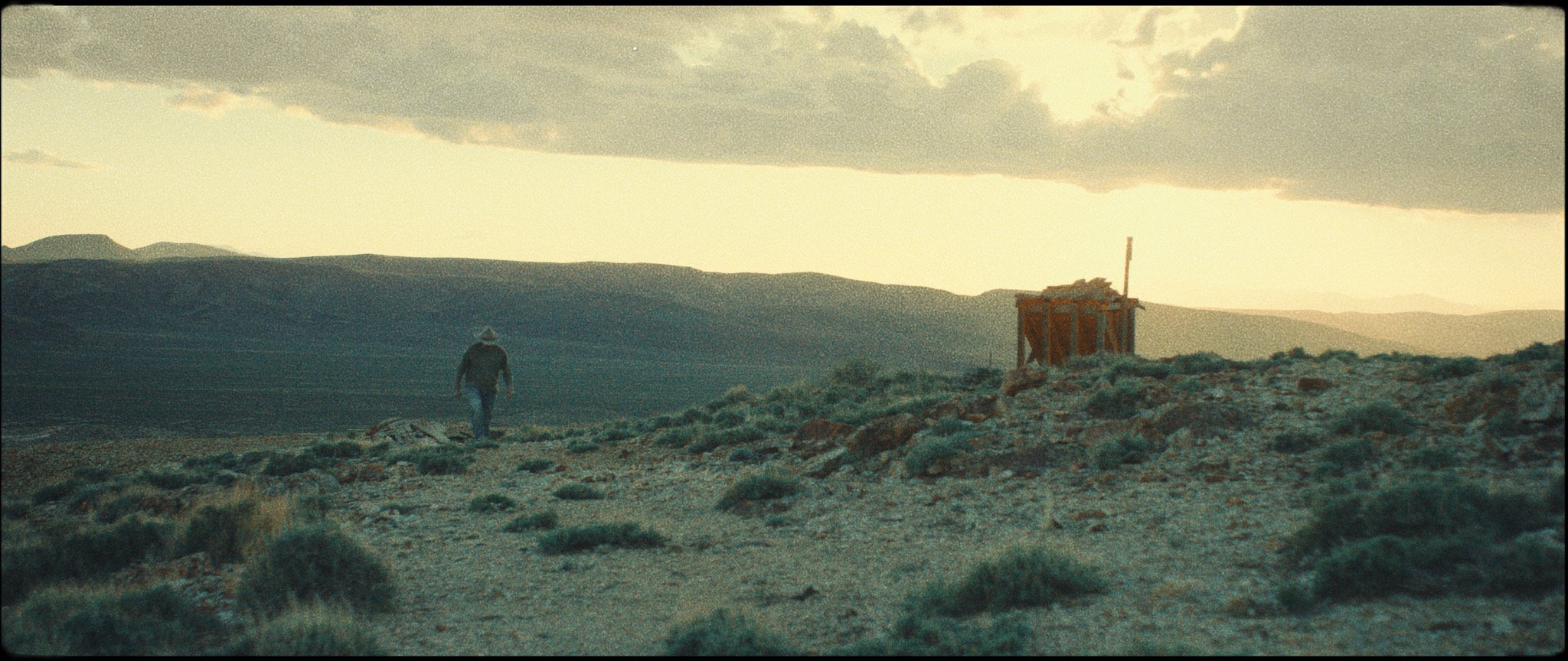
Jess Robbins mines turquoise by hand from his claim deep in the desert outside Tonopah, Nevada. The raw stone goes into ingot-based jewelry he sells all over the world. Peyote Bird and the Sundance Catalog wanted a short documentary that told his story — the land, the process, and the person behind the material. I produced the film over a three-day shoot at the claim. Photography by Leroy Graffe.
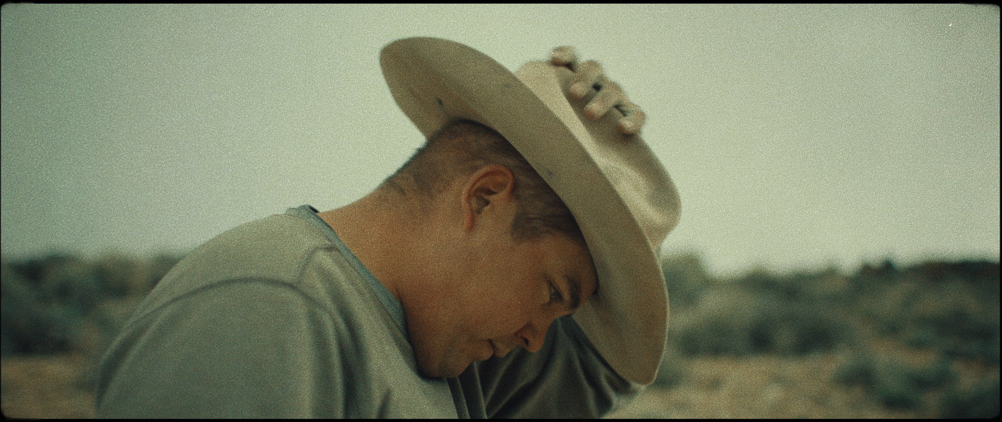
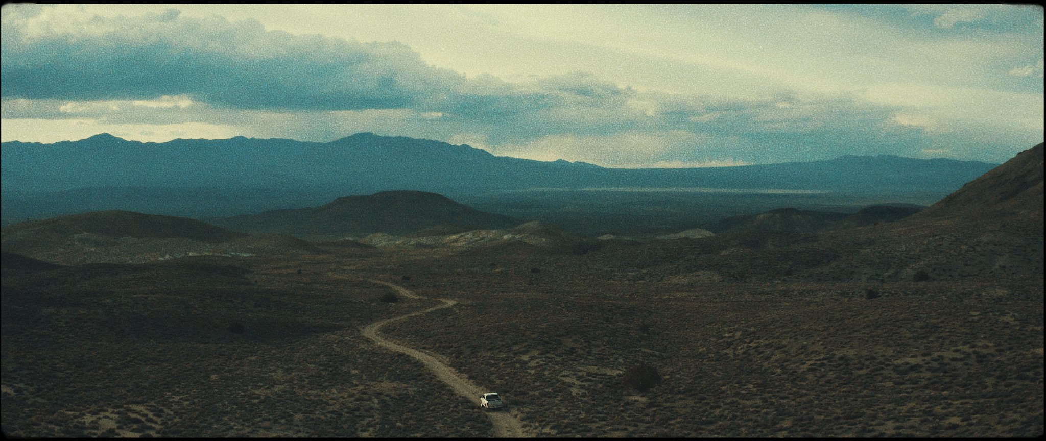
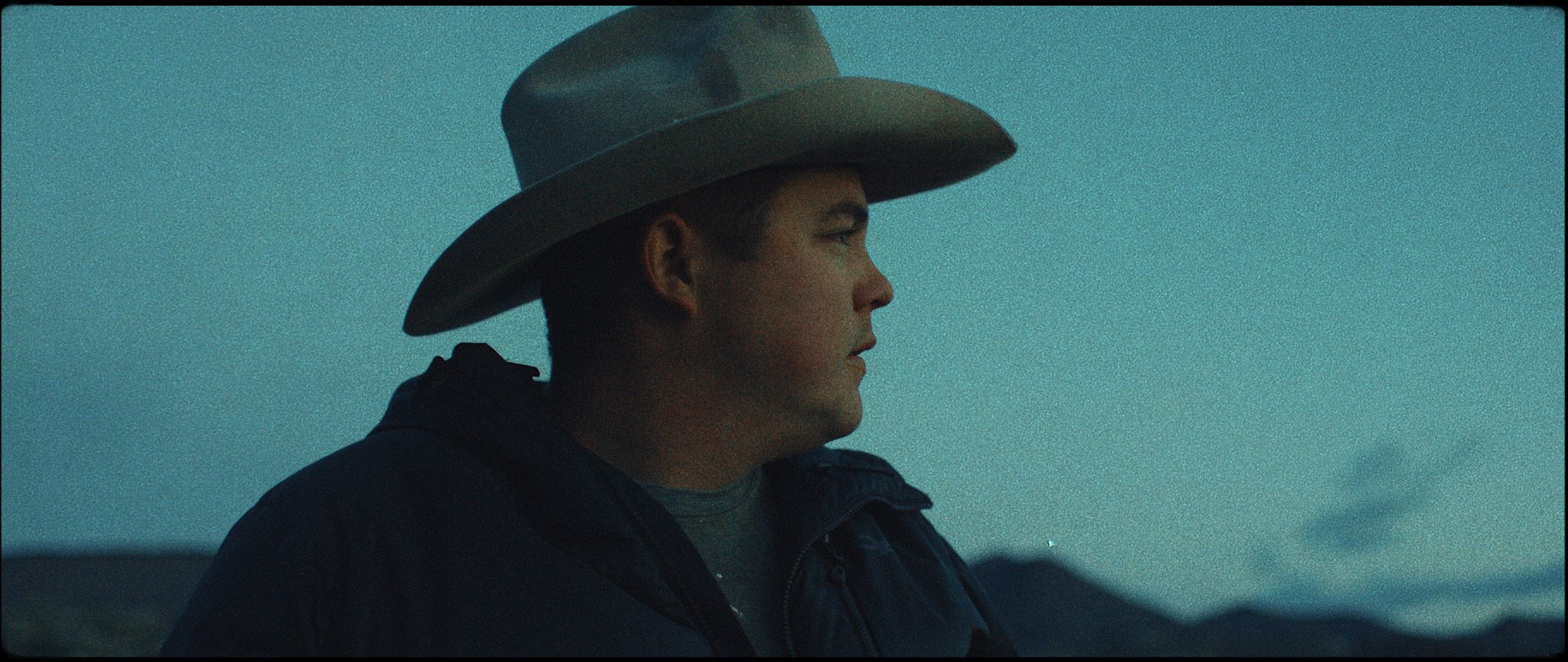
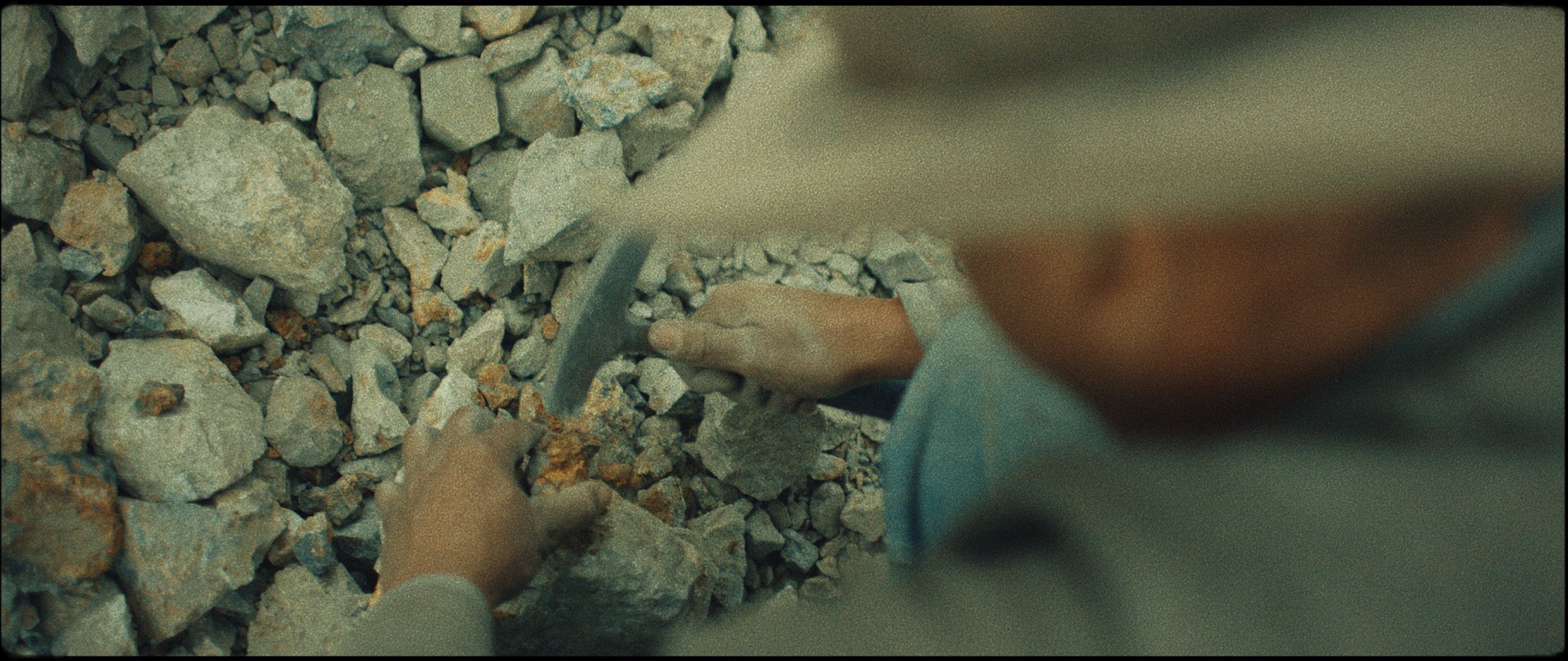
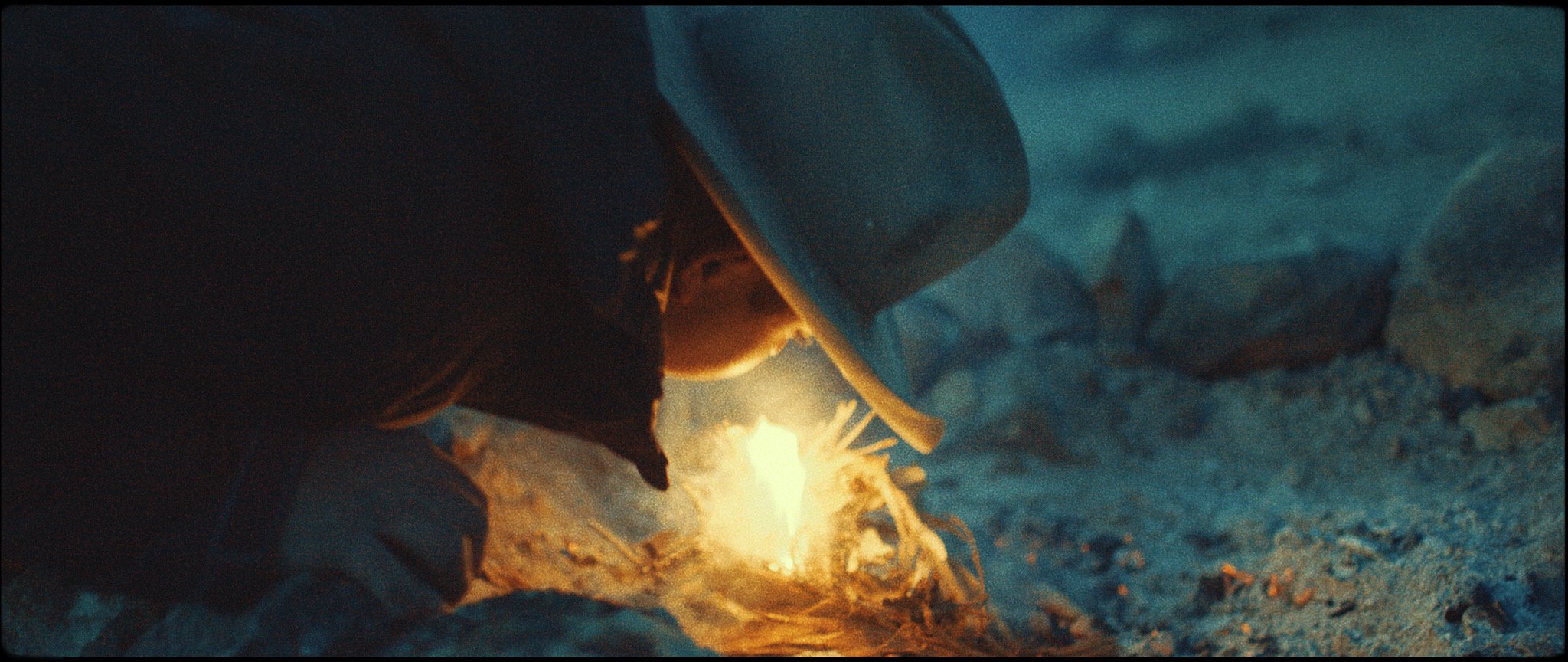
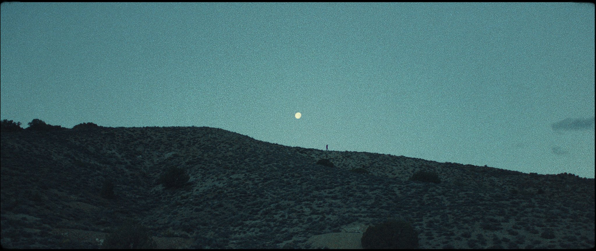
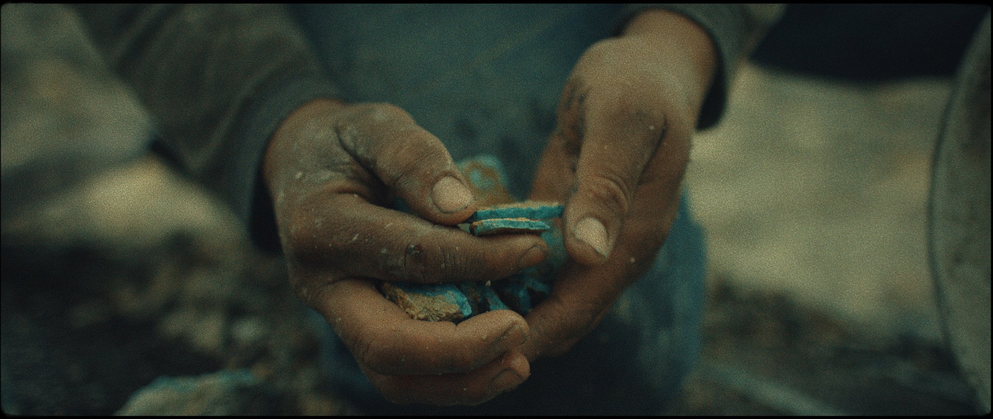
Three days in the middle of nowhere with a small crew and a guy who's been pulling stone out of the ground for decades. No studio, no controlled environment — just desert, dust, and the real thing. The film captured something you can't fake: the quiet obsession of a person who knows exactly what they're looking for and where to find it. One of the most memorable shoots I've been part of.
A hand-made, mixed-media zine exploring surveillance, privacy, and the architecture of observation — built from newspaper clippings, drawings, satellite imagery, redacted documents, vintage graph paper.
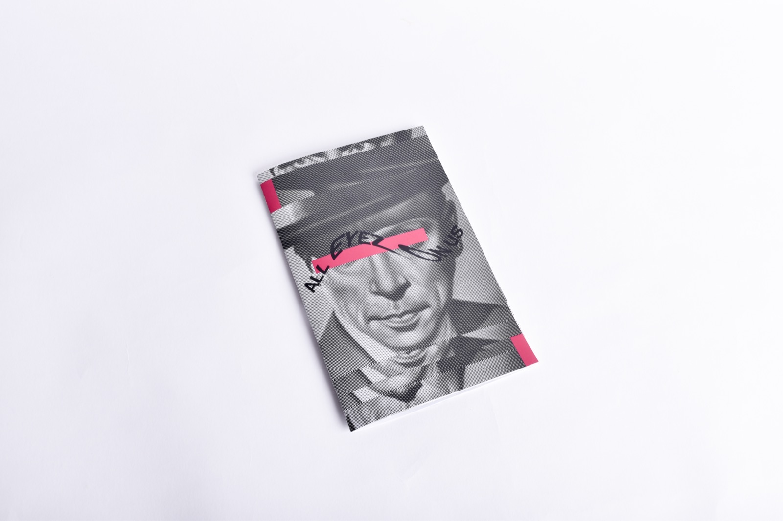
Create a self-published zine as a final project for a college design course. The result was a 13-page hand-assembled exploration of mass surveillance, data collection, and the feeling of being watched. Every page was built physically: cut, torn, taped, redacted, and scanned by hand.
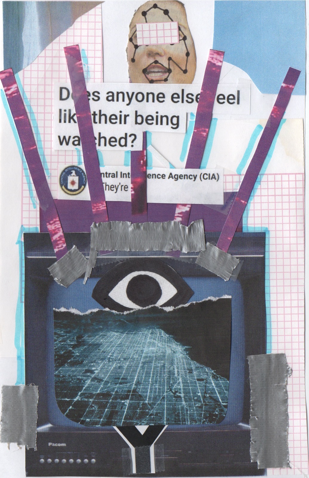
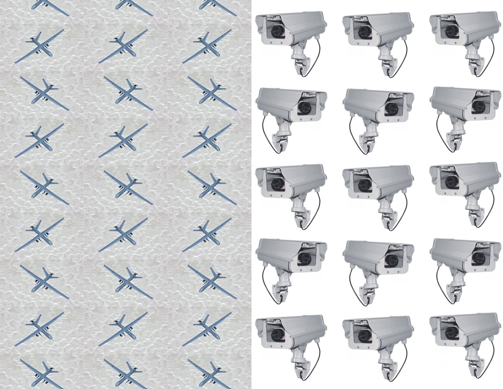
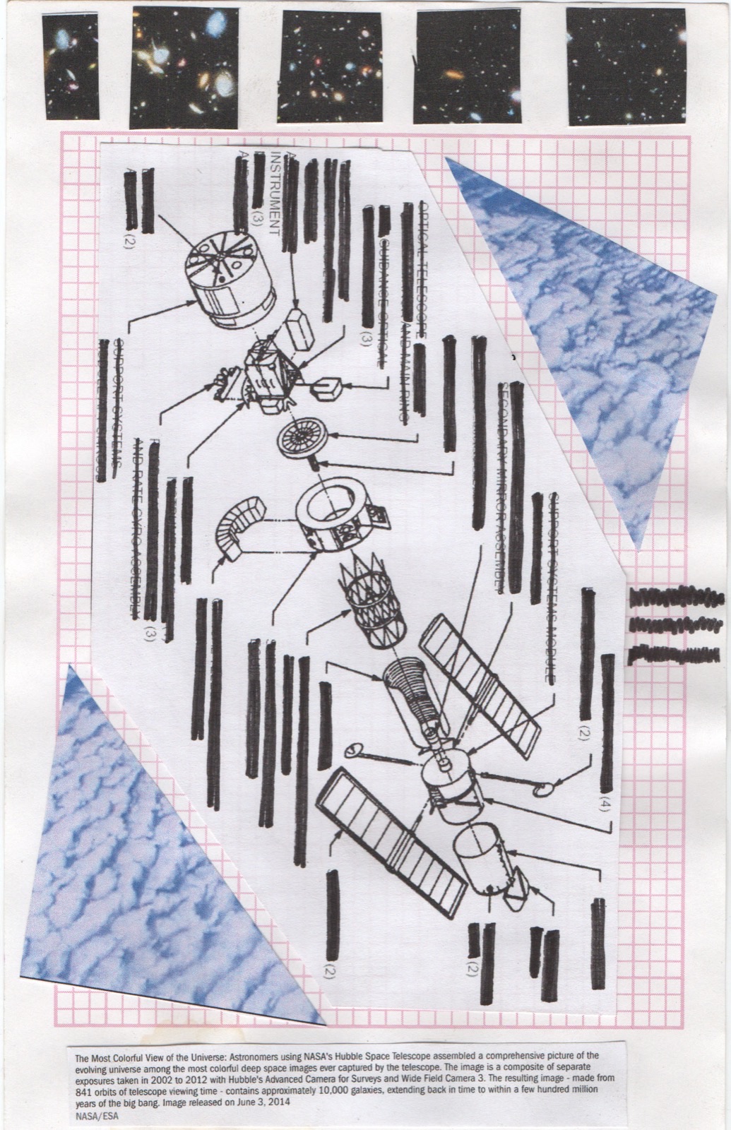
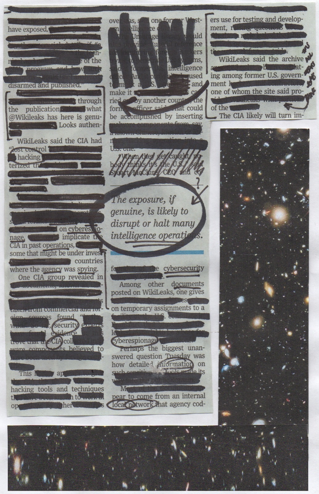
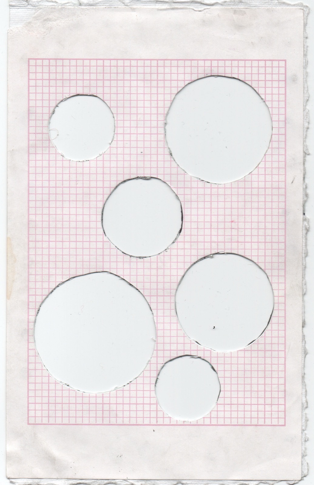
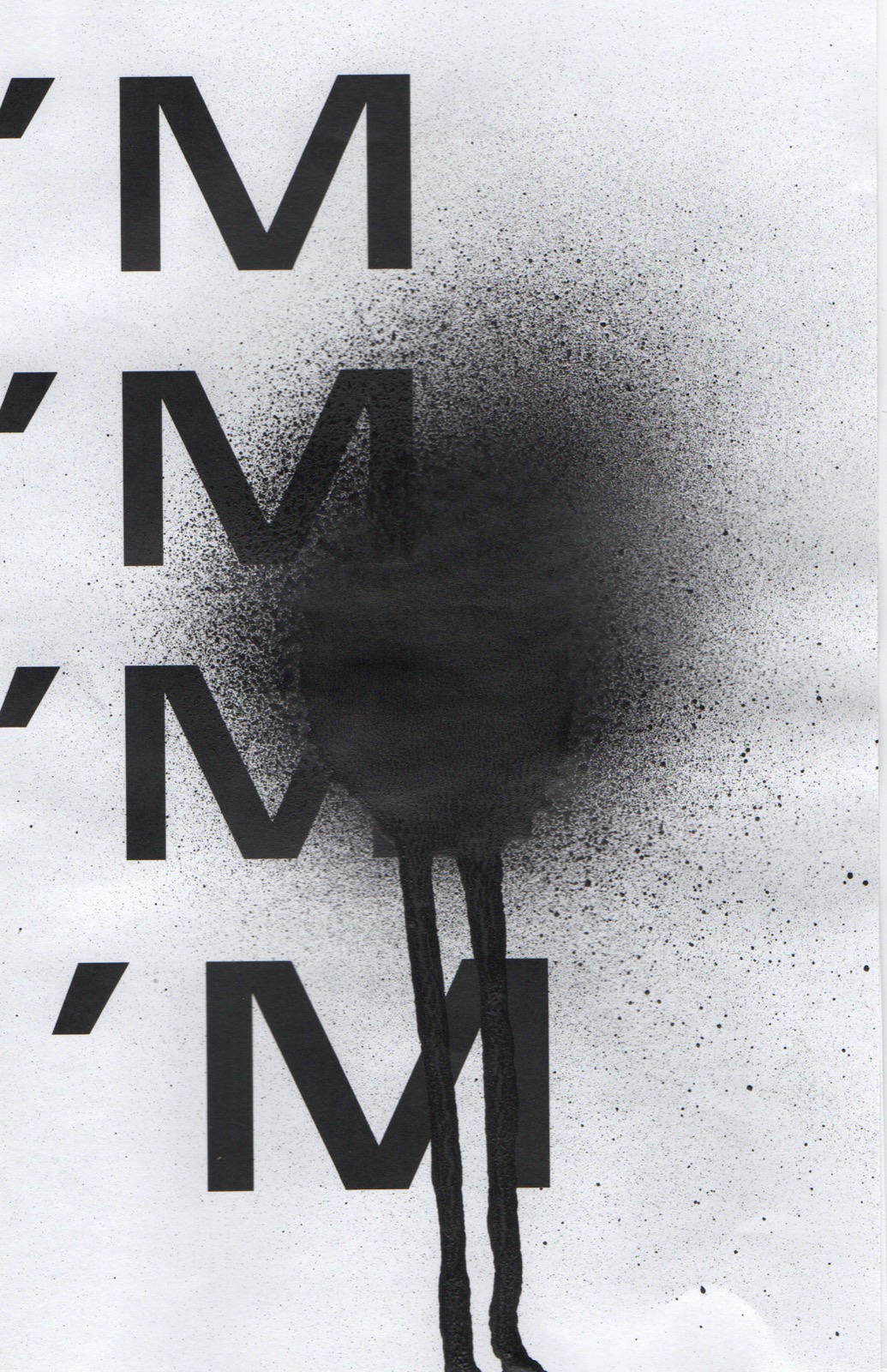
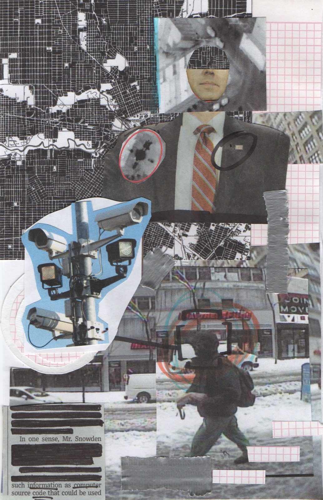
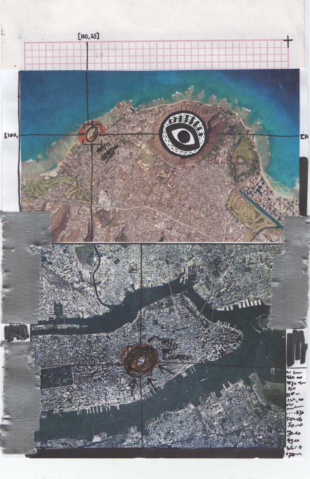
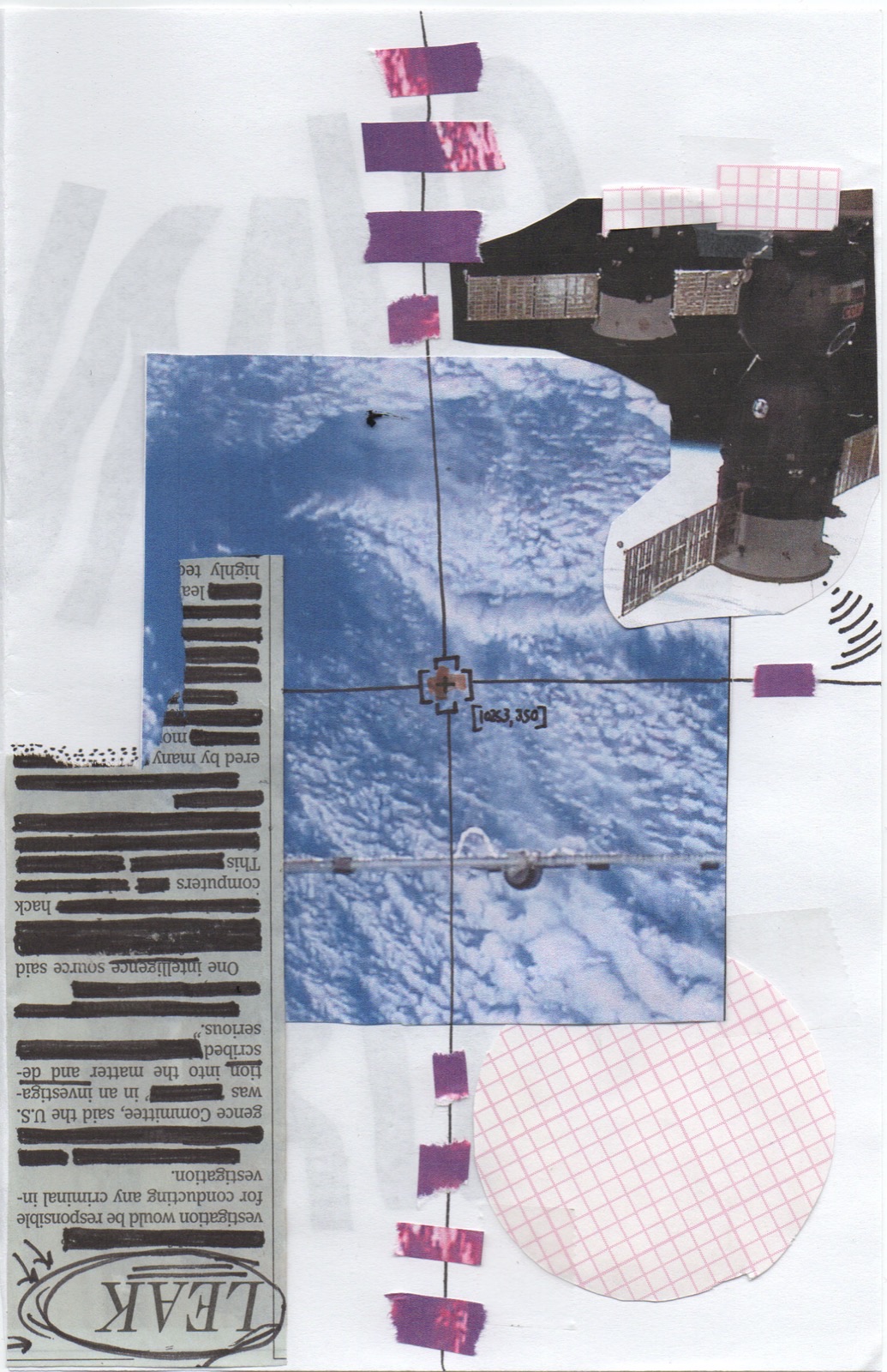
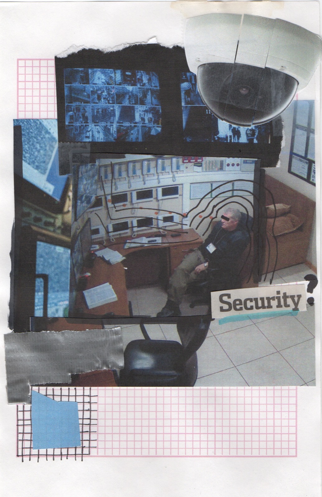
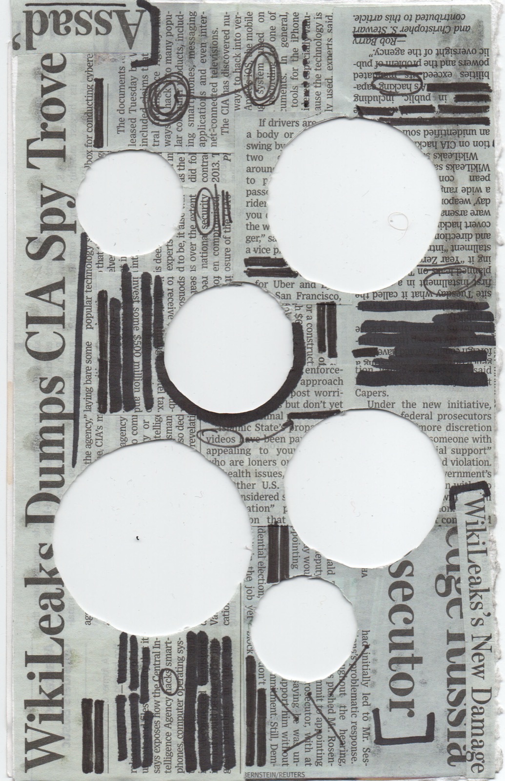
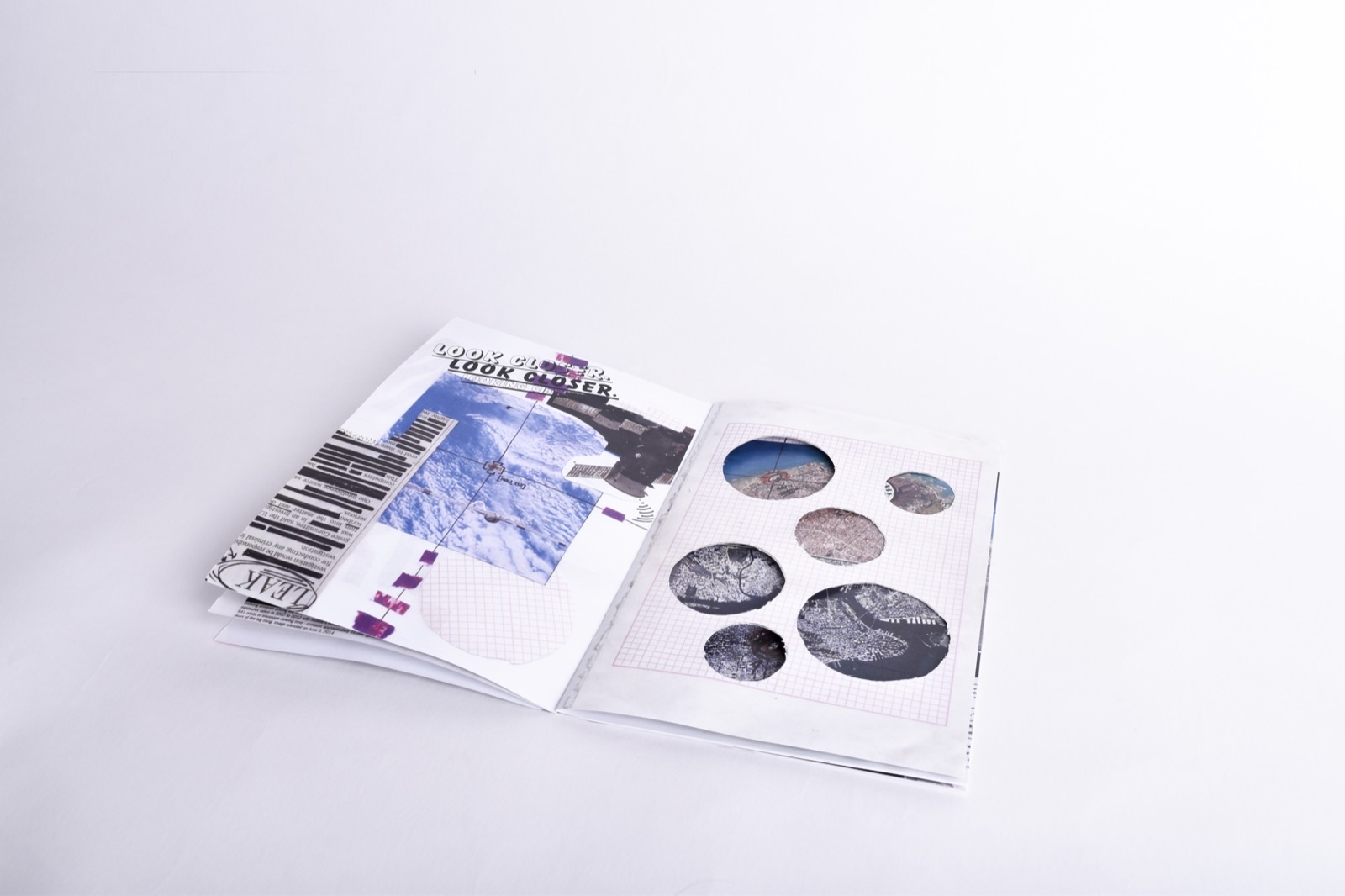
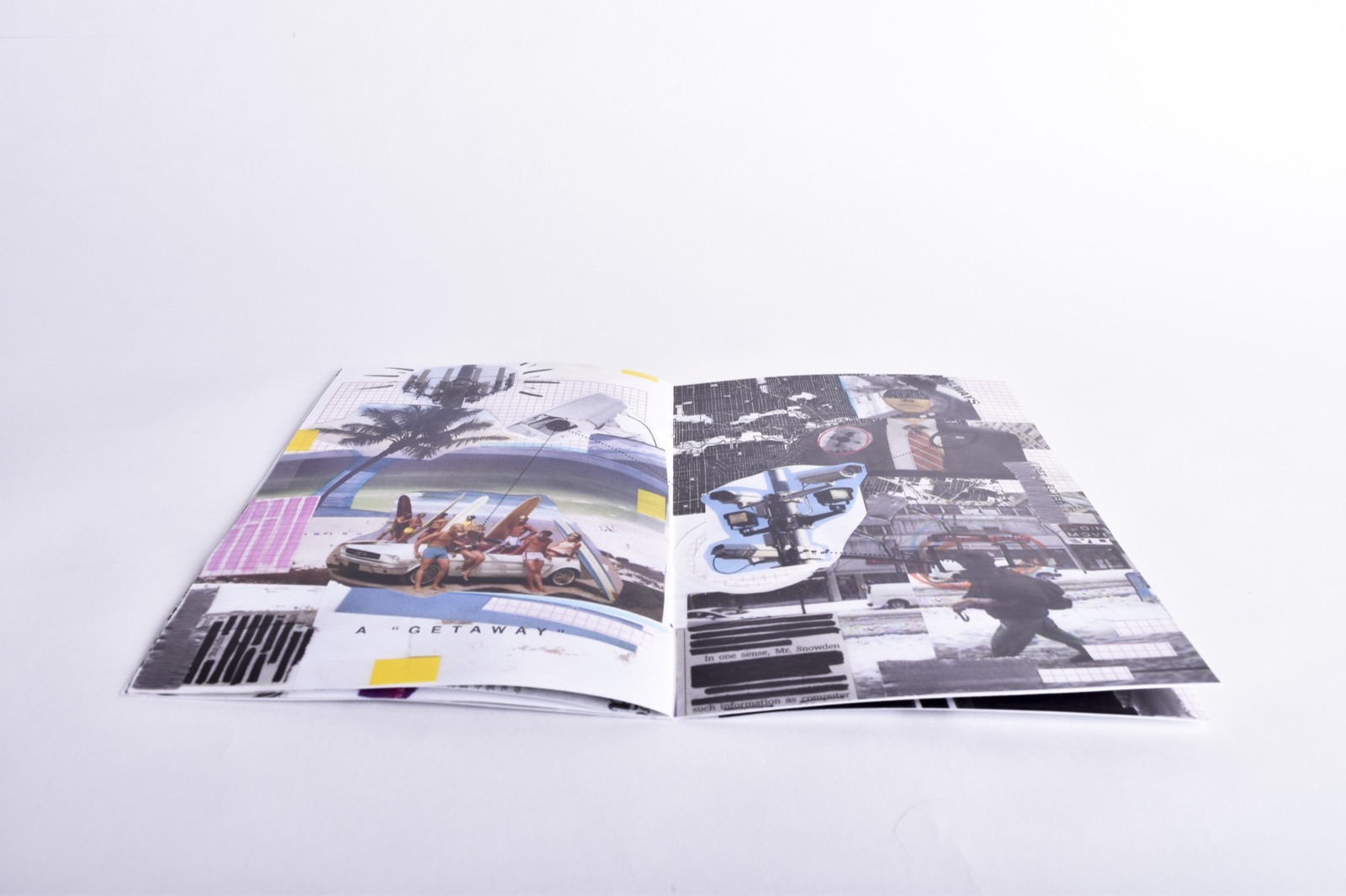
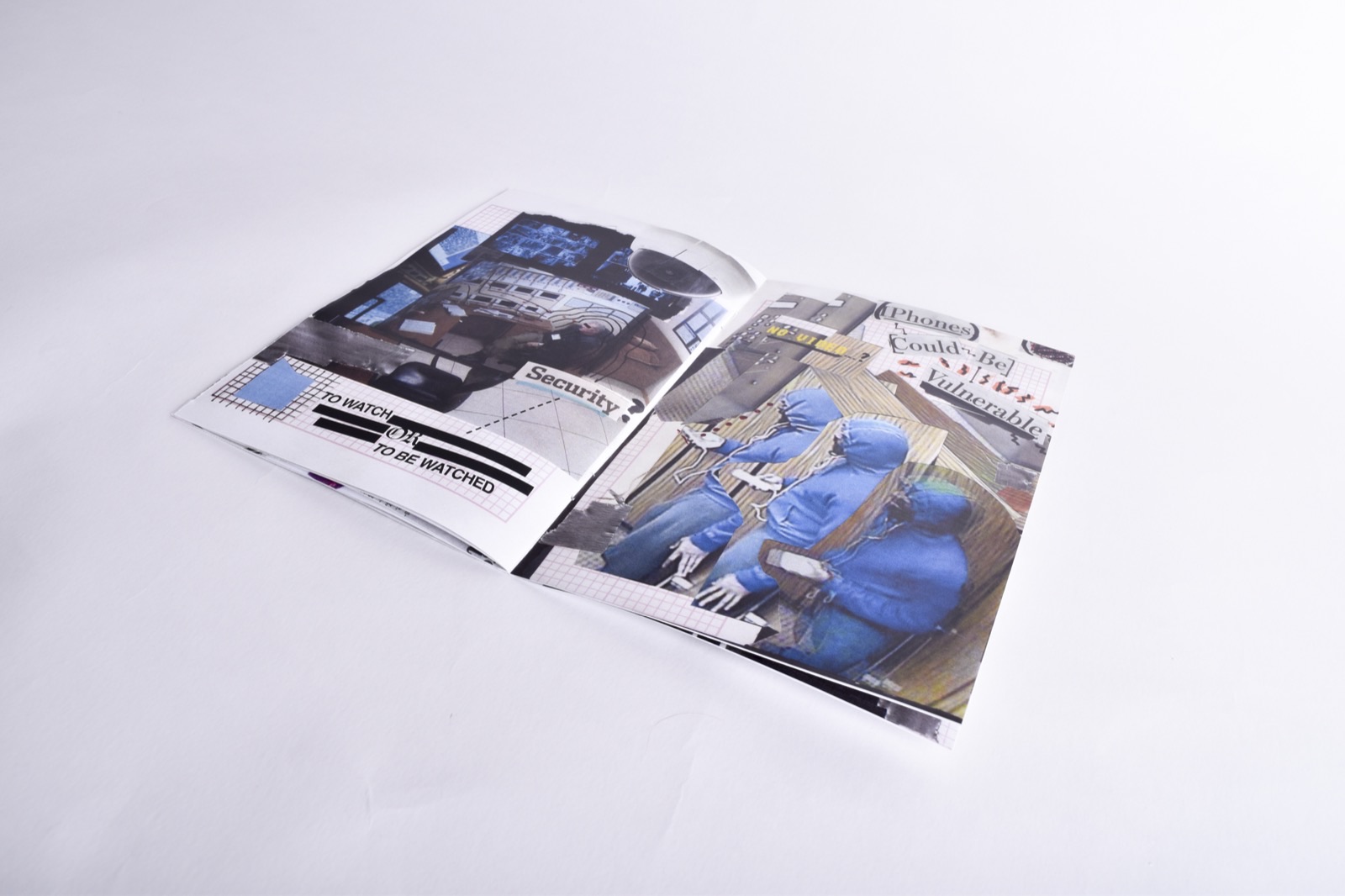
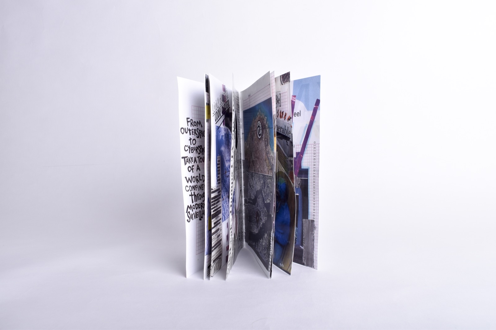
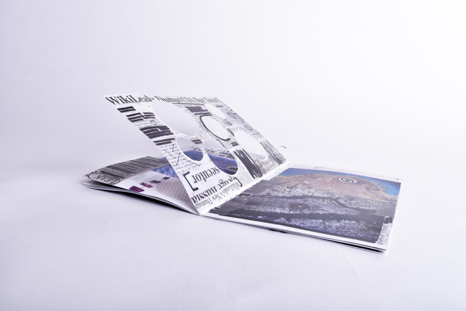
Building every page by hand — sourcing material from newspapers, redacting text, punching holes, layering tape — forced a slower, more deliberate process than the usual screen-based workflows. It re-instilled my love for collage and analog methods of creating that I still work with almost 10 years later.
Made in collaboration with Ian McMullen
The flash sheets serve as an ever-growing archive, the result of revisiting a lifetime of drawings and doodles and assembling them into a digital collection. The process helps me understand the scope of my work, allowing me to see recurring patterns and themes, build upon past projects and ideas, and weave a clearer thread through my creative process.
A growing collection of characters that started filling up sketchbooks and never stopped. Faces, figures, totems, creatures, glyphs, geometric forms — all drawn by hand in ink, then scanned and arranged into flash sheets.
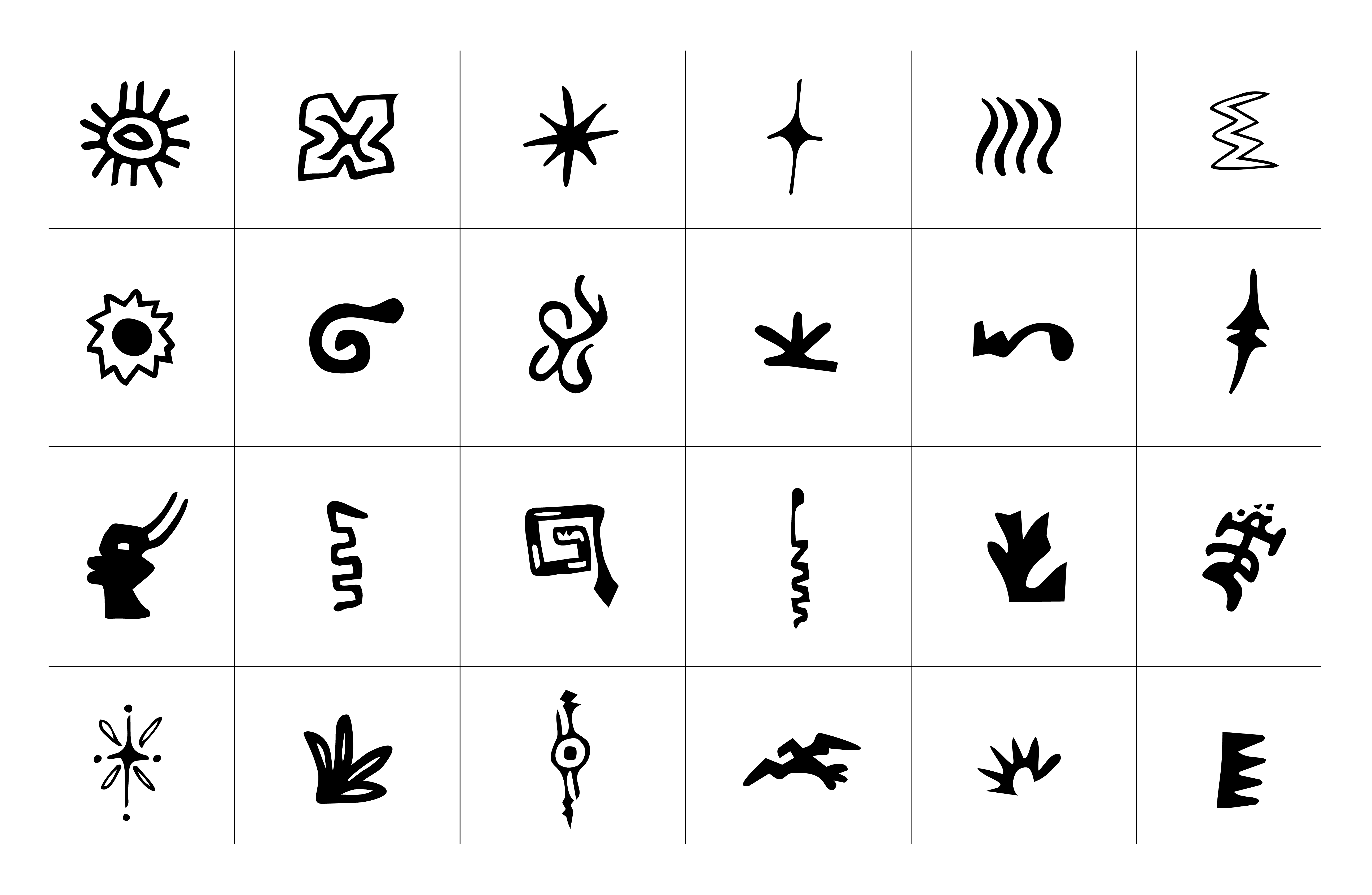
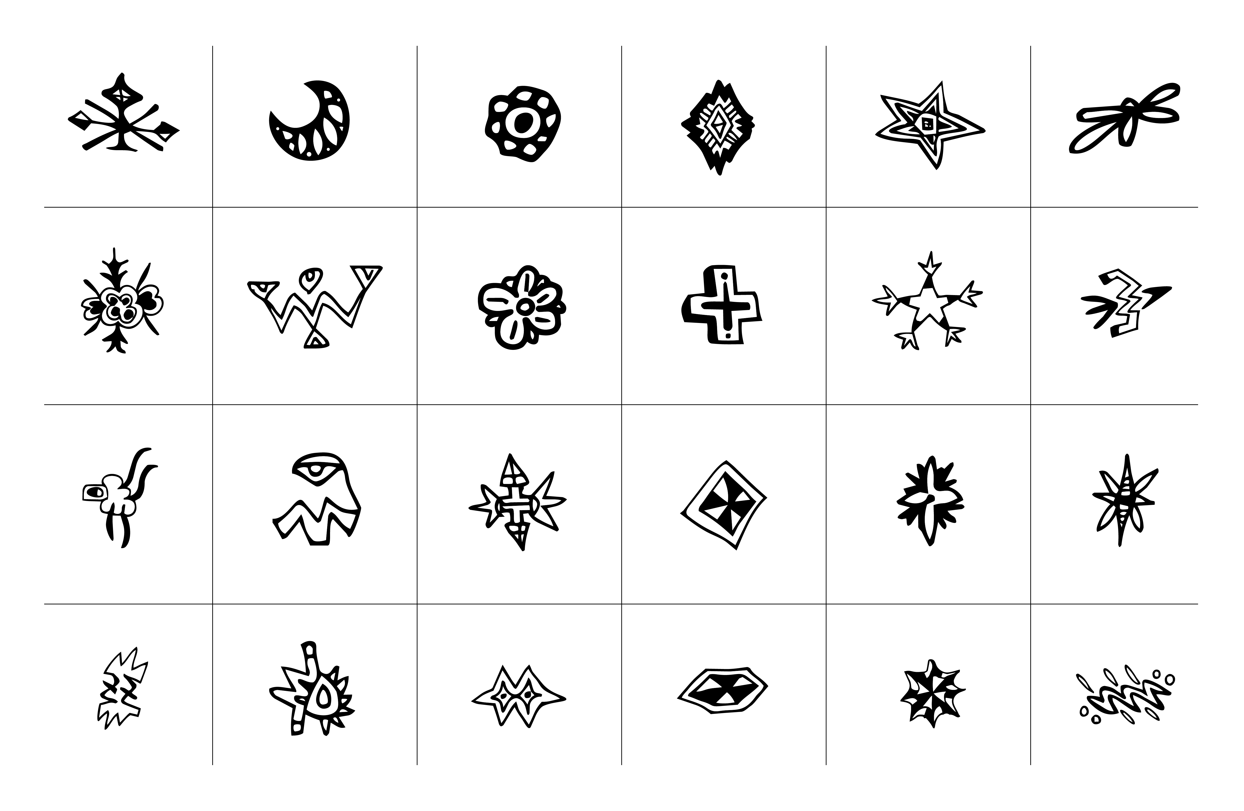
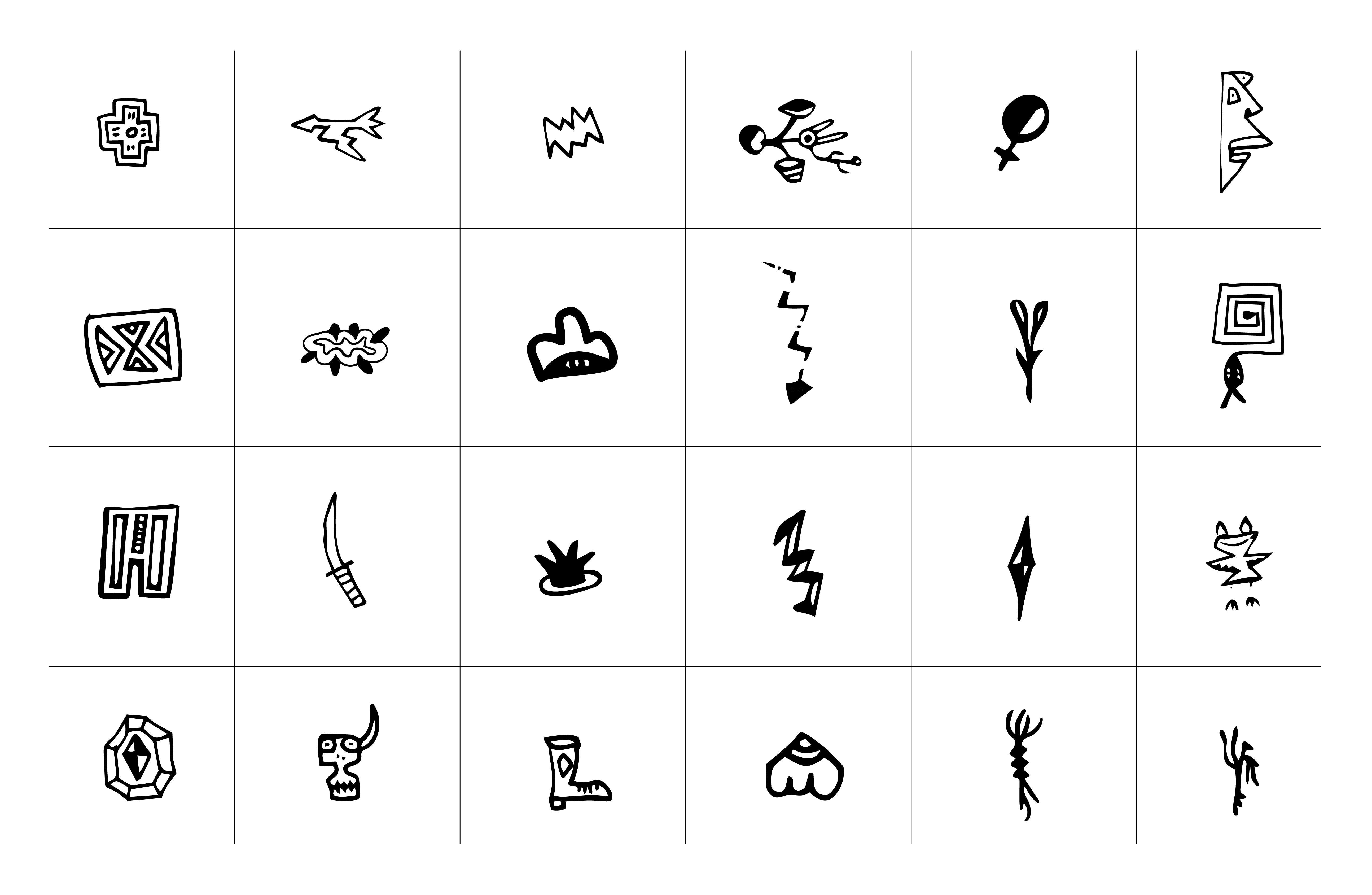
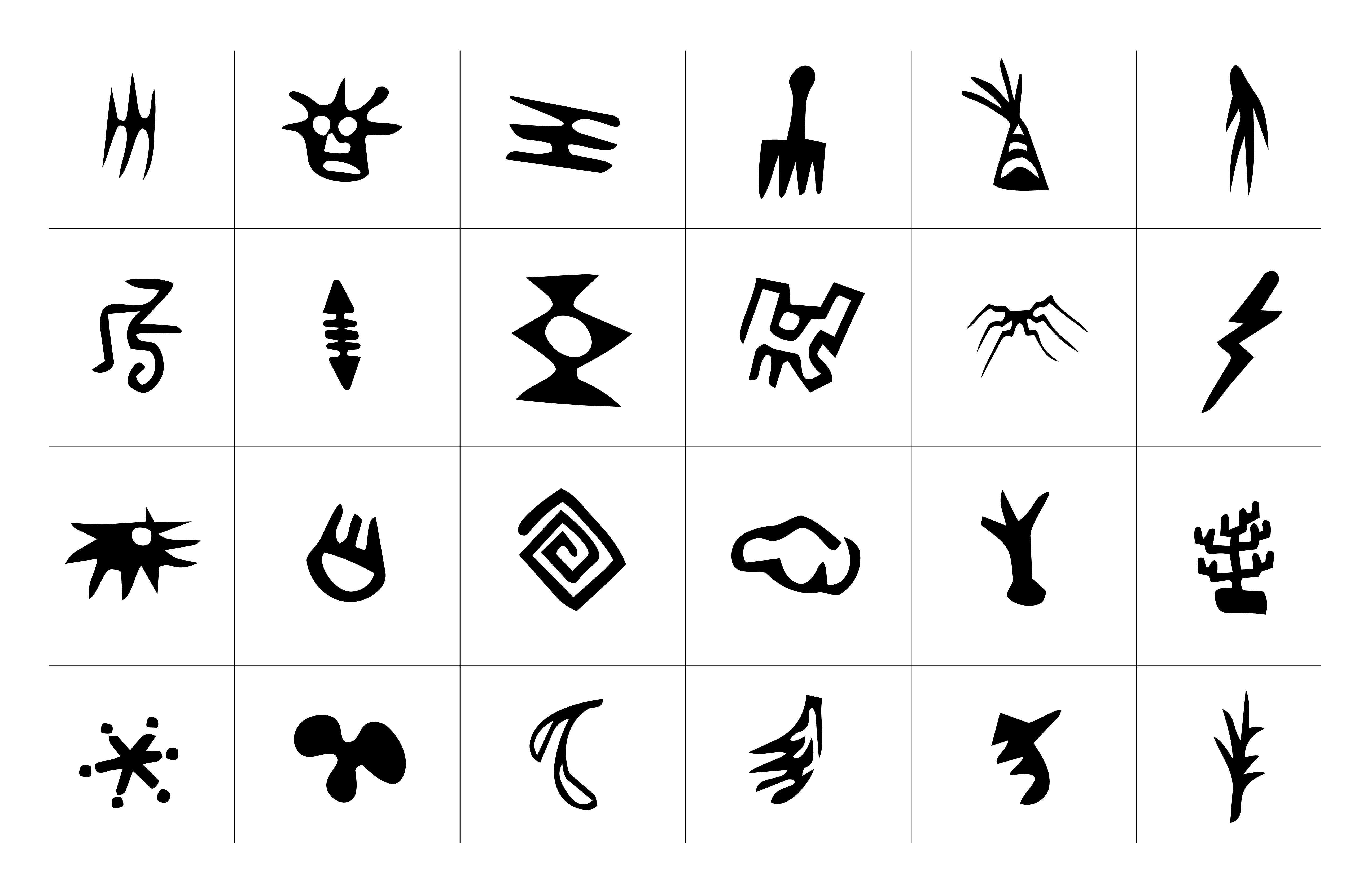
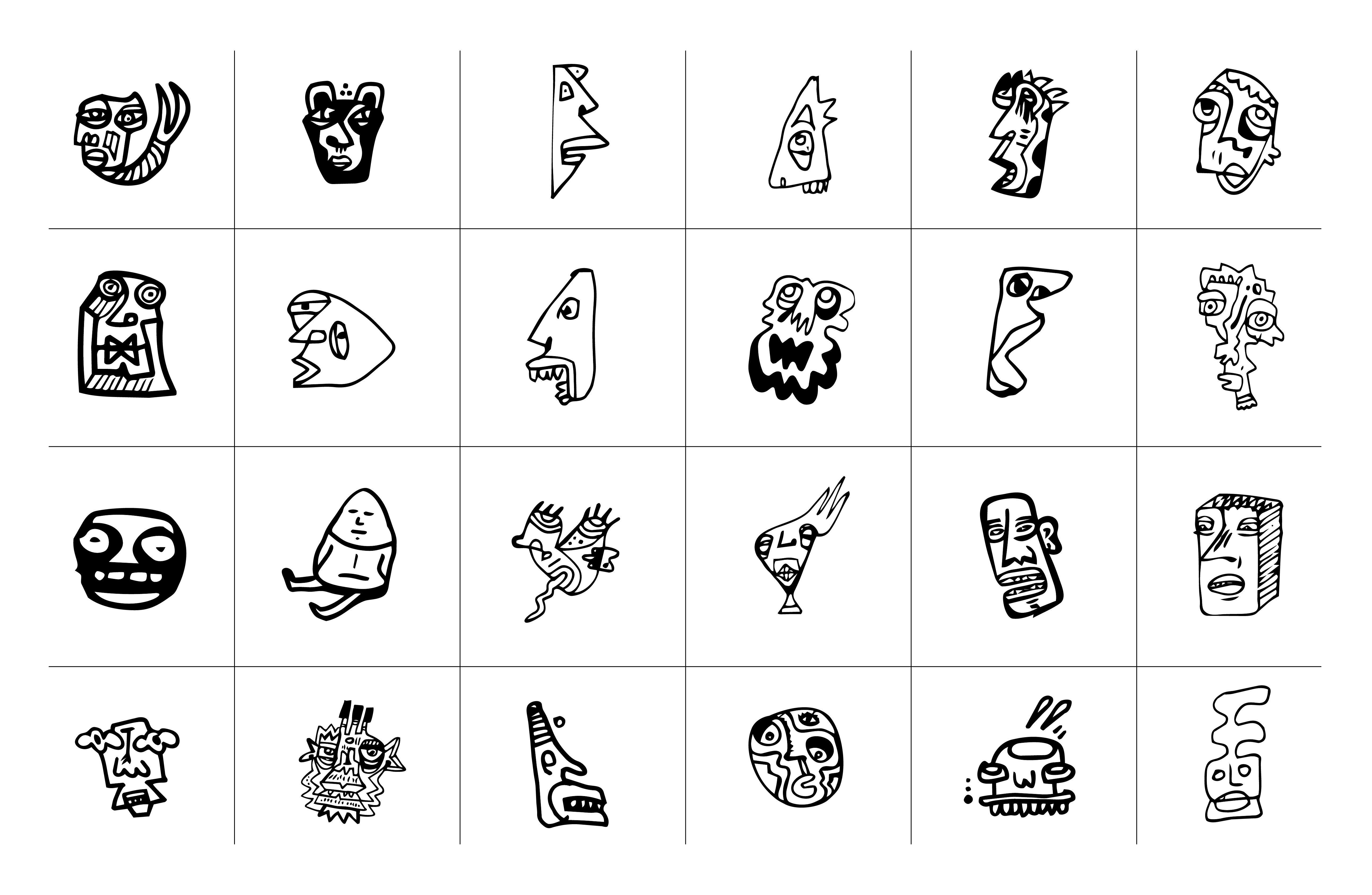
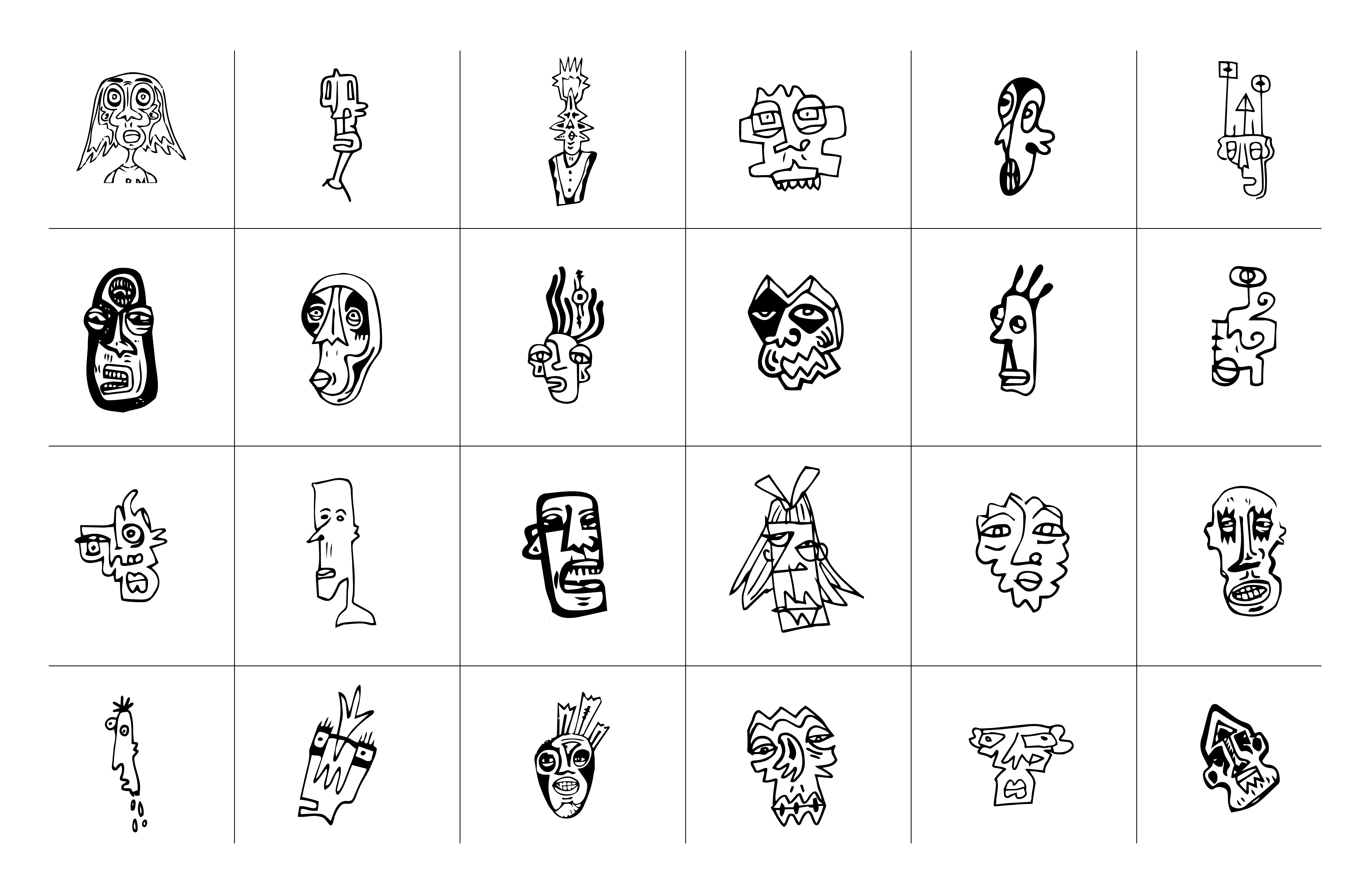
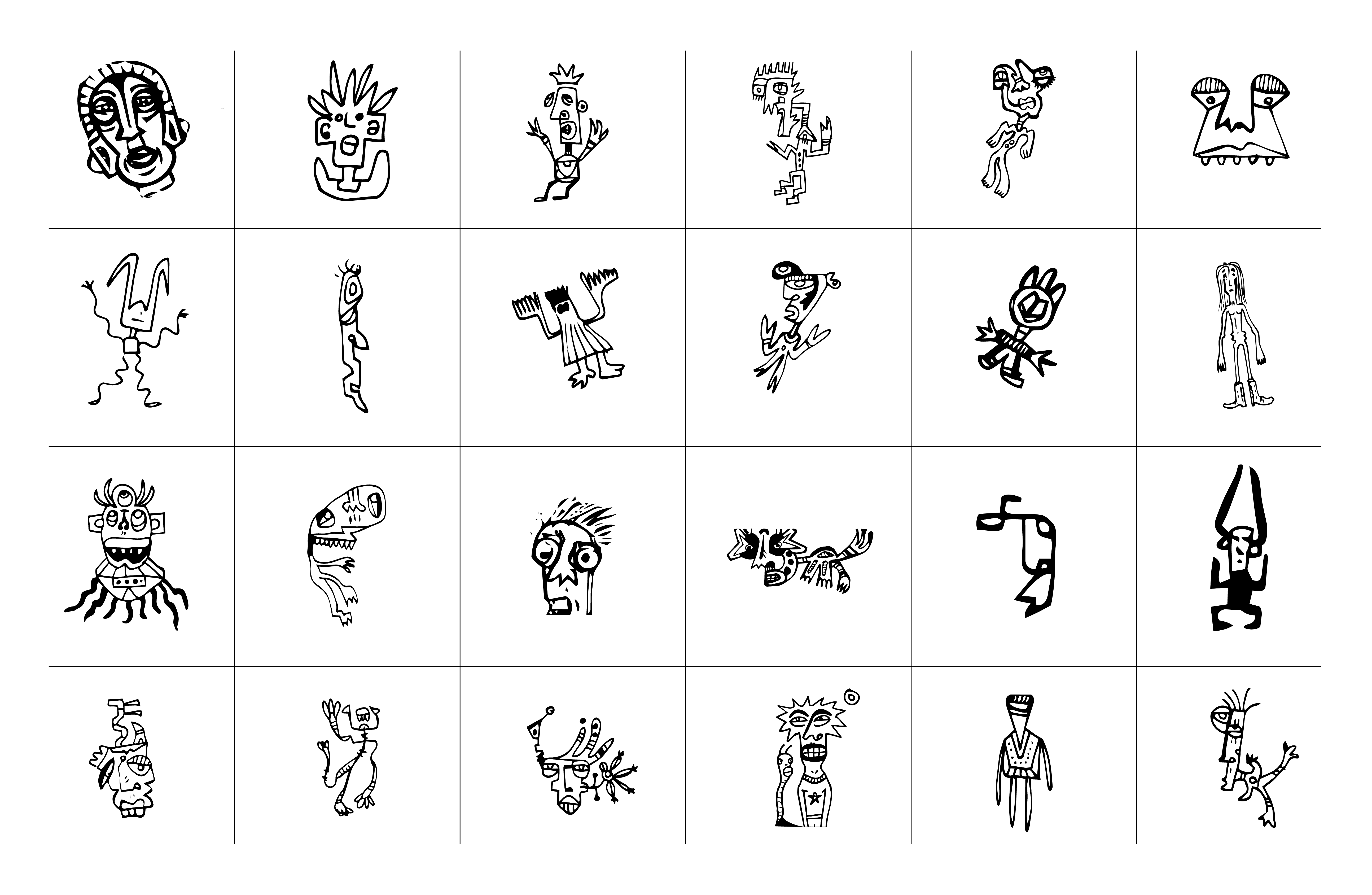
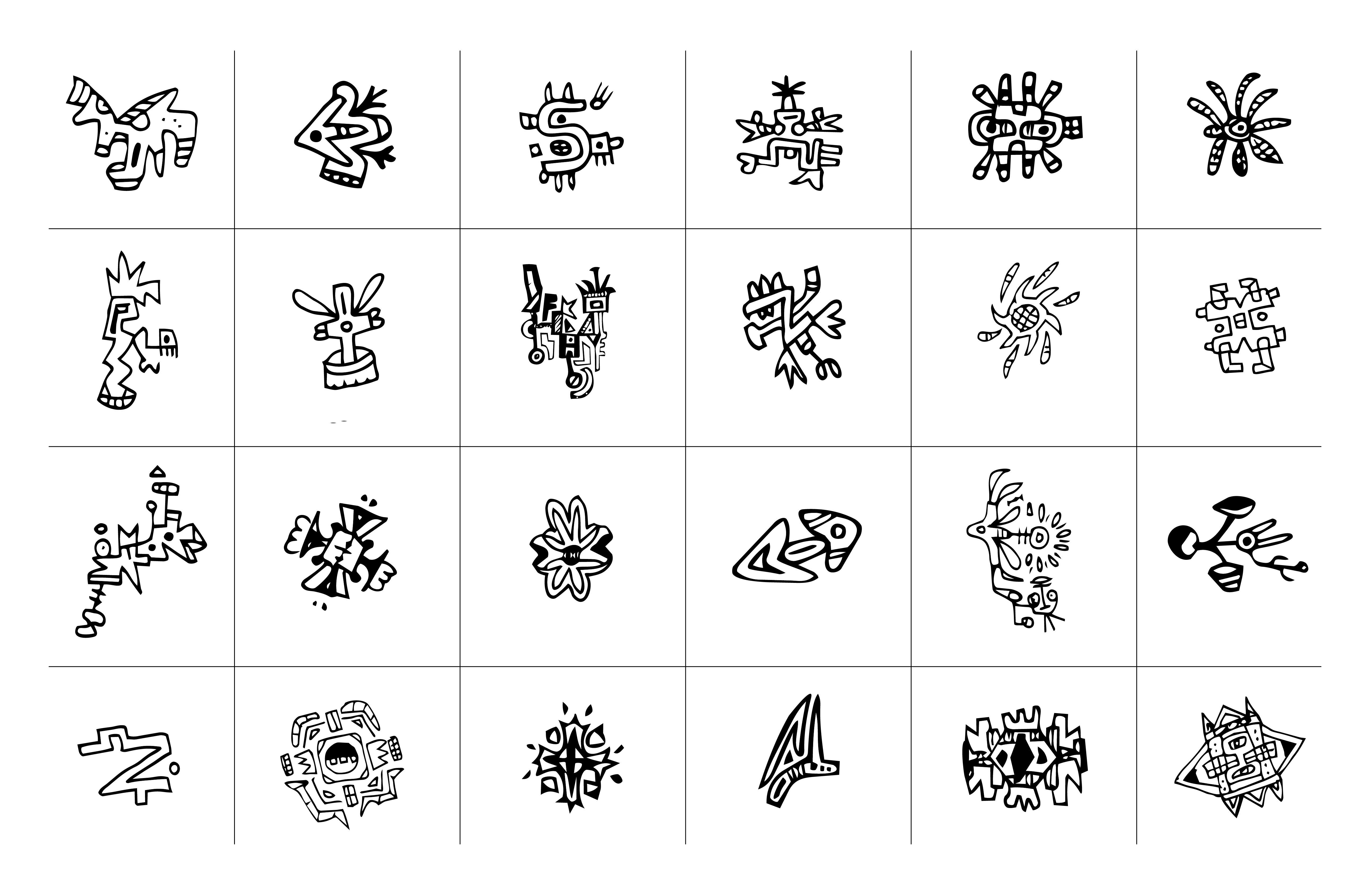
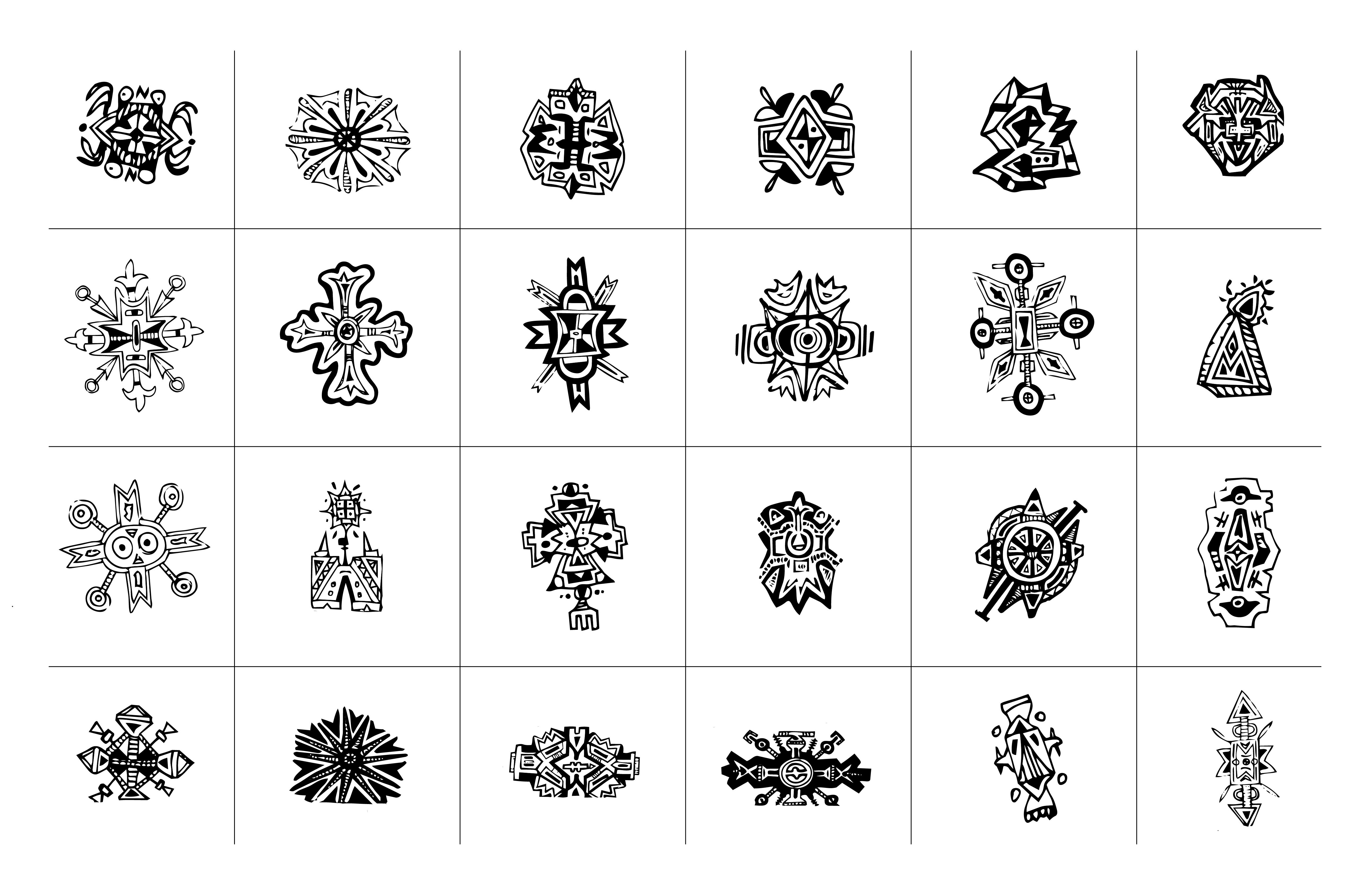
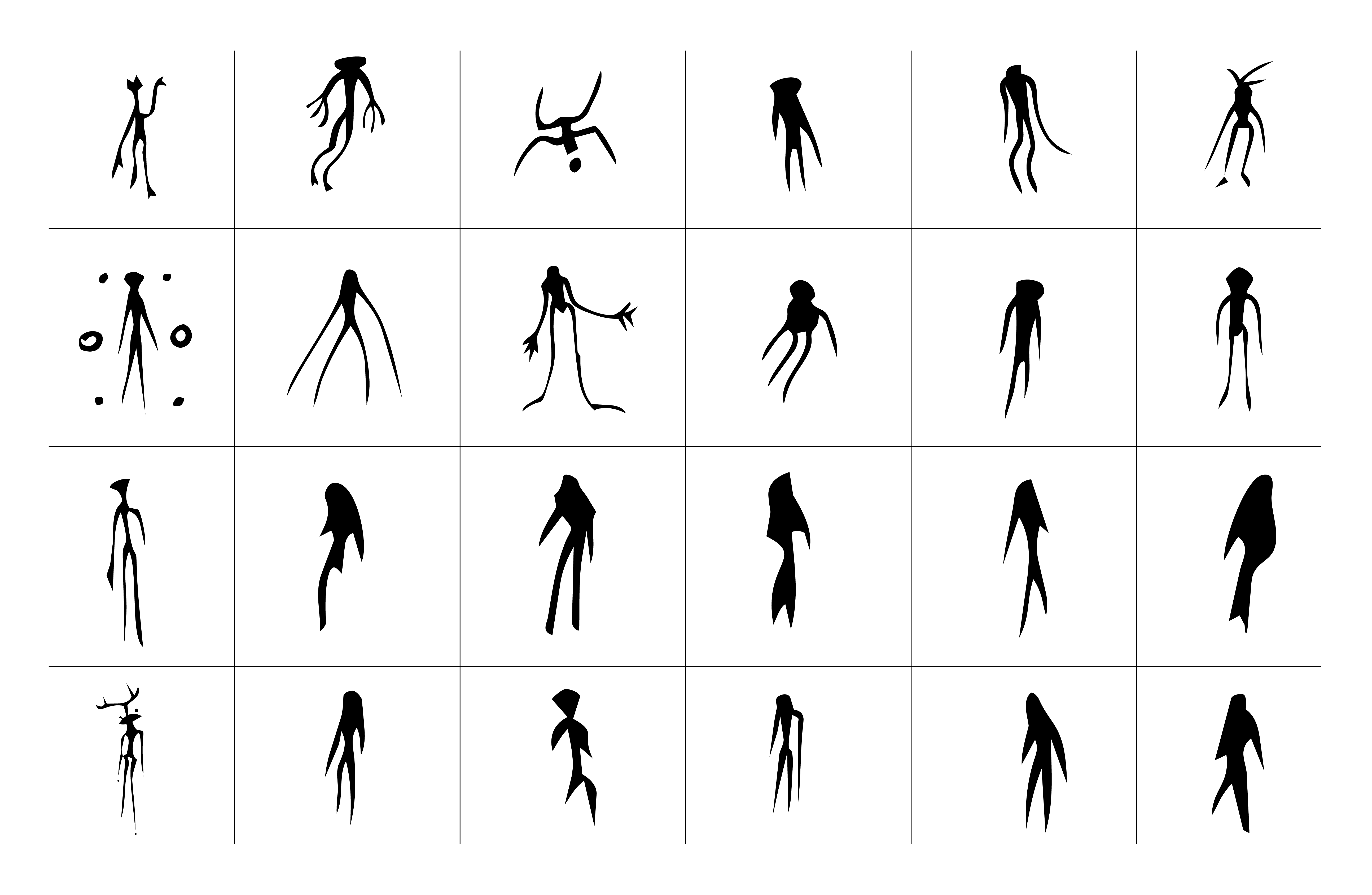
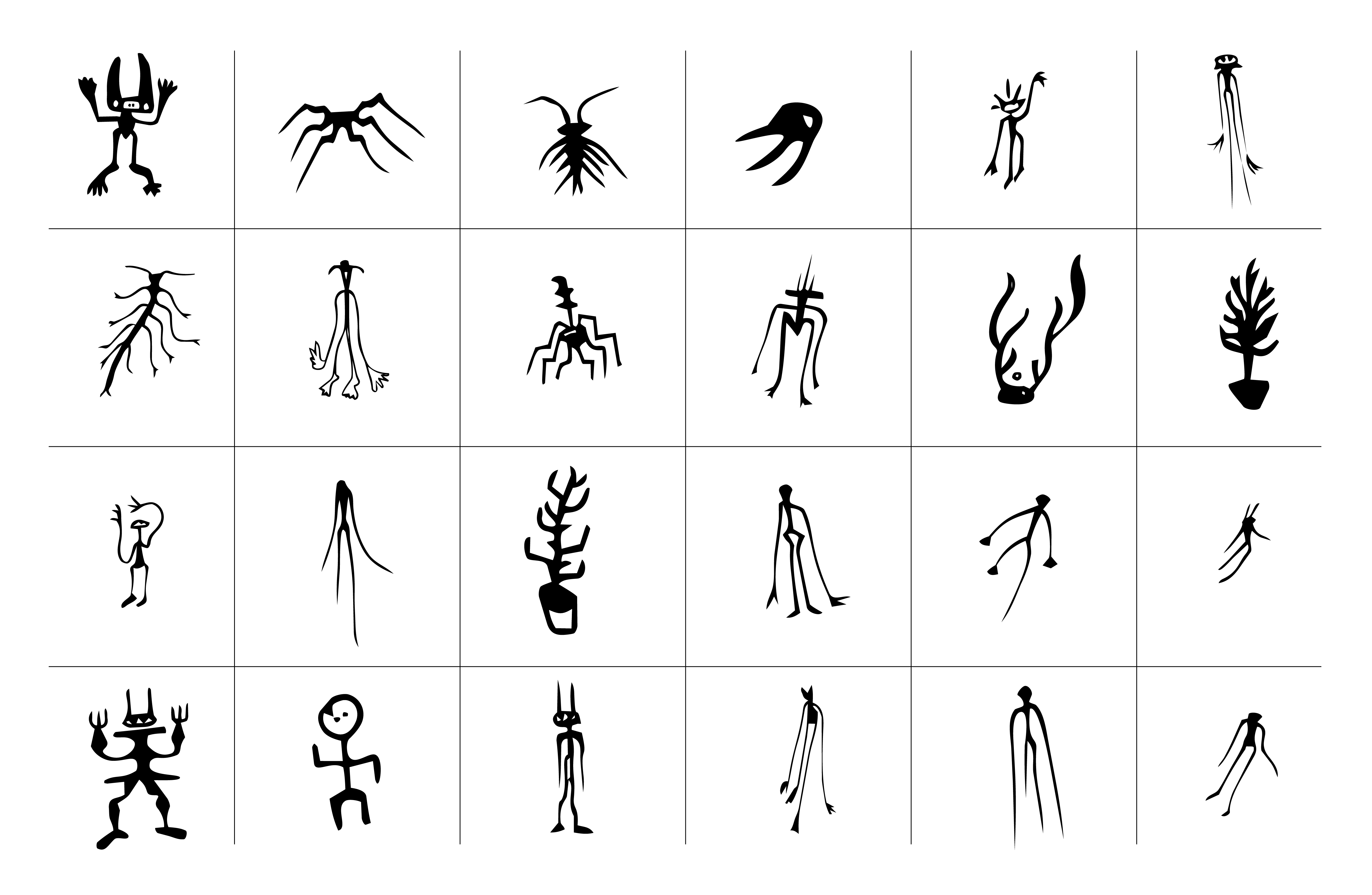
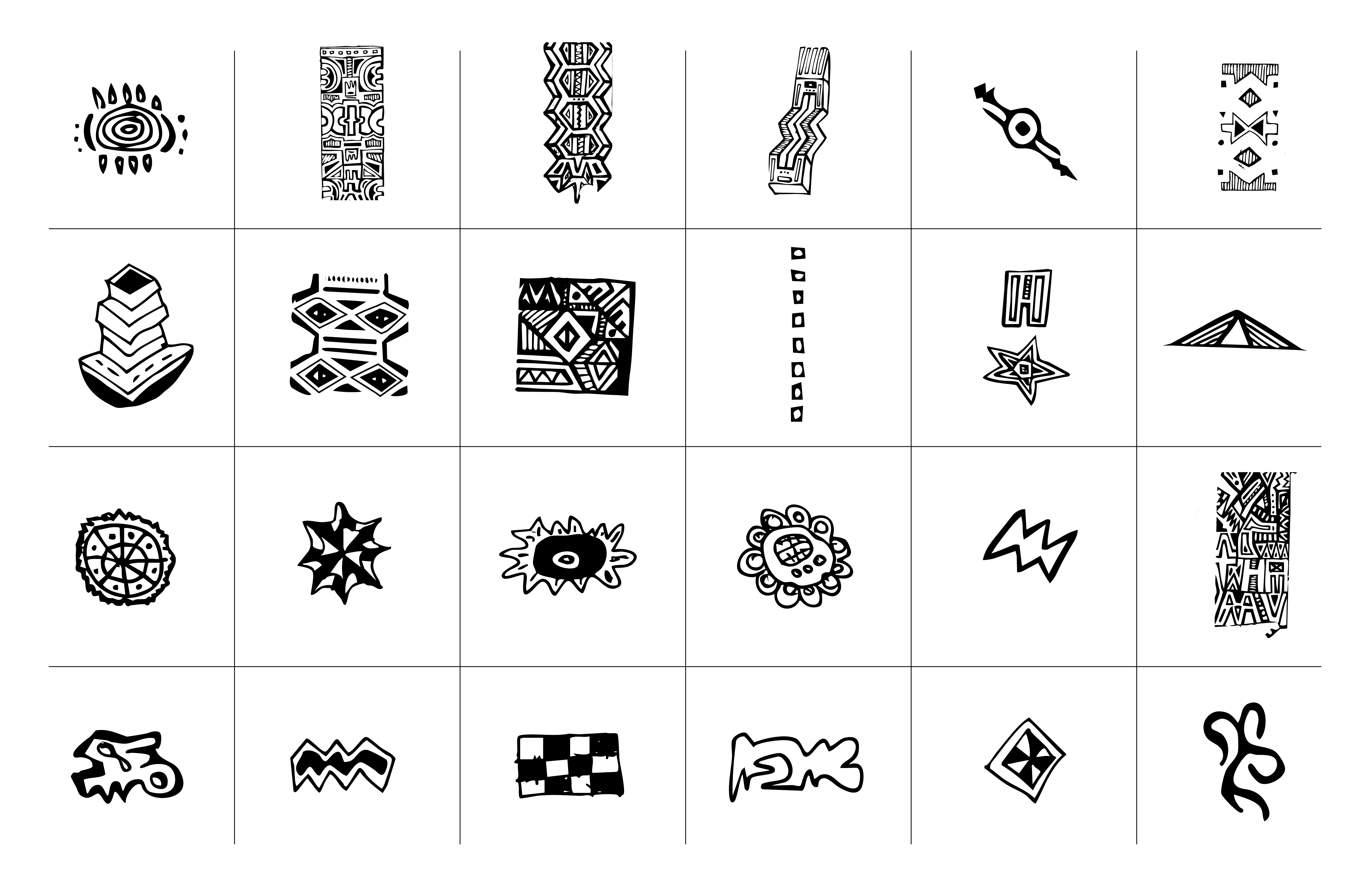
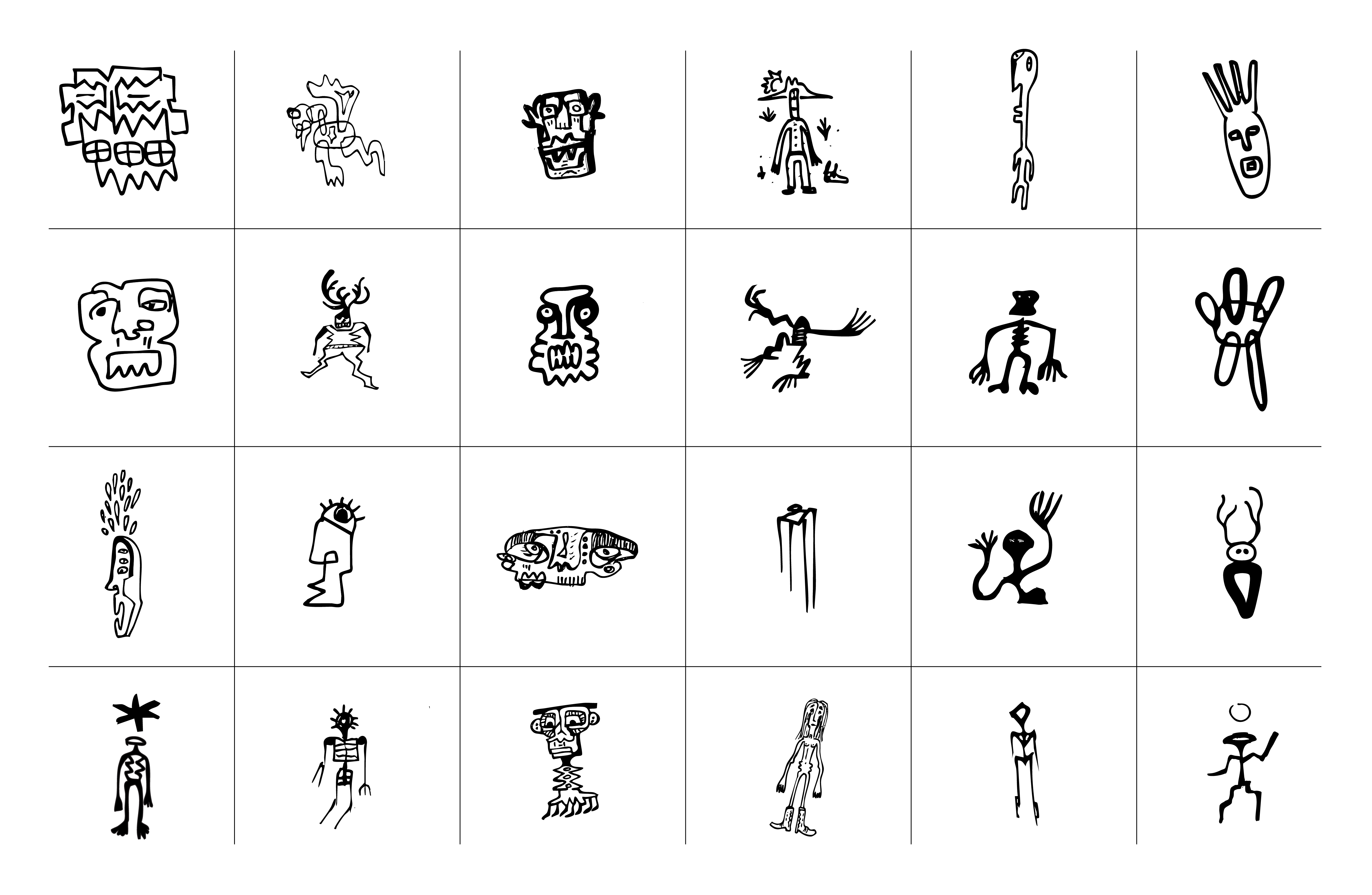
The flash sheets are the throughline across most of my work — the visual DNA that shows up in logo work, in the Rocket Ramps icons, in fabrication details, in the logos, etc. Drawing every day without a brief turned out to be the most useful practice of all. The archive, similarly to the garden, just keeps growing.